Indie game storeFree gamesFun gamesHorror games
Game developmentAssetsComics
SalesBundles
Jobs
TagsGame Engines
(+1)(-1)

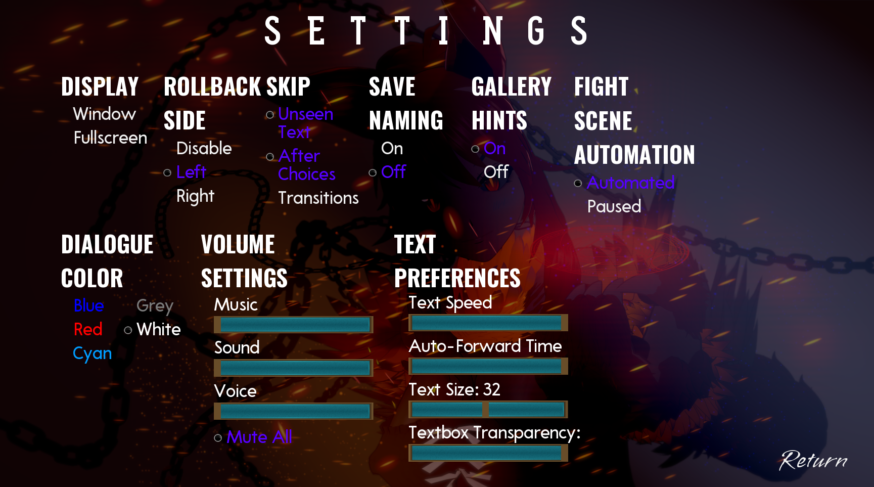
If i may, I would suggest either changing the color of the in game text or adding a thick enough black border to the text so that the text is more visible. The text is currently white and it often display on a white/ light background making it difficult to read without shoving my face into my monitor. 

(2 edits) (+2)(-1)

Yo mate,

Well I changed the looks of the settings a bit compared to the 0.4 ui, but it  has a setting to change the text color right there. Also the textbox transparency is changeable.