Great work!
All of my positive comments from the production jam applies here too. Extra details such as the trumpets for the victory screens and the icons for accessing the rulebook and opponent moves, make the game feel more complete.
There's three minor issues that are not game-breaking and can be dealt with at a later date:
- Minor spelling errors in the rule book:
- Stamina page where it says "Figher"; in "Game Flow" under "Decision", it reads "... followed by he corresponding Reposition Tme Unit".
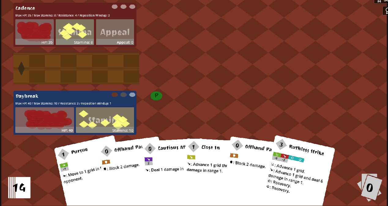
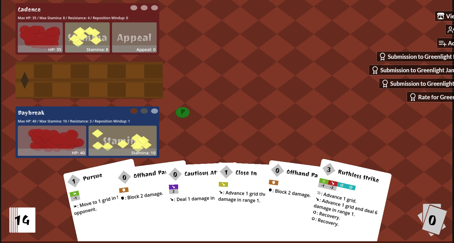
- On larger screens, the text loses some clarity. I played the production version on my laptop (15.6 inch), so the text resolution looked clear. I decided to play the release version on a desktop monitor (54 inch), and the text loses resolution. This isn't a problem on the cards or the rulebook, but it does make it slightly straining to read the character card stats and the writing on the counter piles
 Screenshot taken on 54-inch monitor. Minor loss in text resolution.
 Screenshot on 15.6 inch monitor. Screen text resolution is fine
- When viewing the movesets of characters, it's not obvious that you need to use the scroll wheel to scroll through the list. This didn't occur to me when playing the production version, as I was using my mouse to scroll up and down the page and then I accidentally stumbled upon the method.
Again, these are minor issues. It is still enjoyable to play, more so once you get used to the rules and are able to strategize effectively.

