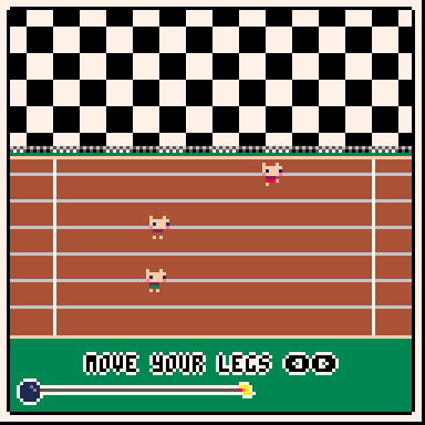
I don't blame your assets (your game is more beautiful than mine!), it's just that the race oddly use only the half bottom of the screen. Did you try to center it vertically ? Something like:
(please excuse my poor MS paint skill)
Thanks for all the feedback and those MS skills are better than mine. I think I had it positioned like that because I had preview disabled and as I was more attracted to it being in the lower third (I think this has to do with the Rule of Thirds from photography). With the text though, you're probably right and it needs to be boosted up.
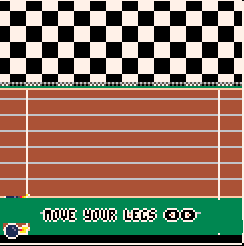
Here it is shifted up 12 pixels: