I am ashamed to post things frequently (more or less, with a lapse of 2 or 3 days) because what I have done I don't consider something worth showing. HH is not a traditional game, and a lot of the work goes to text, but I also work on things outside of text. I'm going to try to break that embarrassment by sharing a few things I've done.
Something I got to work on trying to figure out what I could change or improve to give it a better presentation. There is the window design, the font, and a change of other interface designs. But there is also the backgrounds.
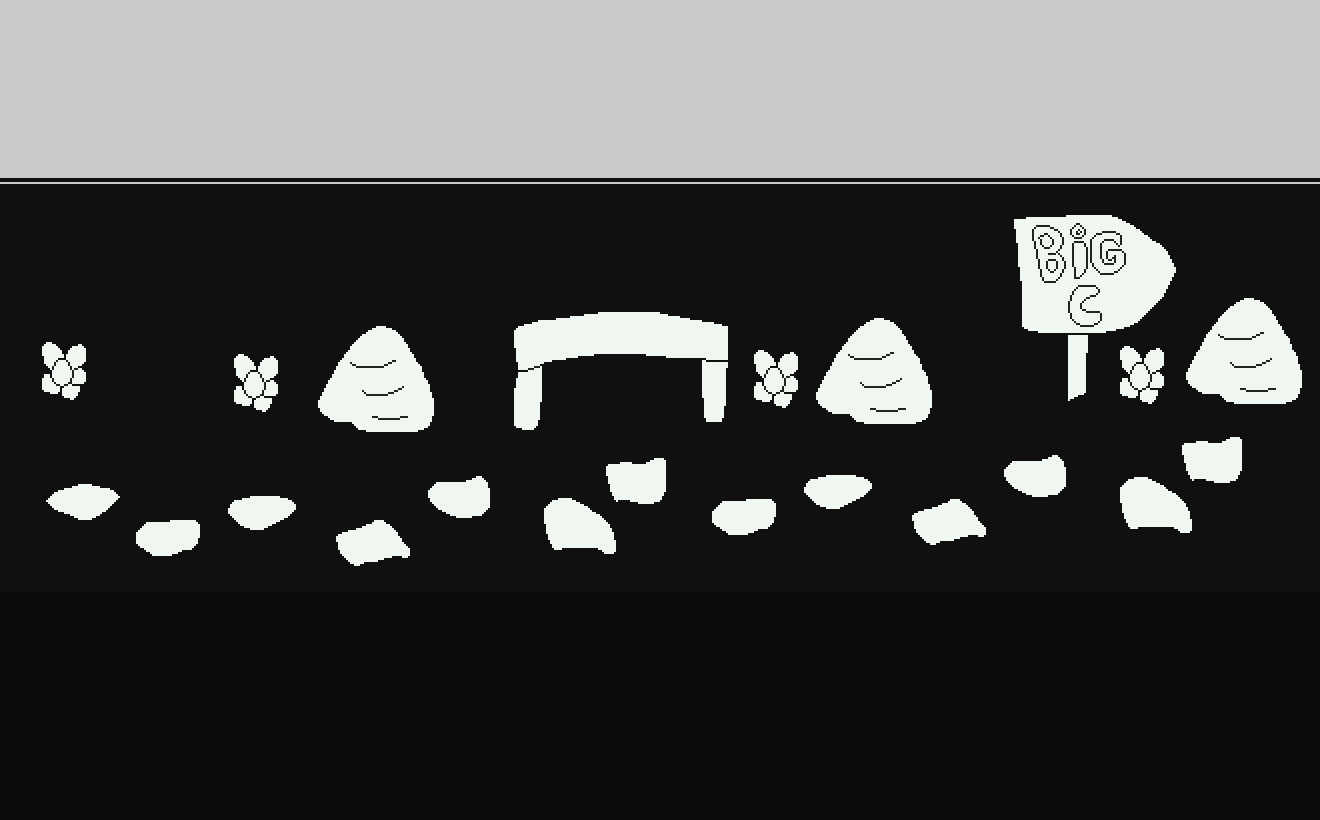
I don't know how to draw backgrounds. But something I'm a little better at is rpg style maps. I was encouraged to go try that.
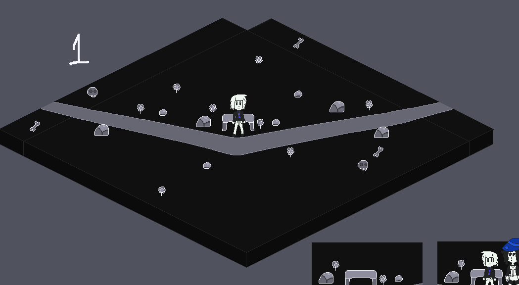
These background sceneries are not explorable or interactive, they work as a substitute for traditional backgrounds that cannot be drawn. I think it looks good, my colleagues think so. 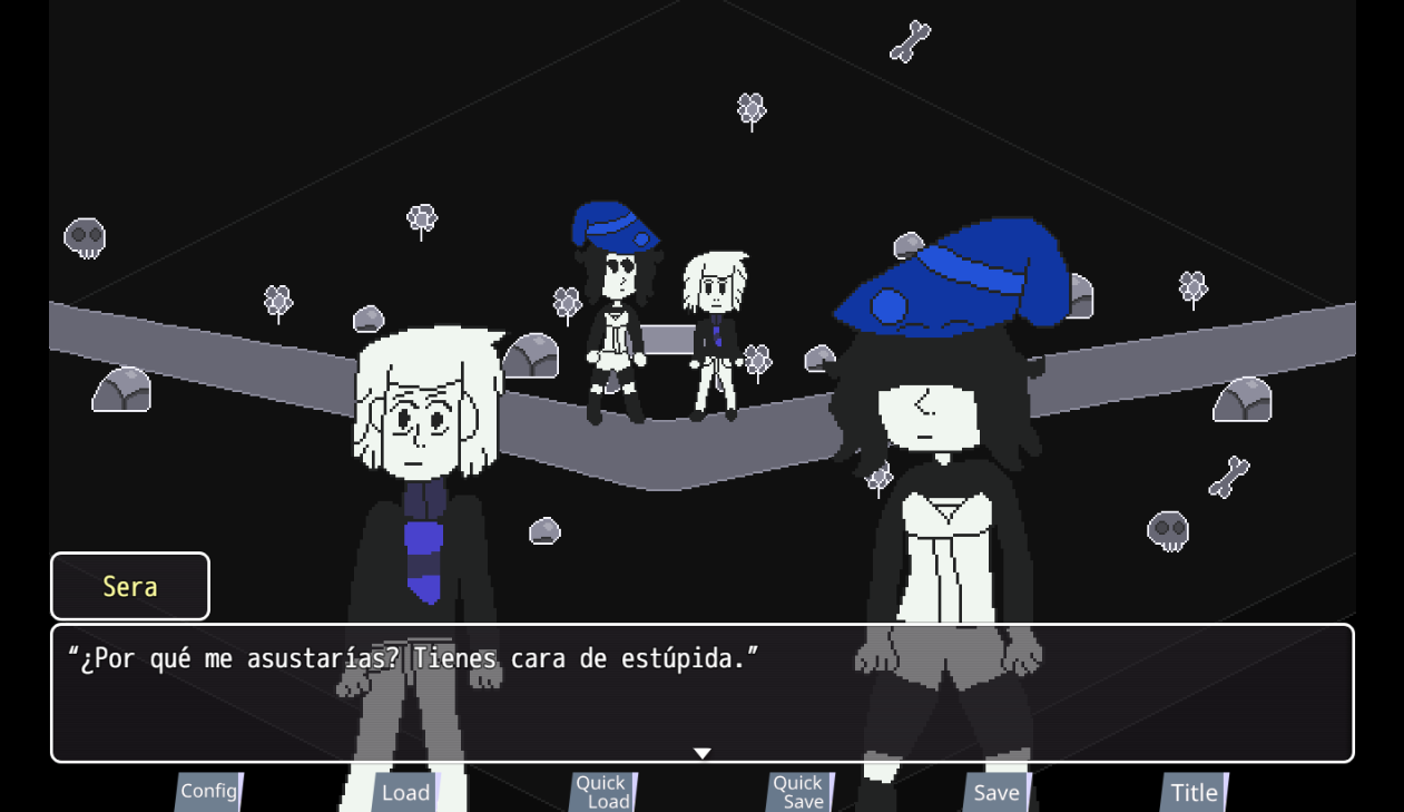
"Why would you scare me? You have a stupid face"
There are several things to correct and change about this image, but the idea of the background maps and the front-facing sprites is there.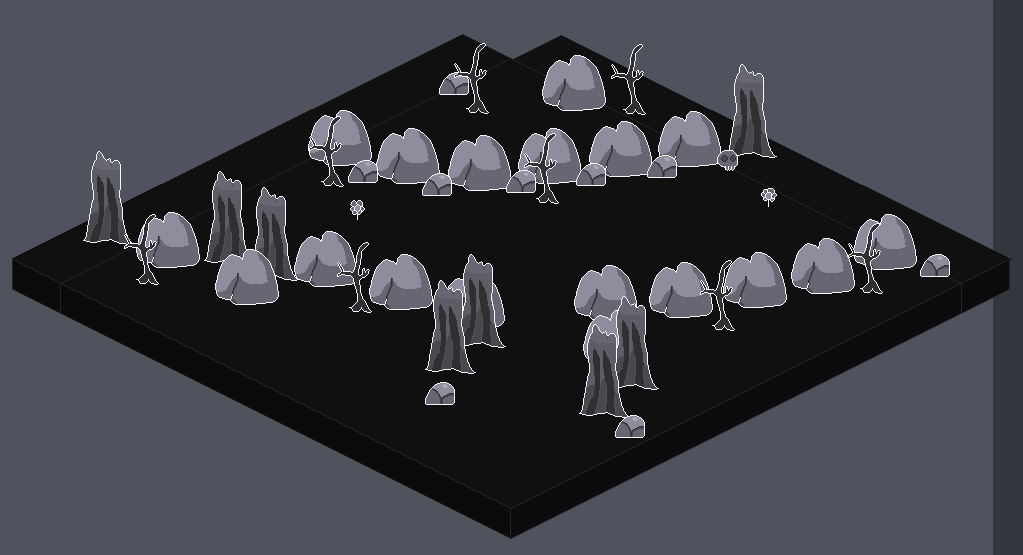
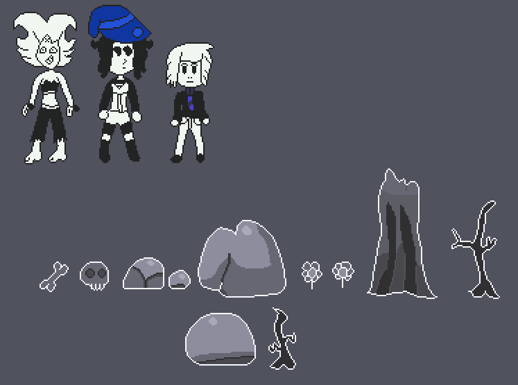
Plus, the face of this character looks better!
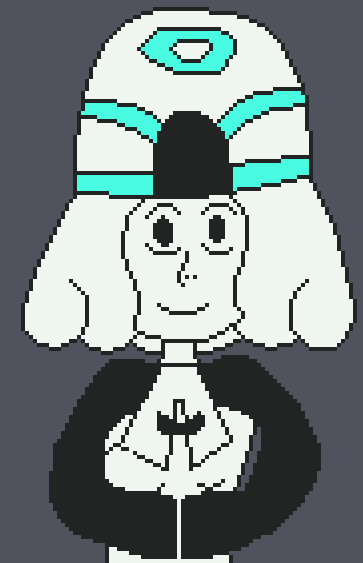
And I added a new font that replaces the base font of RPG Maker MV. It's called Ubuntu Mono.

"Either you're scared of them, or you love them, or you don't care about them."
"Even though they are gods living on earth, that's their social status."
"Although... I'll bet someone has managed to keep something with them."

