Indie game storeFree gamesFun gamesHorror games
Game developmentAssetsComics
SalesBundles
Jobs
TagsGame Engines

Hey, my comment on the game jam page, I just mean that all the UI screens take up a lot of the gameplay space, example:
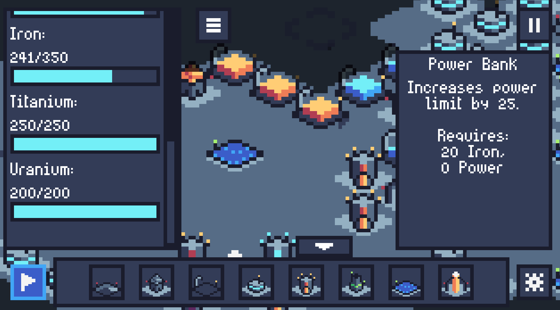
I knew that you could close all of them, and I would close the left one, but then after I build something I would usually open it back up to decide what to build next.

So I was trying to describe something like this:

Basically a smaller version so you could see more, but still get the info you need.

But I was also saying you could use icons, which could be easier to read at a glance and take up less space. Here is an example from aoe2 of what I'm thinking of:


Oh wow, thank you for the mock up! Yeah the menus taking up too much screen space was really something that I wanted to fix, but I didn't have the time. One reason of why it was so big was because of pixel-consistency. I wanted every pixel to be as close in size as possible for that 8-bit aesthetic, but it limits how small I can make the font.
Having a bar with icons however, was something that crossed my mind only after the fact. Having all of that information readily accessible on the top with icons would make the game much more readable. On top of that, it would free up the left side of the screen, so I could stop the other problem of clicking something on the right side of the screen and the info panel covering it. I could just move the info panel to the side that matters least.
I really like these ideas, and I totally have to use some of them for my next project. Thank you so much for the feedback!

I totally understand that - both not having enough time to do what you want, ha, and the pixel font consistency. One game I had to make the smallest pixel font possible that is still readable, which I believe is 5x5, for the same issue. There are multiple things you can do, but it feels like a no win situation cuz each solution has a downside.

Glad you found the feedback helpful! It is really well done, and even more so impressive that it was done in 48 hours!