Really well made game, i like feedback when you kill enemy (this camera shake is oddly satisfying), indication when character jumping or where is spear is nice touch. But movement is like mario on ice, for game where precise control of character in fight is important better using 0-1 movment especially jump is easier to control in mid air, avoiding enemies and positioning, generally less clunky, like in Dead Cells or Momodora: Reverie Under the Moonlight
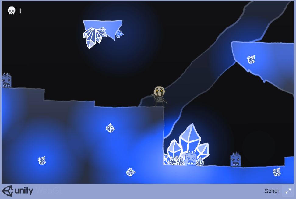
Enemies is really hard to see for color blind people. For enemies never use the same hue as background or terrain, better are complementary colors (here will be better orange or brown). On screenshot how game looks for people with protanopia

For Chrome or Firefox exist extension simulating color blindness. You can open screenshot in browser and use extension for testing. When design i recommend using something like paletton.com, where can you simulate color vision deficiency when choosing color palette.
And some unnecessary nitpicking:
- when background noise loop end you can hear crack
- helpful would be arrow indicate direction where is spear (when you throw spear far, player can don't know on which level spear can be)
- enemies when respawning can kill you, but you them can't (it just weird to me)
- after launching from spot on far left when you hold left you momentum is buggy (you first slow down and after a while momentum is released)
Hope I was helpful, Keep up the good work!

