whew this is almost perfect, I think the hitbox issue is a problem with perspective. I walked into the spikes and screencapped the positions I died at to see what was going on. (apologies in advance, this comment ran long but its not all about the hitbox!)

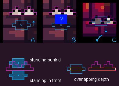
A and B is the same death, I am guessing that the player hitbox is placed on the body, around the size of the blue square in image B. However the player's feet haven't reached the spikes yet, they are at different depths on the Z axis, the player really appears to be standing some distance in front of the spikes at the time of death.
In image C, we can see that the hitbox does make sense when moving downward. The player's feet (small x) are clearly in the middle of the spikes.
Putting the hitbox on the whole body makes sense in 2d platformers because there is no depth, but in 2.5D / isometric games I think the hitbox should be sized and centered according to the shadow. (The 'height' of the shadow is approximately how deep or round the character is, so it doesn't need to be 1px high like the yellow box in the graphic above and could instead fill the shadow, the yellow was to emphasize the center of depth).
ok but with that out of the way, the rest of the game is actually amazing and full of great details. I love the color palette. The duck and especially the ghost animations are *super* good.
The very first time I got to the switch and expected the screen to fade to lead to the next level, but instead the music changed, and the dungeon tiles started flickering to the beat, and then the ghost pops up behind me in the same corner.. the moment the objective clicked I had a huuuuge grin (and then I immediately died on a floor spike).
Anyway I got to the switch again and then after a little time passed in the dark the tempo of the music changed and the ghost... stopped... AND STARTED DANCING? (it-it was dancing right?) I mean I think the mechanic was to allow the player to pass by the ghost, especially when the random spawn position turns out to be disadvantageous right, but it felt like it had a personality, and was almost perfectly in sync with the beat.
The handwritten letters and little flicker in the title animation, excellent. The gleam on all the spikes, slightly offset from each other, and used as a hint/reminder in the dark? awesome. particles on the thwomps, awesome. the unique music for the victory screen, A++. progression screen in between stages, feels good. Tiles flashing in the dark on tempo with the music, super awesome.
So I think the hitbox needs another fix, kinda badly, but the rest of the game is truly fun and well polished. I think this is an overwhelming positive jam outcome.
Also, I'd encourage you to use a gif in the first 2 screenshots, because the animations are really strong in this game and people will be able to see that when they mouse-hover your game in the jam gallery. Currently the victory screen and title screen as the cover/1st screenshot didn't give me a clear idea of what in-game looks and feels like. (I personally love GifCam for its convenience and small gif filesize, tho you may want to temporarily resize the game and record gifs at 256x256px to get the best length/filesize/framerate ratios).

