Nicely made! I like it a lot! The fact that you made it in Scratch makes it easy for me to mess around with it too and make changes, and on that note I think I have found a solution for you as well.
I recommend you try to use the costume “run_3” or “jump” instead of the idle sprite. You could make a couple changes to it if necessary, but I think that would improve the visuals immediately.
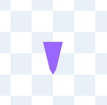
Additionally; I think you should make the hitbox collider look like this [image] instead, as it get’s you closer to the walls when sliding down. I also made it a little shorter so you can fit in between your platforms, but that is all up to taste.
I had fun playing and wish it was a little longer, actually. 😁👌

No problem! My suggestion would actually make the hitbox and little shorter and slimmer. It would make the sprite fit perfectly against the wall. I suggest you use the background tiles to compare so you can make it fit as closely to the picture provided, but again it is completely up to you.
Good luck with future games!

