Had some time today to give your demo a try! Didn't get particularly far - only a few save points in, but I've got some feedback for ya
Platforming feels great - it's weighty and responsive and the player animations work really well.
The ambience of the game is nice - the music and foggy caverns gives it a very mysterious Metroid feel. The overall environment art and player art is nice, but the mixed pixel sizes really hurts the experience. I would definitely recommend making the pixel sizes more consistent. You've got what seems like 6 different pixel sizes on one sprite and it's jarring.
Another nag I had with the environments was that the functionality of the blocks was very inconsistent. Some of the blue square blocks can be broken, some can't. Some are solid, some you can walk right through. For a platformer, the player should be able to instantly translate what is a platform, what is a hazard, etc., so I would advise making those more consistent. If a block is part of the background, it should have more muted colors or lower contrast or something to differentiate it from a foreground object.
The main reason I stopped playing though is that I don't feel like the combat is very fun, or very satisfying. One big reason for that is that what happened when I pressed X seemed to be completely unpredictable. Sometimes the hammer would swing and I would be stuck in place until it finished (which is what I would expect from playing games like SotN), but sometimes I could still slide around. Sometimes swinging locked me into dashing forward, sometimes I did the dashing/swinging animation but was stuck in place. Sometimes the swing animation would play twice (it would get about halfway through and then start over) and sometimes it wouldn't play at all. The inconsistency of the weapon functionality combined with how enemy attacks are basically just them flopping all over the place made it so the only real tactic I could figure out was to just stand in place and spam X, which seemed to hitstun enemies enough that I could just do that until they died. Maybe I'd get hit once, but they'd always drop a health/money item.
I would really suggest you spend some time playing Megaman X4/5 as Zero, or maybe some of the SoTN-esque Castlevania games to get a feel for a melee-combat focused platformer. Megaman X4/5 as Zero would probably fit the pacing of this game a bit better, but I feel like Zero had some fantastic mobility and swinging his Z-Saber was satisfying and consistent.
Additionally, I couldn't figure out how to get into the menu at all. The only way I could seem to pull it up was by Left clicking, which is weird for a keyboard-based game. Why not escape or tab?
Overall I think the game has a great tone and is very promising, but the combat needs some big-time polishing and some consistency in the visuals would go a long way to help this game feel much better to play.
A few other notes/bugs -
- Sometimes the game's keyboard controls would stop working after I clicked to open the menu, making me restart the gamea
- The hammer animation would sometimes play twice
- The first puzzle with the floor/ceiling spikes where you have to use the dodge roll to get through - the first time you try it, there's two sets of spikes, and if you roll too far you hit the second set of spikes - but at this point, the player has no idea how the roll works or how far it goes. Right after this first puzzle, there's just a lone set of spikes that's very easy to roll through. You should flip these around - let the player get acclimated with the roll distance before putting them in a situation where they can take damage from poorly-placed roll.
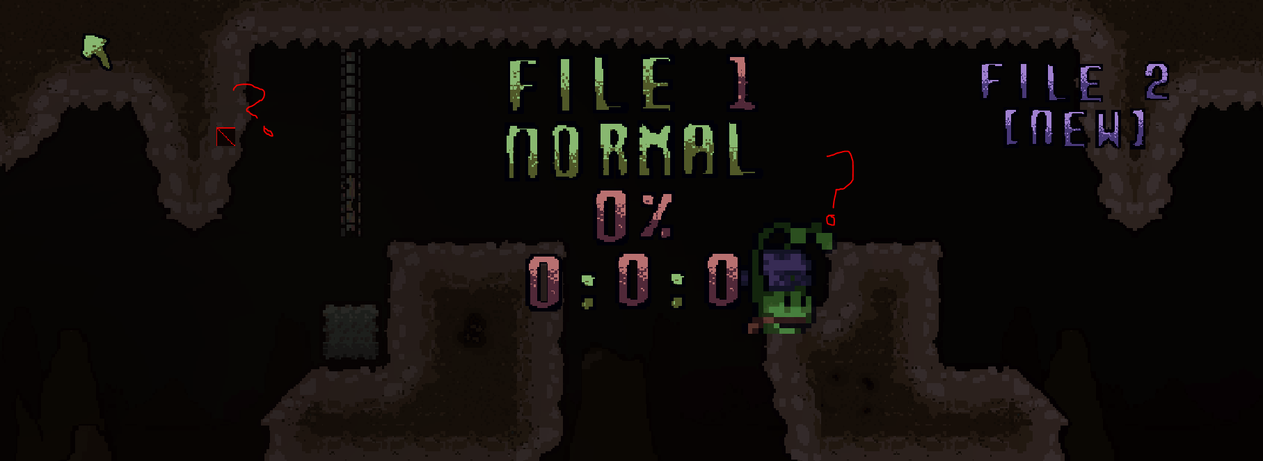
- See image - weird graphical bug on the menu screen?

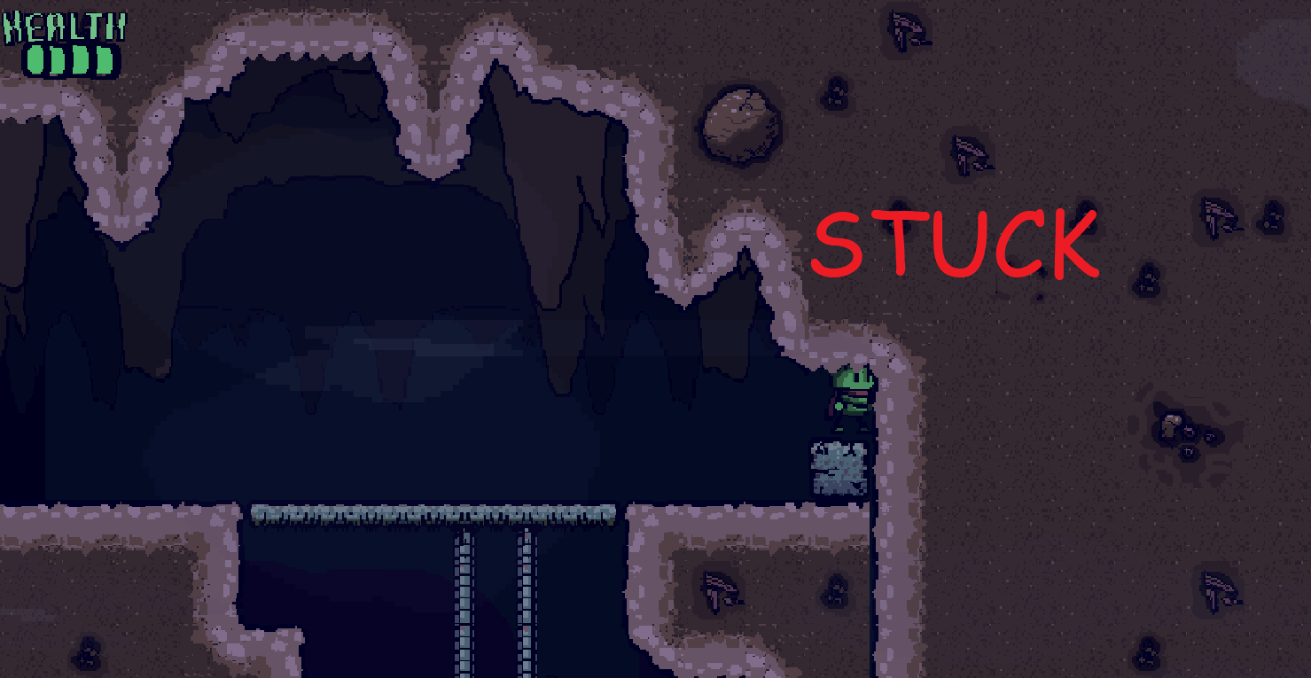
- See image - I got stuck in the first screen, on top of the blue block in the north-west-most corner.


