According to all known laws of aviation
Impeccable spritework and heartwarming attention to detail in the iyashikei-as-a-videogame vein pioneered by P.A.T. (this one features toads too!). I'd like to commend the sound design here; the SFX selection in the game hits all the right spots. My favorites are the sounds of the small flowers filling up the score gauge at the end of the level (the sound the wilted flowers make when there are a lot of them is even better, but you have to sacrifice a perfect run on a given stage just to hear it), the clinking glass, and the spiders being hit and scuttling about. As much of a standout as the art.
Game plays like a not evil version of Flappy Bird. The twist is that crashing against the game scenery is actually the goal this time. Along the way, elements that alter or hinder your flight abilities are introduced and due to this, certain parts of the game feel like graceful puzzle sections. Wind levels are kino; my personal favorite was Stage 13. I thought thorn levels were sadistic until glass panes were introduced. It's exactly the kind of game that grips you by making you wonder what the next mechanics will look and behave like.
Just a few things I wish were there:
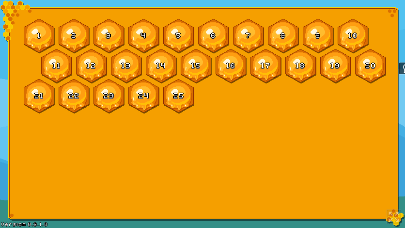
- a button to "lock" the big flower (temporarily prevent interaction)? This may seem trivial in small or linear stages, but would prevent some frustration when you're exposed to the flower all the time in "open-world" stages like 16, or in the ones that require frustrating maneuvers, like 20 and 25. I understand, this is something that directly affects game difficulty. It's probably part of your vision anyway. It's just that -- touching the flower is currently the only way to get a game over, that is, if you're going for the 100% but end up inadvertently finishing the stage beforehand. Well, I wouldn't even bring this up if the game wasn't marketed as chill-out media.
- show the stage number when a level starts? It has to be an intentional part of the aesthetic that there are no numbers on-screen except on the stage select menu, eh? I don't think showing the stage number real quick would compromise it, though.
"Yes, there are two paths you can go by"
Re: "Question of the day". If you wish to keep things peak comfy, leave it like they are now. Getting hurt already takes control from the player in a game in which you have limited control over the main character, so I believe it's punishment enough. A downside I see is that you might need a larger amount of content (with decently spaced additions along the way) if the player cannot die. If you went the Nintendo Hard way, giving the character a traditional health system, you could get away with less stages, at the cost of the completely chill experience. Only you can make this call, but I actually think that Bumbly Bee would stand out more by leaving us with infinite hits; I'm biased towards it. A certain hit game released last year doesn't even feature player health or lives. Seems to be a trend the market will follow.
Fun fact: on stage 5, I bumped at a certain point on the level where there were a bunch of spiders nesting around a token. My screen went red. I thought that hitting the spiders enough times did that but it turns out I had actually double-clicked outside of the game frame (I was clicking frantically to break through the tangle of spiders) and accidentally selected the area (selected elements are highlighted by red on that page).
Download version when?
Playthrough: 100%. ~1 hour (about 45 minutes spent on stages 1-24; like 15 minutes to clear stage 25 alone).

