The game looks fascinating. I like the interactive story concept, which is also very close to my heart.
I didn’t progress far, though, mainly because of two reasons:
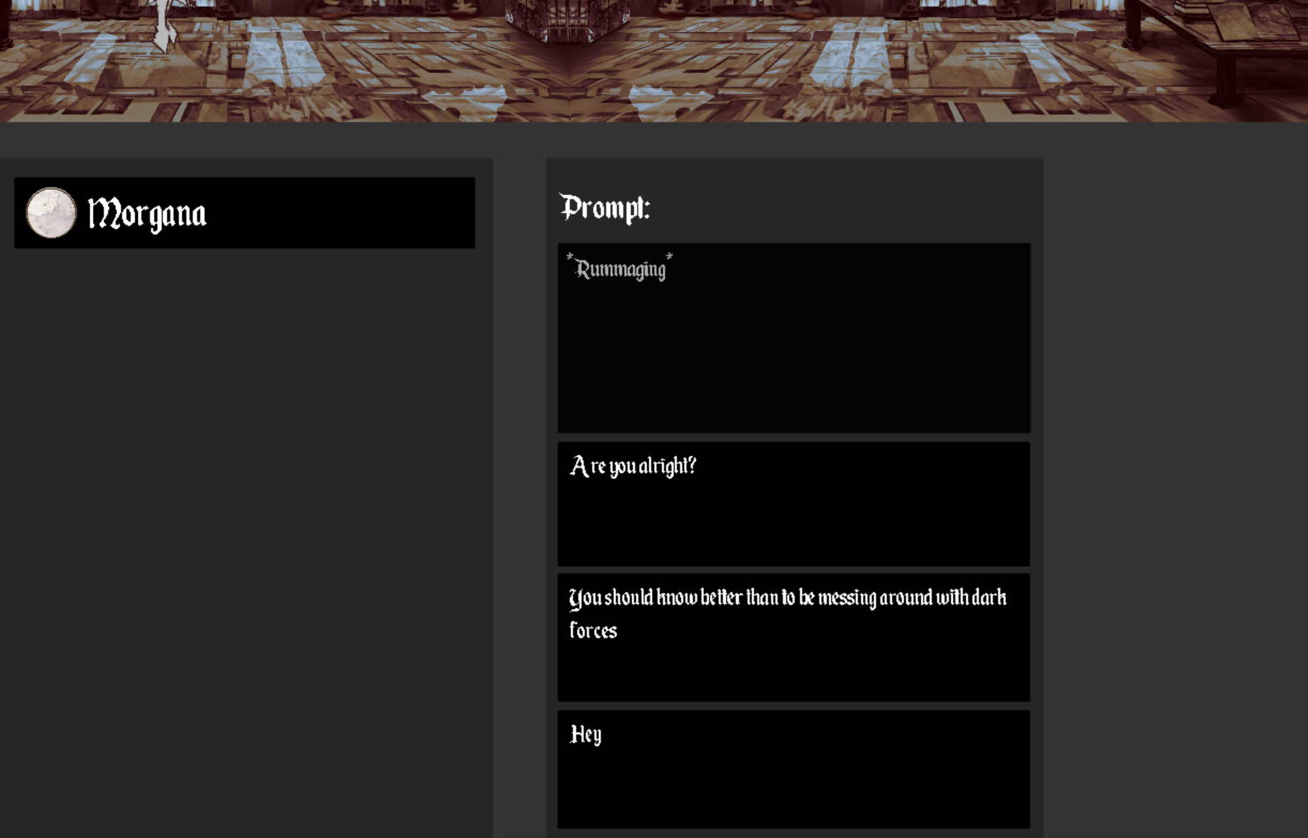
- The font was extremely small for my eyes.
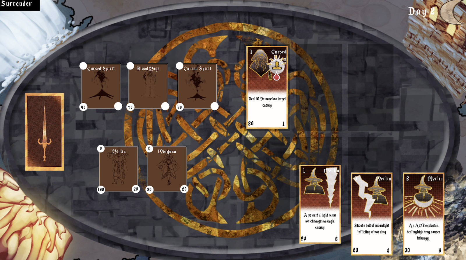
- The combat buged out for me. Or maybe I didn’t understand how it works.

Sorry, I can’t read this text on a retina laptop.
I suggest you change the font to a more readable one because the main purpose is to convey the information and then to be beautiful. Please also allocate more space for the text in general because reading it is the single important action in the game.
 There is no need to have only a tiny dialog window while the rest of the screen is unused. When I’m in dialog, I would prefer to interact with text mostly, and the rest of content becomes of a secondary importance.

