On Sale: GamesAssetsToolsTabletopComics
Indie game storeFree gamesFun gamesHorror games
Game developmentAssetsComics
SalesBundles
Jobs
TagsGame Engines

2bitcrook

44
Posts
150
Followers
61
Following
A member registered Mar 13, 2023 · View creator page →

Creator of

Recent community posts

No problemo, thanks again for making the achievements!

It's been super cool to see the average playtime for the game, I had  originally seen the game as a 30-45 minute experience, an hour tops (hence the joke at the end haha) and it's been so cool to see that actually be the playtime!

(Also funny to see the people who speed through  it for the cheevos, 4 minute speedruns abound haha). 

Oh how silly of me, I actually just remembered a secret to do with  Lobster Cops portrait :D. That's one that could be fun for the wonderful retro achievements you made! 

Thanks! For the name Minus 1 / -1 works, I actually couldn't decide on which one so it really is a mystery in a way. 

There is a secret in there, something to do with the main menu but I won't give it all away....😉

Aw  yay! Was hoping people would download it and play it on a handheld, great choice! 

Just a still image. 

The jam actually isn't about making a game of any sort, it's about making a single 160x144 picture scene with 192 unique 8x8 tiles or lower, so no programming is required! 

Eyyyy wonderful! Also saw you used the guts frame for Morticians Macabre. So glad you're getting multiple uses out of the frames :D. 

Thank you!

Glad to get a thumbs up from your eyes! (that's a sentence!)

Well it did help that most of the posing was done for me, but if you keep at it you'll get better. Hands can be daunting but if you keep drawing them, you'll get the muscle memory built in. 

Thank you! And I've had a similar experience! I still have an older laptop running vista and one thing I made sure to save from it were two AMVs :D. 

I did think about getting a cover of "There she goes" to accompany it after the jam! :D 

Thanks! I only realised after the fact this was a double whammy of a love letter to the GBC Cardcaptor Sakura games which have such wonderful pixel work. :D. 

Ah coconut doggy~ 

Wonderful entry, that will be one chill capybara! Love the double thick linework, always a fan when its used due to how literally and figuratively bold it is! Great job on making it fit within the limitations. 

Very striking and moody, love that you reserved all 4 colours for the head piece and went full 1bit for the body/chest. Some artists would be tempted to highlight the chest just a little, maybe even adding a little bit to the buttons but I believe forgoing this resulted in such a strong composition.

Truly puts the focus on the middle of the canvas, coupled with the wonderful lighting on the tendrils from the glowing core. Phenomenal. 

Love the concept and angle you chose, essentially doubling the viewing space able to draw in the scene (due to the helmet being reflective)

Also a double win for having a starry background since empty space can be filled with repeating star pattern, and again inside the helmet. Very creative!

Super cute entry that really feels like it would be in a zelda-like where you find a stick as a key item/or even weapon. 

Love the extra thick cartoony linework, really makes the character pop against the background and nice usage of dithering. 

Great composition, especially with the corally foreground. 
Love you utilised palette shifting the line art for the see through dress fabric, it never fails. 

I think if potentially you could have saved a few extra tiles some extra bubbles/far off seaweed or fish could have really made this scene even more outstanding. 

Absolutely masterful effect with that fish-eye lens.

I can't think of anything else to even say, just top tier pixel work, composition and usage of tiles (with tiles to spare to boot!) 

Great job and smart choice to fill in the background with a starry sky. You only need a few star patterns and voila! 

Love the really stylised magical swirls coming from the cauldron, adds a lot of whimsy to the piece.

Slightly left field/tangent, I can actually imagine this being a label for some form of candle wax melt or oil. Bewitching Brew :D. Or I guess that makes it sound like a drink haha. 

Phwoar! What a wonderful composition and perspective. Love the design, reminiscent of Jane's dad in Tarzan or Sabreman from Sabrewulf.

It's funny how cemented certain types of characters are in media.

And great job on those hands! 

Eyyy thought I recognised that background, so glad to see it put to good use!

Love the final piece and that you went with double thick cartoony/comic lines. I'm always a sucker (fitting because of lollipops!) for that style of linework. 

If I had to choose a favourite pallette it's a tough tie between the double orange or purple and orange!...Let's go with double orange, it's just so autumnal/halloweeny :D. 

Absolutely head of over heels in love with the double thick linework, super charming. Makes me think of comic book inking with the line weight.

One area that could potentially make this pop more is a completely pitch night sky or having the sky be the brightest colour. 

Also love the perspective with the foreground, peering through trees, such wonderful composition. 

Such a wonderful use of predominantly black tiles that results in the white and light green absolutely popping wonderfully in contrast. 

Unsure if you have drew any inspiration from Amiga pixel art (or have any experience in it) but your piece really evokes that style. 

Love the perspective you went with, really dynamic!

You really crammed in a lot of detail into the piece and I adore the fact you still reserved some tiles for the character in the far off background! 

Haha yes, I thought the same about the old Youtube UI, thank the stars for 4:3 being the GB ratio as well. (Makes me think the GBA and modern Youtube are more 16:9 hmmmm? :D) 

And thank you! It was a lot of fun, looking forward to next years. It's an absolute solid jam concept due to not being able to rely on sprites/it's pure BG so your tile work as to be on point. It's also great due to it's very feasible in the time limit too. I'll bang on that old drum, limitation breeds creativity ;D.

Thank you! I went through a similar experience too, so many new anime and new songs discovered thanks to AMVs :D. 

Great job at filling in the entire canvas, it's such a challenge to fill all 360 tiles with a 192 tile pool (or in your case pond/lake ;D) to draw from.

My favourite part has to be the cat sprite, love you only uses black and dark green for it, it really makes it pop and stand out. 

Great job with the shading and light source! That extra detail on the hair and shock emote/spiky reaction symbol is also a wonderful addition! 

Thanks! Was a tricky process getting it to 192 since can't use sprites for anything, but was a real good challenge that meant I couldn't lean on that as an easy out :D. 

Such a clever play on the theme as a whole and being a GB dev as a whole! 

I love that because of the nature of tilesets you've absolutely crammed the canvas with so many varied tiles one can use, and then you've wielded them to paint just enough to leave room for more. 

Truly sometimes it can feel 192 is too little, but sometimes you realise it can also be so much space if you know where to put them. 

And I love that sneaky 192 tile at the bottom right, an entire tile just to show you had one left ;D. 

I can just imagine this as a cutscene in a game, the next scene is holding the voxel, then using GB studio's Camera Shake event until seeing the next screen is a huge voxel boulder heading our way! 

Also you know it has to be said, great job on those hands. 

That dog sprite is stellar, and I love you knew to give it a white leash to make it really pop/stand out against the dog and background.

Like Bad Dad said, looks like an intro scene from a game! 

Nautically awesome! Love the fade to 1bit with the ships mast.

Glad you like them! Tried to throw in some gothicy/spooky/squelchy ones like you suggested :D. 

Thank you! I do indeed plan to do some more!

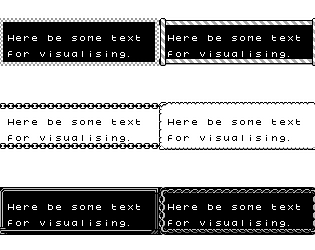
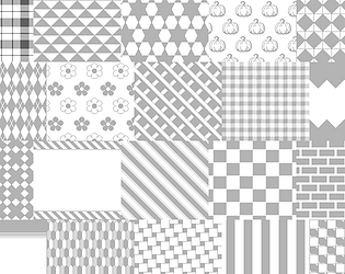
Current plan is to do more backgrounds for my background asset pack and then I'll be doing some more frames.

If you have any suggestions let me know =]. 

Disturbing lack of Leon popping some sweet ollies and kickflips in this update but I do enjoy that radioactive ooze. 

It's all designed for the gameboy so it's based on a 160x144 pixel resolution. Enlarging pixel art as a whole doesn't really work, you can really only scale it by wholes, like x2, x4, x8, x16. Depending on your art program you should have the ability to do that.

Vector? Oh no sorry this is all pixel perfect/done in mspaint. There's literally nothing more to it than that, sorry!

Sorry not quite sure I follow, source file? You can find every frame on the .png download. With that you can just resize/copy parts to make bigger scenes and change the colours.