On Sale: GamesAssetsToolsTabletopComics
Indie game storeFree gamesFun gamesHorror games
Game developmentAssetsComics
SalesBundles
Jobs
TagsGame Engines

A Friendly Irin

125
Posts
17
Topics
27
Followers
4
Following
A member registered Oct 30, 2019 · View creator page →

Creator of

Recent community posts

Amethyst is generally considered the hardest dungeon, so I would actually recommend getting Pearl or Bismuth first. Otherwise yes, Peridot is recommended first since she's a useful support character.

ESA is a very straightforward Metroidvania. The only "puzzle" aspects are in the endgame. For La-Mulana, its puzzles are largely disconnected from its ability/item upgrades, so they don't have this problem.

Okay, I have a hypothesis for why that's happening and I'll try to fix it tomorrow.

Where, exactly? It's hard to fix problems unless I know specifically where they are.

(1 edit)

I was not aware that the source code could be obtained here.

What do you mean by "still"? Which options are broken?

KNOWN ISSUE: Audio looping is janky. Because the HD remaster is made in Unity, it is easy to examine the music assets with asset extractor software, but I cannot find their loop point data anywhere. If anyone knows how to find it, please tell me!

Oh nice! The lack of elemental affinity feedback was something that bothered me.

Okay, made it to the purple area, but I can't figure out how to progress. Got a few coins, but I can't figure out how to go beyond the teleporter or above the central column.

I feel this would be better as a linear puzzle game instead of a Metroidvania. I discussed this when I reviewed Antichamber, a game that did a similar thing: A Metroidvania is based around seeing a barrier and recognizing you can't pass it until later, but puzzle games, by their nature, obscure whether you lack a necessary upgrade or just aren't smart enough to figure out the puzzle; the question of whether you can pass the barrier isn't obvious. This potentially leads players to ignore solvable puzzles because they think they lack the means to solve it while futilely bashing their head against a puzzle that is impossible.

The only "Puzzle Metroidvania" I've seen successfully pull this off is Toki Tori 2, which did it by having no formal Metroidvania upgrades or hard barriers; the only barrier to going off the beaten path is your ignorance of the puzzle mechanics. But if you're replaying the game or are very clever, you can sequence break anywhere you like.

I'm stuck after getting the first upgrade (legs). I can't figure out how to get to the destination on the map. The red section is blocked and I can't progress any further right than the screen where you get the legs. Is there something I'm missing about the legs that would allow me to walk through a one-tile-high space?

By manually setting my computer's resolution to 1280x720.


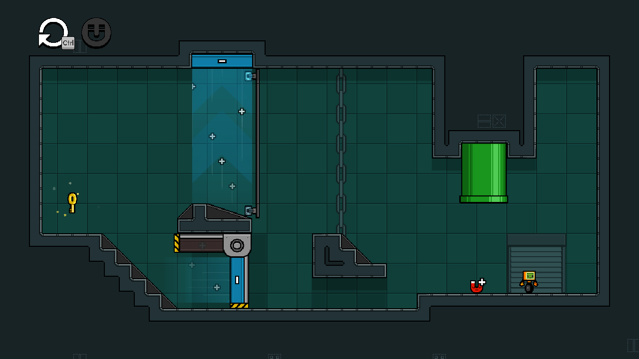
The first level looks like this on 1280x720. This is how it's supposed to look: Everything is visible and well-proportioned.

This is how it looks on my default resolution of 1280x1024. As you can see, the edges of the level are cut off. I can still interact with things in the edges, but I can't see them.

Auto-pickup is an interesting idea, but I'm not sure how it would work when you drop the magnet. I didn't have any trouble with the controls, but I played with a controller.

Mark actually wanted the game to be an action platformer like you describe at first, but found that all the levels he made ended up being puzzles, so he decided to focus on that. Maybe he could revisit the idea later when he has more experience?

Finally found a workaround for my resolution problem and finished the 2.0 demo. I liked it a lot, definitely a big improvement over the first demo! My only potential complaint is that the puzzles felt very easy -- I solved all of them in only a few minutes, much faster than the ones in 1.0. Still, that's probably okay for introductory levels.

Unfortunately, I'm running into graphical problems with V2.0. I have a nonstandard monitor resolution (1280x1024), which cuts off the edges of the screen. If you could add a way to adjust resolution, that would be handy.

I've only done one puzzle so far (the rightmost one) but I think V2.0 is a big improvement! Movement is much more fluid and I love how bouncy and expressive the character is, especially giving the magnet a face. I also think that throwing the magnet into the pipes to open doors is really neat, and helps explain how the magnet travels with you.

One thing is that I find the level reset a little clunky. It only draws a black bar across the middle of the screen, rather than the whole window. At first I thought it was opening a menu. (This might be due to the aforementioned resolution issue, I'm not sure.)

(3 edits)

Very neat. I like how many different strategies are possible with all the items, but I feel there's not enough incentive to use the more complex ones. My first run I just used regular weapons and stacked a ton of bonuses on my Brutal Spear, and won on my first try. I've since tried archery and magic builds, but I always end up dying to one of the early bosses. (Incidentally, the badger boss' rising power is really brutal for a first boss. If you can't wipe him out fast, you're doomed.)

I think the main issue with archery is that it requires you to get a lot of the exact right items in a short timespan; arrows and bows are useless without each other, and arrows are rarely superior to melee weapons unless you have multiple. It takes a really long time before an archery build becomes viable, during which you have to carry a ton of dead weight. The archery kit event helps, but of course that's random. Maybe there could be some weighting to random drops to increase the chance of getting arrows if you already have a bow and vice versa?

I feel the game also has the same issue as a lot of RPGs, which is that battles are won before they begin -- strategy matters far more than tactics. Because enemy attack patterns are so simple, you can almost always win by doing the same thing each turn. I think that more mid-battle backpack manipulation would help with this; the curse enemies are a good start, but maybe they could reorganize our items as well? I also feel like reorganizing shouldn't take an entire turn of combat, as it's basically never worth three weapon attacks.

This was really cool, especially for a Ludum Dare game, but DANG it was hard as nails. There's so little room for error. I think it might have been better if enemies dropped letters only one at a time -- there were a lot of times when enemies just dropped all their letters into one column, which is way more dangerous than spreading them out. I overall felt like my human reaction times and mouse speed just weren't up to the task. Maybe if there was a text-to-speech protocol that let you call out words? Not sure what kind of software you'd need for that, though.

One thing I really liked is that you provided actual temptation for the violent option. I started off trying to be nice, but I was quickly forced to pick conflict because it's so much easier. A lot of morality games make the good and bad options equally effective or difficult, which completely defeats the point, in my opinion. It should be hard to be good in the face of conflict, and easy to give into temptation.

I've been a big fan of your YouTube series, and I'm very glad to see you making your own game!

I don't think I have much to add that wasn't covered in your postmortem video; I agree with most of the feedback. I was particularly bothered by the magnet not being solid when it was on the floor. One thing you didn't mention that bothered me a little is that touching a door automatically forwards you to the next level instead of requiring a button press. I'm just primed to think I have to make characters walk through doors, I guess.

The awkward fusion of action and puzzling was definitely a problem for me. That is something that bothers me a lot in puzzle games, as it's frustrating to not know whether I'm executing the process wrong or if my setup is wrong. I think part of this may also have been the issue with the character controls; I like platform characters that are fast and fluid, with low friction and high acceleration, but this character was very slow and cumbersome, so movement wasn't as fun.

My favorite levels were... uh, I don't remember the names (it might be a good idea to clearly display level names when they start, since it makes it easier for players to give feedback), but the one with the three magnets that could lift the magnet but not the character, and the final one with the moving plug over the spike pit. I found the solutions quite a clever use of the game mechanics.

I did run into an odd bug in the room with the two horizontal lasers, where I threw the magnet above the lower laser when it was in its lower position, and it landed on top of the laser, as if it were solid. Moving the laser eventually made it behave correctly, but that was strange.

(1 edit)

Interesting. Turning elements into literal rock/paper/scissors amused me.

I found it way too easy to complete, though. It only took me two runs to get the true ending, which doesn't really convey Sif's soul-crushing hopelessness. When it's actually really easy to change things, it undercuts the narrative that Sif hasn't been able to change anything. If nothing else, I would expect them to just start doing things at random in desperation; that's usually what happens in time loop stories. (It's also a bit of a pet peeve of mine to have the unblockable attack do 9999 damage; it's just so obviously artificial. I don't know if it's possible in RPG Maker, but it would have been cooler if it just sent you to the game over sequence without any visible damage.)

Even given the theme of repetition, I still found the encounters too tedious, as they always are in jRPGs. I think it would be enough to make us fight the same encounters loop to loop without also making us repeat encounters within each loop.

The worldbuilding implied by the conversations is quite interesting, and the art is very nice, so I'll be interested when you complete the sequel!

(I have to say though, $12 for a game this short is a bit pricey.)

(1 edit)

Ooh, a new demo! I played the game a while ago, so new content is exciting.

I'm noticing that when the screen darkens, it doesn't go completely black (on the Steam version at least) -- I can still see the scene faintly.

One thing I would like to note: When "mom" or "dad" is used in place of a name (such as "dad's letter"), it's capitalized like a name.

Traversing the pipes in the sewer feels a bit like an Escher painting -- the pipes connect to different levels of elevation without visibly sloping. If it were possible to tweak the graphics to show the pipes sloping up and down, that would add to the environment.

Lance says "Some say [Sava] is as big as a horse", but how would mice even know what a horse is? If humans are so incomprehensibly huge as to be "gods", a horse would be even more eldritch. I don't know, it might make more sense for Lance to compare him to an animal that's more proportional to a mouse? A horse is pretty huge even by our standards.

Ooh, a skill tree! Curious that Lance has so many. I'm now wondering if he's going to come back later, or if his huge tree is just misdirection.

I always thought it was quite foolish of Lance to not cut Verm free in the first place. He says the traps snap your neck, so Verm's tail is clearly already broken; it'd probably have to be amputated even if they could get it free.

I feel there's something lacking to cutting away from the Tiger battle to have Verm get defeated offscreen. If possible, it would be neat to see something like in the Yellow God battle, and have Verm get reduced to 0 HP by a special attack, so we're left on more of a cliffhanger before cutting away.

LOL, stealing bandages from a child in Cranbaile. It's a real RPG now!

After meeting with Gilda, Verm says "you have one exactly minute" -- typo, I presume?

After all the buildup, I'm surprised to see that Verm's regular attacks are almost as good against Tiger as Siobhan's Wyrmfire. I expected something like a defense debuff after the mention that the moles' weapons couldn't pierce Tiger's fur.

It seems a bit silly that you can walk right back and chat with Gilda after she banishes you.

I like that Verm has a bark every time he enters rage! I always find it silly when RPGs have emotion-based status effects but that's not reflected by the characters.

Since Bruce can't attack, it might make more sense to rename the "Attack" option to something else. It amuses me that Bruce wasn't lying about not fighting!

The new demo is really neat! I like that you're streamlining the RPG experience by cutting out cruft like grinding and random encounters. I've long thought that RPGs would be improved by focusing on making every battle a unique set piece, so it'll be neat to see how that works out.

Do you have a timeline on when we can expect the full release?

Very atmospheric. I would have preferred if Inscryption was entirely this, to be honest.

Why does the dude offering help with the desert temple disappear after you find it?

I can't figure out how to beat the Keeper of the desert temple. Is there some sort of trick to it, or do I just need more levels? (I'm level 26.)

(1 edit)

The game won't start on my Windows 10 PC, for some reason. The game window appears, but it just displays a black screen and says it's not responding.

I use a 64-bit machine and the RGSS player says it's 32-bit. Could that have something to do with it?

ETA: It works after restarting my computer, so it's likely a problem on my end.

I'm curious if anyone has a YouTube compilation for what happens when you taze various characters?

(1 edit)

I'm experiencing an odd issue on Windows 10. After I start up the game and then close it, I can't seem to restart the game without restarting my computer. ROM appears in the processes list of task manager and even takes up some memory, but the game does not launch.

ETA: The problem was apparently due to a faulty driver on my end.

The issue with that is that the button for "use tool" is the same regardless of what tool you're using. So all the welder, cleaner, and wrench jobs would look the same.

Yahtzee is working on sound effects as they come. He only added them right before the public release, I believe. If there are missing sounds, he's probably working on them, but he also encourages players to point out specific things they think should have sound.

There's no music at the moment. Yahtzee is planning to hire a composer in the future.

(1 edit)

I'm not normally that into life sims, but I enjoyed your dev diary series so I figured I'd give this a try.

I think my biggest issue so far is that you can't talk to any of the NPCs. I kept pressing the interact button on reflex to talk to shopkeepers and the like, and was disappointed when nothing happened. It makes the NPCs feel like cardboard cutouts rather than people. The dialogue in the story scenes was really great, so I'd love to see more of it.

The other thing is that the game kinda has the roguelike problem of every area feeling samey. Inhabited and uninhabited planets each look basically the same to one another. Since the main draw of the game is the environments and inhabitants, I'd like to see more variety there, get to see all the weird alien species and architecture in the galaxy and such.

Minor issues: It wasn't clear to me how the job time limits worked. What constitutes a "cycle"? I think the bars in the lower left correspond to job timers, but that could do with clearer indication. I also wasn't initially clear where the "shipyard" for upgrading the ship was, since that computer is towards the edge of the screen and usually covered up by GUI elements, plus there is another computer terminal at loading docks that I assumed covered everything. Maybe stick both the "expected deliveries" and the upgrade terminal together?

And while I know you want to lock off the story content for the demo, I think it might be nice to at least give us the initial hook. You said in your videos that the protagonist's actions in the tutorial have some relation to the appearance of the cosmic egg and that motivates them to investigate; it would be cool to see what that relation is, as a hook to get demo players interested in the main story. As it is there's not much indication that there is going to be a main story at all.

I liked the personality matrix idea. I agree with your assessment that forcing the player to make dialogue choices for every line is just tedious, and I think this is a great compromise. I think it also adds mystery to the game, in that unlike in a dialogue tree scenario you don't know what all the possible dialogue branches are.

I had no idea the biscuit dispensary wasn't a core feature (since 0.1.8 was my first version), but I think it works great.

This was an interesting idea but it really, really needed a way to move machines around after placing them. I had to remove a conveyor belt after realizing a paint sprayer couldn't fit above it far too many times. I also noticed that you weren't refunded for the cost of a machine if you deconstruct it, which seems unfair.

The game was fun aside from that, but I'm not sure if it has enough to distinguish it from other factory-style games if expanded.

I second this.

This one didn't really grab me. I liked your pitch for it in the dev video, but the actual game feels a bit empty. I don't think it really accomplishes the desired atmosphere of evading a colossal, unknowable monster -- it's too easy to see the wires, that the limbs don't actually attach to anything and are just objects created by the game with predictable attack patterns. (At several points I actually saw the tentacles despawn, which looked quite silly.) I was really spooked by your initial description of a monster so huge you could never see all of it, but that's not really what we got.

A big part of this, I think, is the choice of perspective. You said that video games are uniquely good at horror because of the ability to identify so strongly with the player character, 2D perspectives don't work so well for that. I never felt like I was getting drowned by a sea monster, just that my tool for exploring the game was and how annoying it'd be if I had to restart. (So I guess in that way I empathized more with the artifact? :p) The only times I've been spooked by underwater environments is in first-person games, since that better conveys the sense of disorientation that's crucial to underwater horror. Here, that's not the case -- movement isn't terribly different from movement on the surface, and you're never confused about which way is up. (Might have been clever to keep the avatar constant and move the screen around them instead?)

The other part is that I, personally, am not very frightened by monsters. Monsters aren't real, you see. Existential horror scars me deep in my soul, but as soon as you plop an impossible monster in front of me, I become more interested in its biology and design than how scary it is.

The real horror in "The Life of Erich Zann" was, to me, the slow inevitability of your failure and the callousness of the people around you to your struggle, combined with the possibility that maybe you're just crazy (or becoming crazy) and none of this is what we think it is. It's unknowable, uncertain. Here? Oh, it's a black tentacle. I should probably avoid that. Oh no, it grabbed me. Can I escape by pressing up? Yes, I can. Great, I'll just keep doing that in the future, threat solved. I would undoubtedly be freaked if this happened to the real me, but a game is too abstract. I don't feel any sense of danger or mortality.

P.S. I don't know if someone's showed this to you already, but it sounds like the Magnus Archives episode "Adrift" might speak to you. (The Magnus Archives is, in general, a series I highly recommend if you are interested in horror.)

This one genuinely stressed me out while playing it, so good job I guess? :p

(2 edits)

Like BRTV, I liked the idea of this one but felt it needed a lot more development. The need to scroll through all the objects was really annoying, especially because the interface glitches out if it gets too long. The game also felt too short -- I had a bit of a "Wait, it's already over?" moment when I beat the final mission.

The game felt a little too easy in general. I expected there to be some sort of limit on how often you could distract guards with laptops and cellphone hacking, but it's trivial to keep them constantly occupied. Similarly, cameras are trivially easy to hack -- I think I only got caught the first time I encountered one. (I also completely forgot that monitoring doors made them impassable to guards -- some way to review your abilities and what each object does wouldn't go amiss, I think.) There also wasn't any real penalty for failure, since you don't have any kind of ticking timer or drain on your money in the tertiary loop, and if Trilby subdues a guard you can explore the rest of the level with complete impunity. The game definitely needs more threats, like maybe a constant reinforcement of guards or a timer for the whole mission.

I also thought the minigames were a bit too random, or specifically the type of minigame you got was too random. They all take very different lengths of time to resolve, and obviously the ones that require you to type with specific sectors are harder than the ones that are totally random.

Still, I liked the core concept. The framing story was neat, Casey's social awkwardness was #relatable, and it was really cool to get something focused on the nerdy support character over the typical action hero. And I did find the typing minigames very fun despite your worry that they couldn't hold the game -- I was impressed by how many twists you were able to make on the concept to keep them from feeling too samey. I agree with your idea that the game could benefit from swapping to different character modes, especially since as it is Trilby does so little. I'd be interested if you planned to develop this further.

P.S. I'm sure a million people have told you this already, but Hacknet and Beglitched sound like games at least tangentially related to the concepts here. Add them to your compost pile of ideas, maybe.

I didn't like this one as much as everyone else, it seems. It was a funny concept, but the actual gameplay felt a bit too slow and tedious to me. The problem you mentioned of having to redo the cleaning phase every time you fail is definitely real.

Mostly I think I'm just not that into speedrunning.

This was one of my favorites. I was initially dubious of the mechanics, but once I got the hang of them (and figured out the quick turn button) I got really into it. I'm not normally that into these sorts of top-down shooters, but the gun kata element gave it just the right amount of depth -- there's an element of puzzle-solving and not just shooting, since you need to take a moment to line up the correct shots. The framing story was also quite funny, and I loved the pig noises on game over, since pigs are adorable.

The hardest level for me was level 5 (with the flying pigs). The introduction both of a much faster enemy type and the more limited movement space proved really tough. I agree with your postmortem that the game would have benefitted from larger screen/area sizes.

This was my favorite in the series. The atmosphere was excellent and the gameplay was both unique and engaging. I loved the survival resource-management gameplay, it added a lot of tension. I also liked that running out of stamina didn't prevent you from playing, only moving -- the trembling of Zann's exhausted hands did an excellent job of conveying how screwed you were while still allowing you a little bit of hope.

(Party because of that, I found the stationary enemies much easier than the lines -- I frequently defeated the stationaries without a scratch, but almost always lost some lights to the lines. Maybe they could be balanced by taking more inspiration, or maybe draining stamina for the long draws?)

I agree with your assessment that it doesn't work so well as an arcade-style game. It was frustrating to just suddenly lose progress in the investigation passages because I couldn't pay rent. The rent in general was the biggest hurdle for me; I'd be surprised if anyone survived long enough to recover from a missed payment, since the resource drain is so severe that gimping stamina restoration is effectively a death sentence on its own.

The other thing is that I frequently fell behind in researching the new techniques. Are you supposed to encounter new monsters before learning the notes to counter them, or was I playing wrong? In general, I did find it frustrating to not be able to do anything in those situations -- it's basically random whether the appear often enough for you to survive at that point. I suppose it fits the theme of powerlessness, but it might have been nice to give the player something to do in those situations (and when you run out of inspiration).

One thing I did find a bit of an odd design choice was that some of the monsters could be reasoned out even if you didn't get the corresponding instructions (the eyes, rain, and inverts), while the colored lights did have hard gating. I feel it would have made more sense for it to be all of one or the other.

Overall, the game was very tense and exciting. I always think abstract, imperceptible horrors are much scarier than concrete monsters (as in "Something's in the Sea"), so the nightscape here was nicely creepy. I'd be very interested if you chose to make a full game out of this.

This might have been my least favorite, unfortunately. I like the idea of it, but I think it would be better suited for proper platforming levels rather than a randomly-generated elevator.

This style of constantly sinking platforms is also very stressful and frustrating for me, and one of my least favorite types of platform level. I think the need to keep up with the beat is enough incentive for forward motion, especially if you changed it so that missing the beat killed you.

I'm also not terribly good at platformers or rhythm games, so take everything I said with a grain of salt.

This was one of my less favorite ones in the series, to be honest. It's a great concept, but I think it needs a lot more development to do it justice. There's not actually a whole lot to do since there are far too many contestants to keep track of with the manual controls, and the events are so random anyway.

I think my biggest gripe is that it progresses too quickly. Most of the contestants usually die in the first round, and it's rare that fights extend more than one round. It makes everything extremely volatile, which combined with the randomness makes it very hard to drag things out as you're obviously supposed to.

I think the game would benefit from bigger maps, reducing the shrink rate of the safe zone (maybe not placing one at all in the first round to provide setup time?), and those healing/defensive items you mentioned. I'd also have liked more information on what the stats and various weapons do, even if you can mostly infer them.

A year late, but I just stumbled across your dev diaries and found them quite interesting!

I thought this one was pretty fun. The concept was really funny and the gameplay was sufficiently engaging. I thought it got a bit frustrating towards the end where it's very easy to lose your place in the large levels jumping back and forth to answer call buttons, but I can't think of any concrete ideas to improve it. I might rank it 6/12? Somewhere around there.

I must have forgotten the news that cat astronauts are also making moon bases in real life. Games are abstractions, and real-life logic can't always be assumed to apply. Most games do, in fact, prevent you from losing critical or unique items even if other items can be lost.