Indie game storeFree gamesFun gamesHorror games
Game developmentAssetsComics
SalesBundles
Jobs
TagsGame Engines

armandorusso

16
Posts
8
Followers
10
Following
A member registered May 17, 2020 · View creator page →

Creator of

Recent community posts

Amazing job, this is such a creative game idea that is incorporated so well with the jam theme!

I absolutely love the amount of detail that went into the game. Like for instance if youre a kid, you can't jump as high. And how each color represents each age group very well.

I was a little confused as to what signifies the age getting smaller or bigger. I thought I understood it while playing but at times I wasn't sure I understood. 

Really not much feedback to give, it's a really great game!

(1 edit)

Thanks Jordan! Glad you loved it
You're right, the music does change abruptly. Adding a fade would definitely help.

As for the clutter of things on screen, that is something we will try to fix in the next build. We did notice there is a lot going on when theres a lot of enemies. I think it makes it a lot harder when there are 2 players on screen since there are 2 trails. As well, adding a more visible border outline to the players is something we might do to make it stand out more. We will be reworking the bee trail system too, so during that time we will make sure to solve that issue.

For the HP indicator, that is something that will be fixed next build as well. Initially, the bee indicator was supposed to have animations tied to it but due to time constraints we didn't add it in. We wanted to add that alongside some color indicators on it to make it more obvious.

Thanks for playing! :)

Glad to hear you guys will continue working on it! I missed out some words in my initial comment, but great job on the art! Loved the atmosphere you guys were going for!

If you don't want to modify the levels too much, then I would say lengthen the string. Or, if you want to make the level design process easier, then making the string longer isn't a bad idea either.

The coyote time was very valuable indeed!

Glad to hear you guys are continuing development! I did enjoy playing it despite all of the feedback. Like I said I do see potential in the game! :) I am excited to play it after the touch ups. Also I was typing too fast so I missed some words in my initial comment, but the art and sound design was really nice! Especially the sound, it fit the mood very well considering a lot of the gameplay is puzzle based

(2 edits)

I see the potential in the game mechanics, however I found the levels pretty difficult and the string mechanic to be a bit frustrating to use because it wasn't dragging along the characters the way I expected it to.

Especially the first level, I find it a bit too difficult for a first level. A lot of the jumps in the first level make you rely on coyote time for the cat character which imo shouldn't be a thing in the first level. The first level should be introducing you to the basics of the movement and the mechanics. While you did do that, I think it shouldn't be this difficult. Also, in the first level after you pass the first 2 switches, you can get stuck if the bunny make the jump (unless you do a double jump and hug the wall to touch the edge tile so it resets your jump).

Also, a lot of the buttons were located at pretty frustrating places (Beginning of second level for example). It felt as though you really had to be precise with the placement of each character so you can activate both buttons at the same time. You should give some leeway.

I do really love the ideas you had for some of the levels (level 3 especially), but I think you should tone down the difficulty a little bit.

The art and sound design is really awesome I really enjoyed looking at each level!

Otherwise, I really like the gameplay idea and I do see the potential in it with some tweaking to the difficulty, string physics, and movement. Great job!!

(1 edit)

Nice! Just played it. The background scroll speed is fixed.
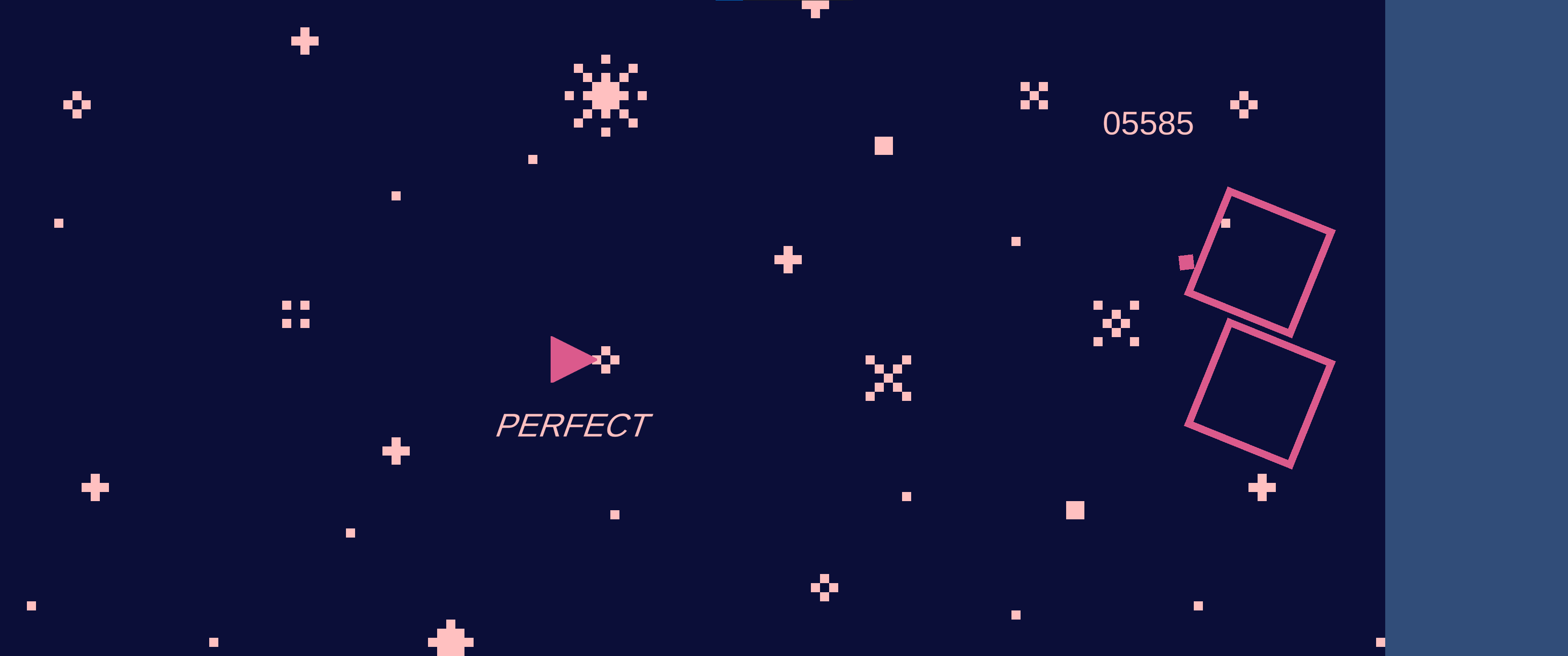
The aspect ratio is a lot better now (I can still see the blue bar at times but a lot less now), but I am not able to see the timing bar at the top left at all (see image).
Maybe you can enforce a resolution? There's a way to do this in Unity (either through code or in the build settings)

Forgot to mention this in my review, but when I was playing the game, the background was moving insanely quickly, it was hurting my eyes a little. You might need to multiply by Time.deltatime to fix it.
Also, I was playing an ultra wide and I was able to see the background cutoff while it was moving.
Again, great game, loved it otherwise!

Thanks for playing! Sorry that there is only a coop mode. We are planning on releasing a version with both 1p and 2p modes.

Thanks for letting us know! We did put colliders so that wouldn't happen, but we will look into it.

Thanks for playing and the feedback!

I love rhythm games and this suits my itch! Great job! Love the music as well

Thanks for the feedback! We definitely felt the same! Definitely something to be fixed if we continue to expand the prototype. We also wanted to fix some of the boulder collision as it sometimes doesn't have the expected result

Wow thanks a lot for that, we appreciate it! Haha that is awesome, we will be giving your game a try! :D

Thank you, we appreciate the kind words! We were thinking about A Short Hike and thought how we can reverse the roles of that game and that's how we came up with this! :>

Thank you! We are happy you enjoyed it! Our artist and musician worked hard on it :D

Amazing!

Yeah we figured it would be best if we had that to increase the comedy of the game! :D