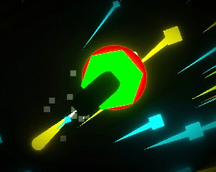
Ohh I see, It makes this a very fast paced game, needs player’s complete attention and skill to score. Great attempt btw. Hope to see you in future projects : )
Arunabh Gupta
Creator of
Recent community posts
Well… the idea seems promising. Adding some power-ups would have been cool. Some things could be improved:
- Better assets for obstacles, collectibles and the player character. A minecraft character could have worked here.
- The restart button doesn’t work. Not to worry these things happen :)
Overall a nice game. I really like the assets used for environment.
Nice concept, students taking on their teachers, all while experiencing their ideal college lives. I like how you can just summon thor’s lightning attack. Also using chain reaction mechanic was quite interesting. The music, too, nailed that vibe of a battle between survival and, well, not surviving.
Few improvements which can be done:
- I want to summon thor’s lightning more than once. I guess it’s just a small bug
- Dying sounds of professors would have added the extra OOMPH to this game.
Very clever idea. Played for 15-20 mins still can’t figure out the how everything is moving 😅. Scene transitions also very smooth. Some things can be improved:
- There is no music or any sound effects. Half of the fun is in the sound effects :)
- Camera movements can be improved.
- Better game assets could have been used
Overall it was definitely an interesting idea
This one’s really good !!!! I like how you added choices to distract the chef. Also getting different responses from different characters everytime you click them makes the interactions more dynamic and the game more engaging. I also liked your art style a lot. My only suggestion is that the sound effects should be changed. Everytime I click on something it feels like a grenade just wen t off in my ears ; )
Overall a great entertaining game.
Really like the artwork done on this one. Car driving mechanic could use some improvement. It’s as if the proctor behind the wheel in the game thought, “Why not add a splash of ‘drink and drive’ to the driving mechanic?”
The map of the campus looks good too, and the font used gives out a quirky feel.


