Indie game storeFree gamesFun gamesHorror games
Game developmentAssetsComics
SalesBundles
Jobs
TagsGame Engines

Band1t

7
Posts
1
Topics
2
Followers
2
Following
A member registered Jul 17, 2018

Recent community posts

Nope.  

I don't know who you are, and you don't know who I am. That's the beauty of the internet.

Oh, sorry for long reply, I haven't been checking my notifications.  

I found it just by sorting by new and made with Godot. Sometimes I do that to give feedback to starting developers, and you were the lucky one.

That's a pretty good game. Especially as a first one. I enjoyed playing it, even though there were some hiccups.

I'd like to share some bugs I've noticed and general improvements:

  • In the tutorial you can get soft locked if you miss a big jump. Can be fixed by adding a path underneath the column to return back.
  • And it's a bit hard to see what is jumpable and what is background. It's best to use a different tile for the platforms.
  • There is a bug/exploit, where if you start the tutorial, then exit it and beat the first level, you get the achievement for beating the tutorial. 
  • In some levels there are enemies who are stuck walking towards a wall, like the Redd in the first level that walks towards a tree. It's probably because they check only for cliffs, and not walls when deciding to turn.
  • In almost every level you can jump over the end flag, and continue on until you fall down and die. Which is not gamebreaking, but a player expects there to be some secret, or a wall preventing them from going.
  • Same with having the Bunny ability active, and being able to jump over the tree at the start, and over the mountain at the end on the level. Some secret coins and/or blockers would be nice there.
  • The "yappologist" achievement is not unlocking, even though it shows 100%
  • The balls that the spiders shoot are not destroyed, so you can accidentally step on one and die.
  • At the end, when the scoring is calculated, if you press any button before the final score is shown, it will not be recorded and remain a 0.
  • Also at the end scoring screen, the numbers sometimes have a very large decimal point, like 12.333333333334. This is because of a thing called 'floating point precision' (check here for more info). You can fix it by using snapped function in Godot to limit how many numbers there can be after decimal point.
  • The minigames, while fun, are completely separate from the game itself. It would be nice if they, for example, awarded some coins for playing them. (maybe they do and I'm too much of a noob to get the coins.)

Otherwise the game is pretty fun. I enjoyed playing it, and wish you further success in your game making journey.

Really solid tileset, used it to get the hang of tilemaps in Godot. 

I've noticed a small issue though, there are two tiles (7,3) and (8,3) that are one pixel off from the top.

Солидная игра

Плюсы:

  • плюсы (хыхыхы)
  • Простая "формула" на которой можно построить сложные пазлы.
  • Без критических багов (судя по одному прохождению)
  • Хорошо упакована, начало, конец, лого, история, аудио. Все присутствует и приемлемого качества.
  • Интересная идея
  • История хоть и не очень донесена но достаточно дает мотивации продолжить чтобы узнать что дальше.

Нейтрально

  • Эстетика уникальная но резкая, тяжело смотреть иногда (пример, последний скрин)
  • Лого. Имя так себе но лого интересное
  • Развитие идеи. Понятно что в лимитное время много пазлов не накидать, но 3 маловато (последний не считаю так как там механика не использовалась) (и кстати на момент написания еще день остается, если возможность есть то еще несколько пазлов накидать будет очень хорошо)

Минусы

  • Управление, для fps платформера оно слишком "плавучие" и неконкретное
  • Озвучка. Про качество актерство не важно, но сама длинна диалога слишком долгая. Смысл уже передан а диалог все идет и идет, из за чего еще и наезжает друг на друга если не стоять на месте и выслушивать.
  • Дезориентация. Все выглядит похоже и с телепортацией и появлением платформ легко запутаться куда смотришь.
  • Наказание за использование механики что была научена, без причины кроме как "fuck u, suffer"

After about an hour of playing I can say that it is a strong foundation but lacking in execution, and frankly not fun to play at the current state. 

I'm gonna split my thoughts into 6 categories:
Game design

  • The tutorial is pointless as the first level can wordlessly explain the main concepts, and then additional stuff, like all the different blocks can can be showcased in further levels.
  • Too many similar blocks, creating confusion and is just messy. Either differentiate them better or maybe just remove some.
    • Blue teleport pad and blue block that moves
    • Light blue block that you carry and light-light blue ice block
    • Purple block for red blocks and purple to press as a button
  • Ice block is not fun and is never used in a unique way. Pushing it and hoping it lands on a button just makes the action frustrating, especially when there is no reason for the ice block to be there instead of a regular blue block.
  • Blue block dropping out of your hands when it touches something is not fun, makes traversal with it unnecessary difficult.
  • Walking on the edge of the level is interesting, but not when it's used in every level. That's better left for secrets and easter eggs  instead of the main puzzle solving path.
  • Level 4 ends when there is clearly more to the level. Makes the player want to find some hidden path when there is none.

  • Level 5 is pretty much unbeatable if the right way to do the enemy cube part is to hope that it lands in the right spot to step on it. Especially when it's the first time you have to do it. If you want to use that 'matador' mechanic, then it needs to be introduced in a safe simple way before making the player do it with the risk of falling off.
  • It's better to disable the teleport pad if it's not a part of the puzzle, it gets disorienting when you accidentally step on it and get thrown back.
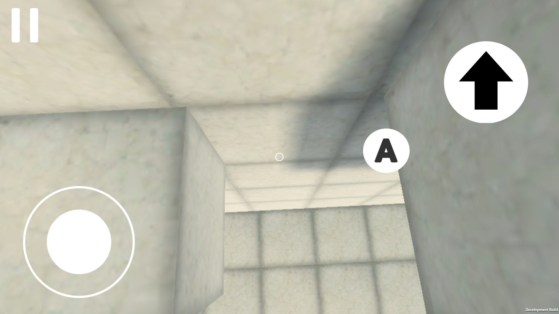
  • There are some gaps where a player can get stuck, like this 1 block gap you can't fall through.

Movement

  • Control is really floaty. There is a noticeable delay between moving the stick and starting to move, same with releasing it. Which makes doing precise jumps really painful
  • First person parkour is difficult, especially on a phone, so having multiple 1 block platforms, and needing to do precise jumps feels awful.
  • Player has a round bottom, so if you stand on the edge you start to slide off.
  • Player is not round, if you stand near a wall and rotate your view you get pushed out. And in some cases you can get through a gap sideways but not forward.

Little things

  • If this is a beta then why is the version number 1.0?
  • English
    • "warning" needs to start with a capital letter
    • "If you find a bug or some flaw, send it to [email], and also describe where and how you found this bug"
    • Also bilingual text implies that the game will be in English too, but after that it's all in Russian
  • It's better to show the music volume as a percentage in the settings.
  • Tutorial text needs better placement, it doesn't look good bunched up in a corner.
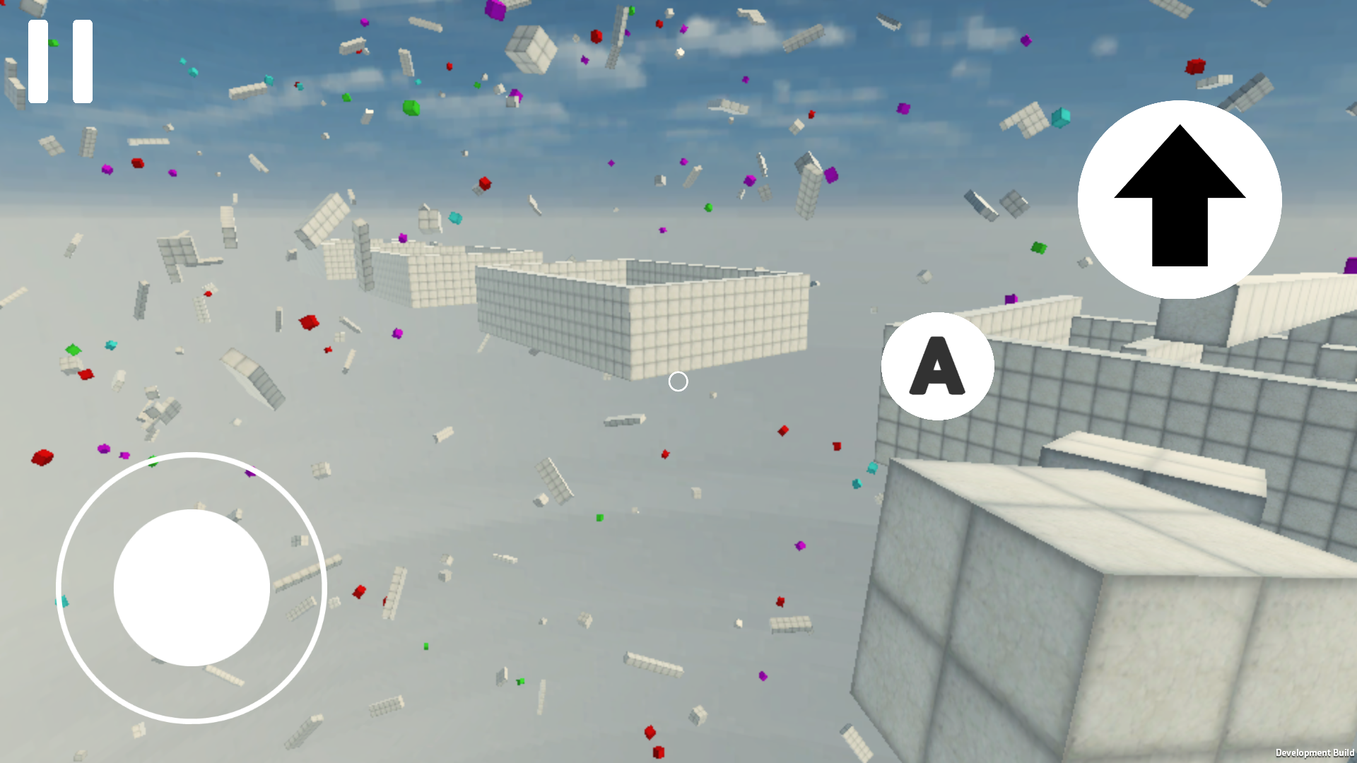
  • In the main game the skybox box is visible.
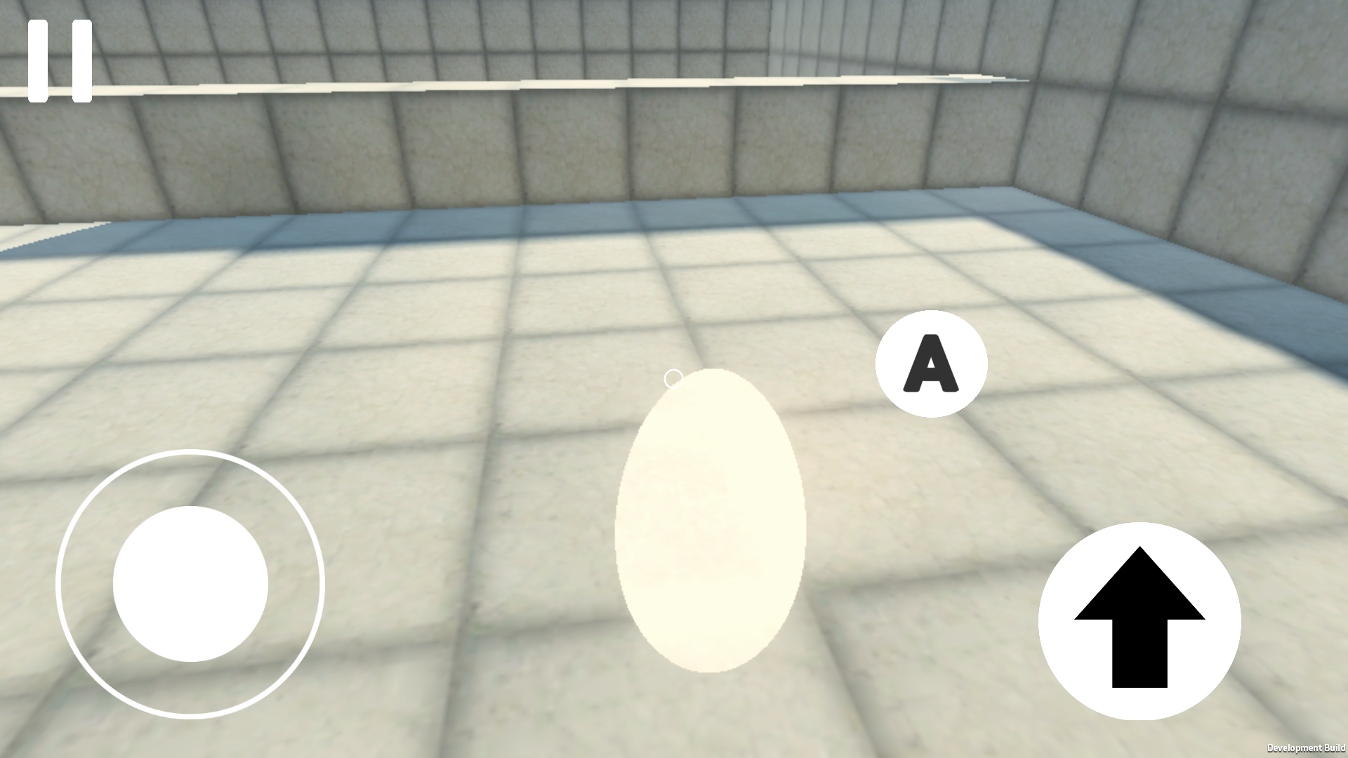
  • The shiny white cube either needs to do something or be less shiny.

  • The goal portal needs to be more noticeable, with the style (maybe like the shiny cube) and during the gameplay so that you know where you need to go.
  • Teleport pad needs more noticeable particles and some effect to cover up the instant teleport

Bugs

  • There is a constant light "shadow" following the player

  • Green block in the tutorial doesn't do anything (and there is an invisible ramp)
  • If you go near a wall with the blue cube and jump you can clip it out of bounds.
  • Skybox blinks black occasionally
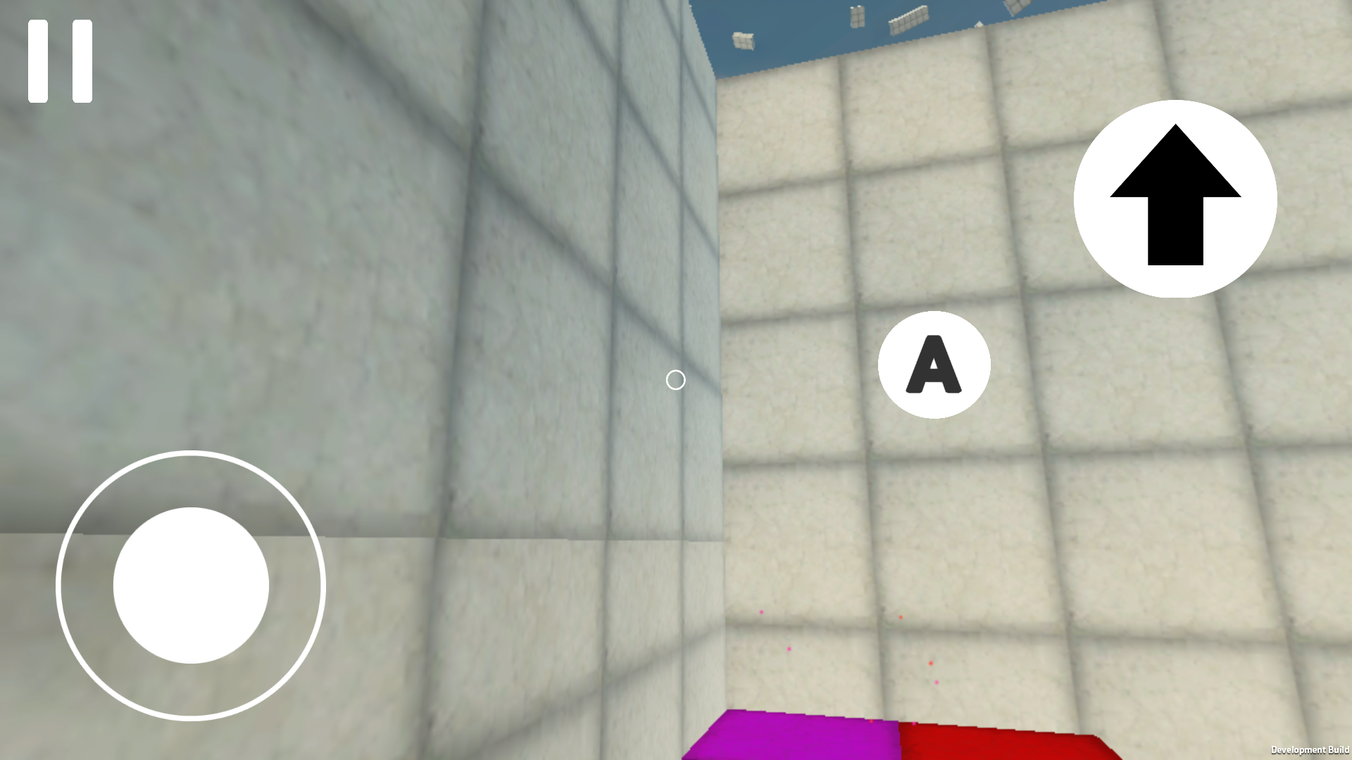
  • Level 3 has a texture misalignment
  • [A] button doesn't reset its color if you look at a colored block and then a regular wall.
  • Jumping over a ledge and going forward makes you stuck on the edge.
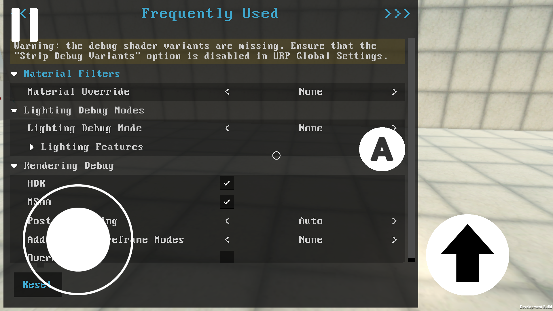
  • You can somehow open up a shader debug menu and it's impossible to close it. (don't know how it happend, it was on level 2) (and turning HDR and MSAA off gave a big boost to performance)

  • Standing on the edge of a button makes it rapidly turn on and off.
  • In the tutorial, the game can freeze if you go near the enemy (not sure, but it froze twice in that area).
  • Slow performance in general. For some reason worse in the tutorial area. Probably related to game logic rather than graphics.

Good stuff

  • Customizing button locations is nice, haven't seen that before.
  • Seeing someone walk on the 4th level was interesting.
  • Green blocks flinging you across the map is fun, but not when they miss and you fall down without being able to do anything
  • The aesthetic is pleasant

Tips

  • It's good to be able to access the settings during the game, without needing to go back to the main menu.
  • Coyote time would make tight jumps more bearable
  • Instead of having the [A] button always on the screen, you can make it so that you tap the intractable cubes instead.
  • A little line, or any indicator to show what the yellow and purple buttons are controlling would be good.
  • Maybe a gyro control for looking
  • I don't know what's the story with the game development, but I assume you don't have the permission to use this name, if you aren't then it's better to change it to avoid any future problems.
  • I recommend checking out this video (and the whole channel in general) and apply it to your design. It should help you make the game more understandable and friendly.

gud game 👍