On Sale: GamesAssetsToolsTabletopComics
Indie game storeFree gamesFun gamesHorror games
Game developmentAssetsComics
SalesBundles
Jobs
TagsGame Engines

cephalopodunk

104
Posts
637
Followers
106
Following
A member registered Feb 17, 2014 · View creator page →

Creator of

Recent community posts

Most of my irritations are around the text/dialog features, and most of them (buttons/editing in play,etc) have already been mentioned.

One additional one though, is that swapping between the plain text and gui views of dialog seems to throw away anything it can't fit into the gui view, which is a good way to lose a lot of work because you made a typo somewhere near the top (while working in text view). Some sort of error message giving you a chance to fix would be a lot better (or 'commenting out' but retaining the bad bits).

Oh, and while the Preview dialog function is great for simple dialog, for complex, nested or dynamic dialog it doesn't seem to behave right? Or I can't work out how it's supposed to behave!

(Honestly - and I know this is new feature territory - but I'd love it if bitsy supported live editing, so you could change text or sprites on the fly)

Oh wow, this is great; what a cool idea!

Wow, this is wonderful. A lovely mix of character and puzzles. Brilliant!

Thank you! That's an amazing compliment!

Oh Poppy this was so so good, and sweet, and nice. I really hoped that other people would start using painted backgrounds for bitsy. It's so wonderful to see Deer's lovely art and your words are great, as always. Brilliant!

Oh gosh this is so lovely!

Wow, thank you! That was really great. I loved the art and the text and the glitch effect was so well used, it really did feel like some ancient thing powering down. Great choice of items too.

This is great. Loved the art style and the story was so nice and uncynical.

Wow, Dino, the mood is so perfect; the art, the colours, the text. So atmospheric.

Amazing presentation Sean, and I loved the little lichens.

So calm and comforting. Lovely. Very Zone; hanging out in a chill space (only with less nightcore).

Wow, this is really cool, loved the art and the story. Brilliant!

Ha ha, I missed this at the time, but it's excellent!

Wow, this is so good. Great essay. The art reminded me of the ZX Spectrum Hobbit game, which was very fitting.

This is great; very interesting, and I like the clean and unfussy art.

This is great, really conveyed the feeling of insomnia. I particularly liked the forced pacing.

Oh hey, this is really good and very informative.

Wow that was really lovely, and emotive too.

Oh wow, this is so charming, and captures the going-mad-in-lockdown mood a little bit too well.

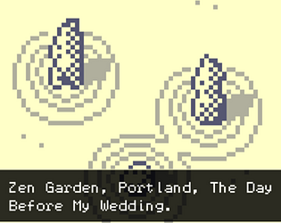
Oh it's really nice to hear that you're using Zen Garden in workshops. Yeah, making stuff really has (and is) getting me through some bad times.

Acheivement Unlocked: you have joined the cult.
(Sweet game with good pixels)

Wonderful stuff (both sourdough bread in general and this essay in particular). Loved the digressions.

Hey, this is great. Really invokes the feeling of community when you're with a bunch of people who like the same thing. Lovely and warm.

Oh, this is great. Really evocative writing; I loved the creeping small-town listlessness, and the supernatural-or-metaphor-or-both elements. The glitchy, gritty art is lovely too. Excellent work!

The path mechanics are set up to choose the valid path closest to the center of the garden (or arbitarily, if 2 are equidistant) so that behavour is intentional, BUT (a) there's no way for you to know that which makes it impossible to optimise for, (b) it probably is more reasonable to expect it to score the longest path.

I'm a bit torn, because I think central is more likely to look pretty, and I've tried to build rules where pretty gardens score well (this hasn't been completely successful, but it is the intent). I'll have a think about it.

Thanks for pointing this out. And for playing; glad you're enjoying it.

This is lovely. The art is so nice and clean, and I really want to try the recipe.

Well, there are actually a couple of ways to get extra colours in bitsy. This piece put's backgrounds behind the bitsy game (making the bitsy background transparent first) -- see the devlog for more details. If you want extra colours in bitsy itself, that's doable too via layers of sprites -- see https://janosc.itch.io/rgbitsy for a helpful tool for that.

I always wondered how bread worked. Thank you for the charming bitsy documentary, Dino.

This is lovely. And also makes me want to make flatbread.

Excellent use of Bitsy3D. Sweet (ha) art and a very suitable soundtrack. Who knew ants could eat so many strawberries? Great work!

This is really sweet!

Oh this is nice. Great rain (art and sound), and I loved the mood. Moods plural, actually.

Clever and enjoyable. Nice work.

That was great! I love how it starts as a normal walk in the park but doesn't stay that way.

Authenticity in art is very important, so I’m pleased that I was able to capture Freya’s true nature.

Well, as expected, this is excellent. Loved the concept, the writing, and the fact that it does react to the sort of story that you've decided to tell. (I'm 3 endings down at the moment). The art is fantastic too, bursting with character.

Excellent job. Really oppressive soundscape (in a good way) and great writing.

Ooh, this was spooky. I started last night and had to stop to continue in daylight. I like the disorienting effect of having the supernatural treated so casually; felt like disassociating. The soundscape is excellent too. Great work.

Wow. Fuck. Wow.

Wow - this is very good. I love that so many screens are just darkness, save for the dialogue at the bottom. It seems like it shouldn't work, but it does; there's a real sense of being in someone else's head.