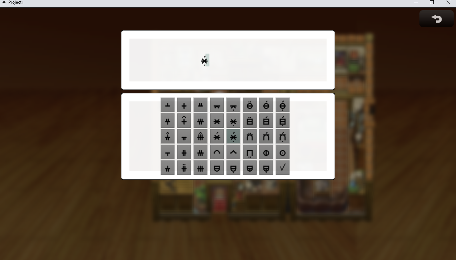
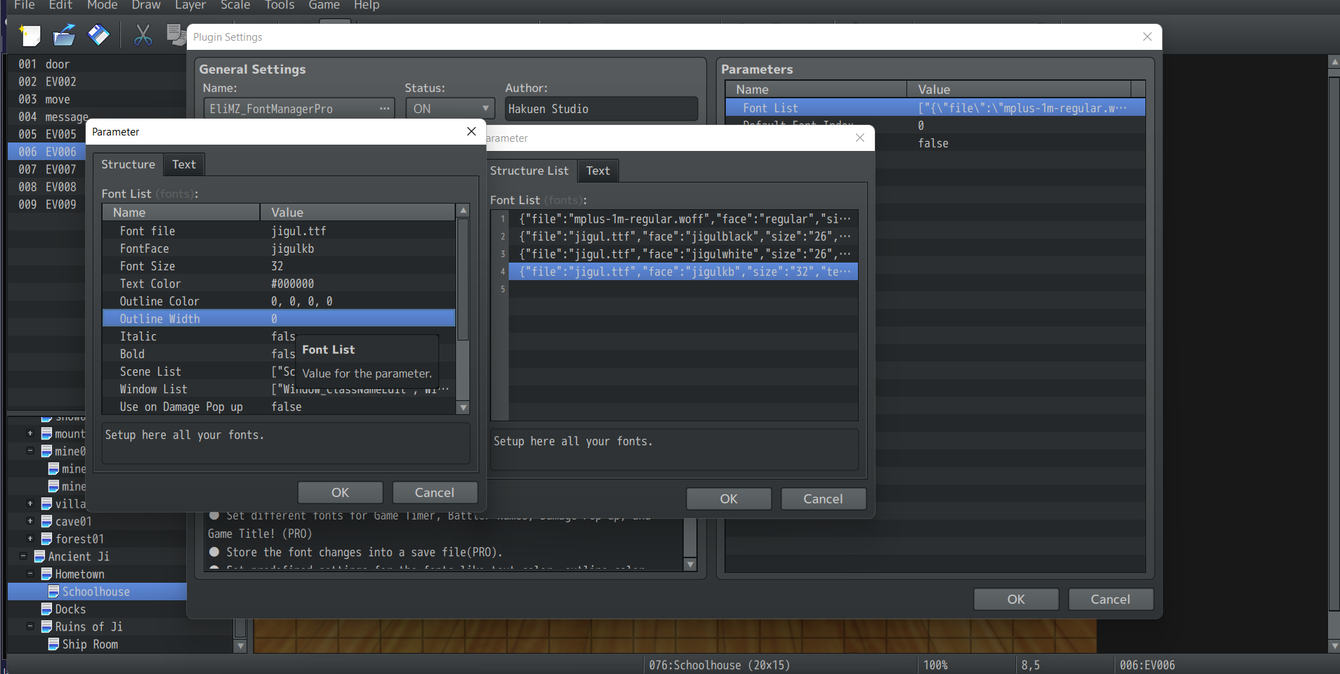
Thanks, unfortunately I don't think my font will work as a bitmap for technical reasons. And I think my problem here is RM/PIXI, not the plugin, so I'm going to try switching to image buttons instead. Just take the issue out of RM's hands entirely!
Playscape Games
Creator of
Recent community posts
Hey fmoo! I'm having some trouble with these utilities, hoping you can help! Scale 2x and 3x are working fine, but "unpack minitile" does nothing for me. When I drag-and-drop the png, nothing happens. When I try using it from the command line, I get an error: "TypeError: unpack_subimage() missing 1 required positional argument: 'MTS'"
Not sure what I'm doing wrong here, but if you can point me in the right direction I'd appreciate it! Thanks!
Thank you for your review! And thanks for playing through! I hope you enjoyed the story ending!
Yes, the dialogue with the scarecrow tells you that the people in the town are possessed by ghosts. You are supposed to go to the southeast corner of town to the graveyard, but I mistakenly made the southwest exit to the beach open earlier than intended (already patched for the next update). If you take the wrong route, you miss a bit of story but it shouldn't be game-breaking. This is one area of the game that will benefit greatly from the Quest Journal I am currently adding.
Yes, there is some inconsistency in how to activate some interactables. This is mostly due to trying to design for both touchscreen and mouse/keyboard setups. Should I activate on touch or on action button? I haven't quite figured out what works best across all platforms, so I have work to do in this area.
Based on feedback, I am considering a total redesign of the mountain cave. It'll still be a maze, but I think it needs to be smaller, use some interactables, and have a more obvious indication of how to exit.
The meaning of Protey's name is intentional; the anagram is not. Nice catch, though! Wish I could claim credit for that.
Thanks again!
Here's my review of The Dungeon of Darkwood:
If I understand the game correctly, it seems to be mostly a proof of concept or demo of a randomized dungeon crawler script. The script produces a dungeon with four randomized levels, on map encounters, and random loot. All other features of the game, like the small town and short story, seem to be mostly intended to give some context to the dungeon produced by the script.
Visuals: For the most part, basic stock graphics are used in this project. There are some simple, nice looking cutscenes that convey the story well. The windowskin and fonts are a good choice. There is good use of the tinting effect to produce the "cursed" atmosphere (maybe a *little* heavy on the tint, but not terrible).
Audio: Decent music choices. There's not a lot of story or emotional ups-and-downs so music played only a small role.
Gameplay: Since the game seems to be mostly intended to showcase the random dungeons, that's what I'll focus on. The random maps consist of small rooms connected by narrow corridors. There is a smattering of random on-map enemy encounters spread throughout the map. There is also the occasional bit of loot. You spawn on a randomly placed staircase and navigate the dungeon to find the next one. You can use the staircase to return to town or any previous dungeon level. Another script feature shown in this game is the ability to insert certain predetermined quest-related events into the dungeon levels.
Eventing: Nothing spectacular here, just some basic dialogue, miniquests, chests, and on-map encounters. I like on-map encounters and this script facilitates using them in your game.
Combat: Standard RMMV combat engine. Even if this game is just meant to showcase the dungeon script, it is presented as a game in itself and could use some combat convenience scripts to improve the player experience. I liked the Rally skill and think it was very smart to include as an example of a useful mechanic in a dungeon-crawler.
Story: short but well-written. Serves its purpose.
Overall, even though parts of the game were barebones, it was enjoyable and I'm more inclined to consider a dungeon-crawler script in future projects after seeing it in action.
My rating:
Humor: OMG. This game is hilarious. Just what I needed!
Gameplay: walking around wantonly smacking everything is fun, and a nice break from the normal endless XP grindy battle games. Swatting everything away in combat is stupidly satisfying.
Eventing: gets the jobs done.
Visual: basic MV resources, plus poorly upscaled 32x32 graphics. Doesn't matter. That's not the point of this game, obviously.
Mapping: It's awful. As intended.
Music: adequate.
Improvements: A few changes to accelerate the flow of the game would be a nice QOL improvements. Picking up the turnips on touch without a notification every time. Automatic menu highlighting on mouse hover would be nice.
Thank you for the feedback. You've given me some good ideas for improvements!
A quest system is a great idea. I thought it would be unnecessary since the story is linear and you only have one quest at a time, but in retrospect there are a few areas where it could help keep track of things.
The beach is supposed to be blocked off by the Captain until you've completed the graveyard, but I double-checked and it appears that I made the Captain's walking range a bit larger than intended.
The graveyard puzzle is a simplified 3x3 lights out puzzle (missing the center light). Hit the blue light on the wall to reset. SPOILER: The simplest solution is to simply toggle each light once.
Please drop back in and let me know what you think of the rest of the game!
Also, I put puzzle solutions in the game's thread here. You'll probably want that for the final puzzle.
Overall, LOVED this game. It's a very serious contender
Gameplay:
Loved the arrow indicators for interactables.
Loved the ability to switch the encounter rate and difficulty to focus on the narrative. (I played at narrative and 99. Encounter rate still seemed high though for some reason?)
Visuals:
Excellent mapping and atmosphere.
Perfect font choice and use of color.
Ocean color transition seemed to go in the wrong order? Maybe? Typically darker colors would be farther from shore.
Great blending of default resources with custom art.
Audio:
Great use of music.
Eventing:
Entertaining cutscenes.
Puzzles were... puzzling :) Other than taking a sec to figure out the expectation, they were fun.
Well balanced, complex, and fun. Difficulty levels are a great touch.
Automated mouse highlighting would reduce clicks required, speeding the pace of encounters.
Great use of animations.
Minor notes:
No music or battlebacks during combat on the ship at the beginning. Would've been cool and looked better with a ship battleback.
I did not encounter any bugs during gameplay.
Thanks for the feedback! Yes, I felt very nervous about the choice, but early movement was slow by design specifically because the early maps are quite small and you gain a *lot* of speed later in the game. I wish there was more fine tuning available in the movement speeds so I could've made the difference less extreme.


