Glad you liked it!
ClearKnight
Creator of
Recent community posts
This is an interesting concept. The main annoying thing is that blocks can change from black back to pink. I would sometimes get the last block to turn black, just as another was turning pink. This just makes it very hard to complete some levels. Also, as this is a "Black and White Jam", I would recommend trying to stick to a two-color palette. This makes it a lot more rewarding. Overall, it's a fun game.
It wasn't clear at first what to do. The section on the side of the screen telling you what to do was too crowded with unnecessary information, such as the drone number. I like the simple art. I don't understand the logic behind the "utility" score. Why does charging bring down your utility so fast? I also feel that there should be some consequence for running out of energy or utility. Overall, I put a few minutes into this game, and it was fun once I got the hang of it.
I really enjoyed playing the game, but I feel that the timer is too punishing. A couple of times, I was a short distance from the door, and the timer hit zero. You could make it so that zero is showing for a little bit and then send the player back a level. I like the simple art style, and it fits well with the simple concept of your game.
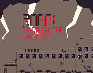
I enjoyed this game a lot. The only thing that I think could be improved (it's fine without these changes) is the cohesiveness of the art. This could include changing the setting to something like a haunted mansion as that fits the theme of the ghost and the bats (this is all just my opinion). If you could play and rate my game, that would be great: https://amethystgames.itch.io/robo-through-the-factory
I really like the concept. Keeping the minimalistic art style really could work for this game. The only thing is that the platforms were basically the same color as the background, at least for me. Would you be willing to play and rate my submission at https://amethystgames.itch.io/robo-through-the-factory?
The art was great and so was the idea. I was wondering if you could rate my game. https://amethystgames.itch.io/robo-through-the-factory
Some of the asteroids spawn very close to the player. This makes it very frustrating to play, especially when you spawn in and you immediately lose a life. I recommend moving the spawners farther out so that the player has a chance to react and so the player cannot see the asteroids spawning in. I would also recommend lowering the spawn rate of the asteroids. The large number of them on the screen at once made it very easy to die. Other than these two issues, it is a good game with a good foundation. The music and art are both very good. You can't go wrong with a small color palette for a game jam.
It might have just been me being bad, but I really could not get into this game. I think that a tutorial might be a good idea. The different icons are a bit hard to understand and some obstacles are impossible to avoid. It is an interesting concept, just not executed in the best way (in my opinion).
Nice concept. The moving platforms could use some art. I would also recommend removing the invisible platforms if you plan on expanding this game. I think that they would only make the player frustrated. Also, I would recommend having fewer platforms in the first level. It just got kind of repetitive. With some small tweaks and more levels, this could be a great game, especially for mobile.


