I’m happy to help!
Cole Sweet
Creator of
Recent community posts
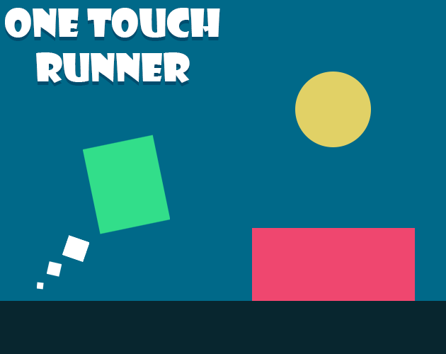
Hi there! Over the past little bit I've been trying to kick into gear my game development journey. A lot of the advice I got was to just start making games. Inspired by a recent game jam theme I created a small commercial game called One Touch Runner!
One Touch Runner is an infinite runner game where dodging, jumping, and sliding are controlled by a single button. I tried to make the game simple, difficult, and still have a good game feel.
Please let me know what you think!
Hi everyone!
I've been trying to improve my pixel art lately and was inspired by the release of Astalon: Tears of the Earth (I really enjoy the art in it).
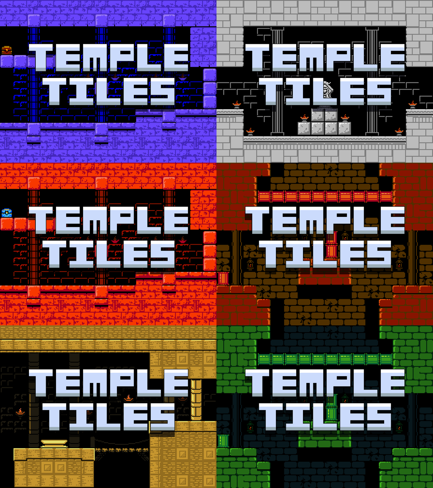
Inspired by Zelda II, I decided to try and make a temple tileset! The tileset comes with 4 unique temples, all with 3 palettes.
I hope you enjoy it!
Temple Tileset
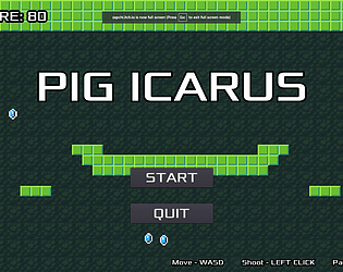
Thank you! And yes! You can see the collision box a little. I was trying to figure out a way to show the collision box without it seeming like it was a debug thing. My goal was to have it so that the player has a better idea of where they can fit and where they can't. There is also a slightly green larger box around the player to represent the next size up of collision box after they absorb an ape. If I were to continue with the game, I'd probably make the size of the player to a grid so it's easier to know and predict where you'll be able to fit and not fit. Thank you for playing!
Thank you for the feedback! Yeah I agree it could have been a bit harder in some places. I really spent the first 4 levels doing tutorials basically. I think that if I had more time I would absolutely try and heighten the difficulty AND create a zoom-out-able screen so the player could see the entire difficult level.
Thank you for the feedback! I'm happy you enjoyed it! I absolutely agree with you on that front. I think it would be cool to have some barriers or something that requires the power of a huge ape. There would sort of be a two way system then. You need to be small enough to get between spaces but big enough to break down obstacles. Interesting!
I really enjoyed your game!
I think that if you were to continue adding upon it, that having an automated system for planting and harvesting plots could be nice! The further to get the more plots you have to go back and plant and it can get a little overwhelming!
It may have been just my playthrough of it, but the values seem mostly to just increase rather than decrease for me, maybe you could try to make the game more punishing and risky when it comes to the market prices and the time it takes to plant.
Overall, I really enjoyed it! Great job!
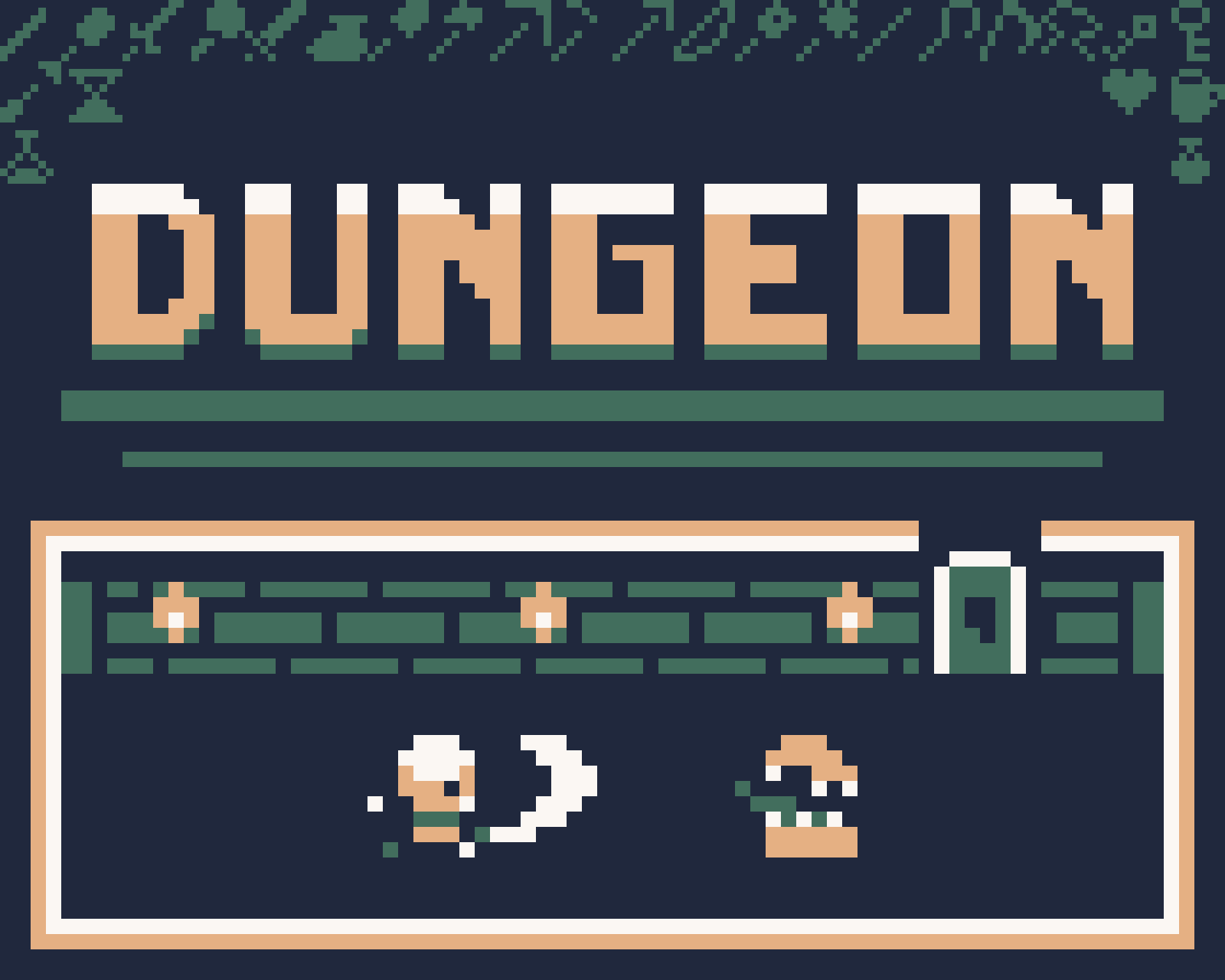
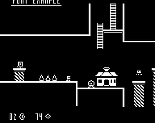
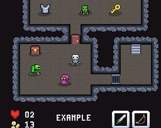
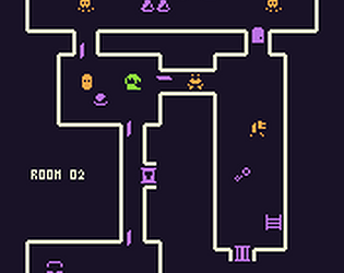
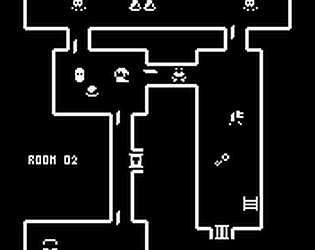
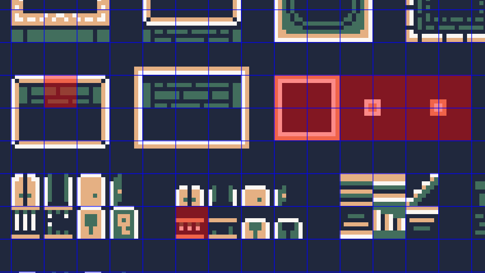
This is a 2-bit pixel art tileset that would work well for any zelda-like or rogue-like games! I made it using 4 colours and 8x8 tile sizes. I am trying to improve my pixel art through these and hope to create more specific tilesets like enemy sets and item sets. Let me know if there is any particular tilesets you would like to see! Please enjoy it!
