Wow.. Thanks for letting me know! I certainly won't be giving them any of my other templates.
doptrix
Creator of
Recent community posts
Thanks for your interest!
You can download a free demo of this template (with 1 level) here:
https://howtoconstructdemos.com/generate-random-levels-from-pre-built-scenes/
Issues #1 and #2 are old, please see screenshots in my previous post:
https://itch.io/t/701461/issues
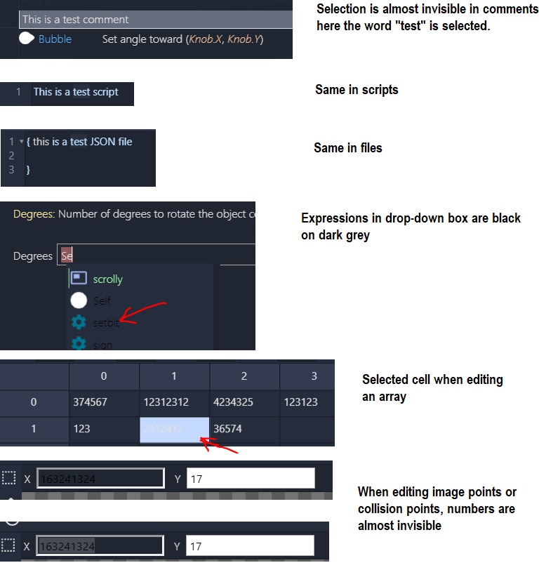
Issue #1 has actually got worse, in previous versions the selection was barely visible. Now it's completely invisible.
Thanks for fixing most of the reported problems. However, some are still there:
1. When you select text in a Plain Text file or in a script, the selection is now completely invisible. Even on maximum brightness I don't see it..
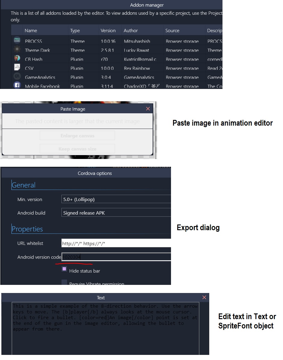
2. Text boxes in Animation editor (to edit collision polygons, image points) - the text there is still black on dark grey and barely visible.
Thanks for the reply!
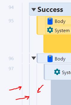
I can understand why you removed all icons, the code looks much cleaner without them. But icons improve the readability of event sheets hugely! Say, if you want to change something about Bullet, your eye can instantly see all events and actions with Bullet icon, you don't need to scan each line of code. Objects icons, icons for loops, waits, triggers etc. are just as important. I often shrink the column with object names, leaving only icons visible.
This is a great feature of Construct and I honestly can't imagine working without it..
I will wait for the version with icons, it will be a perfect theme!
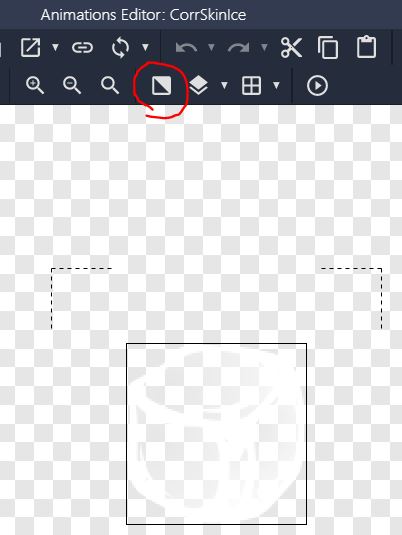
Another issue - Toggle Background button in Animation editor doesn't work, which makes it impossible to edit white sprites...
EDIT: arrr... I just realized there are no icons on the event sheet - no object icons in events/actions, no green arrow for triggers, no clock icon for asynchronous actions, no plugin or behavior icons. I guess without all the icons the event sheet looks more like a "professional code", but this makes it so much harder to read!
I wish I noticed this before the purchase, this is a deal breaker for me. You should put this in big letters in the description.
Reverting to the default theme.. :(
Hi,
I like this theme, but when editing text in any expression, comment or file, selected portion of text is barely visible. Selection background is only a slightly different shade of gray..

Here I selected the word "true".
Is it possible to make it more prominent? Or could you tell me where in the CSS file I can change this?
Thanks!


