Plot as in conspire with your friends to do something.
Explorers Design
Creator of
Recent community posts
I'm super excited to see Sunk Cost develop!
I love submarines and have been waiting a long time for more games to use them. The fantasy-meets-industrialization theme is also super interesting.
Inspired by the cities and factions in Cardinal Basin, I made a few smaller Blades in the Dark-style factions for it.
https://www.explorersdesign.com/factions-sunk-cost/
Thanks for letting me know! I'll try to fix that.(It probably broke during the recent Canva updates.)
Try this link instead: https://www.canva.com/design/DAFlKaE3JZU/PecYla2p5N3TmPJb80_h4A/edit?utm_content...
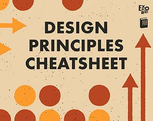
Negative space is when the omission of color, art, or "content" creates a new image in and of itself. For example, the arrow pointing forward in the FedEx logo is an example of negative space.
I make the distinction in the cheatsheet so that if someone googles it later they're less likely to get the incorrect impression that all white space should form an image—or that it's common.
Negative space is white space, but not all white space is negative space.
I believe it does somewhere in its folders. However, you can also access the Canva template for free without making a purchase. Here's the link below.
https://www.canva.com/design/DAFlKaE3JZU/PecYla2p5N3TmPJb80_h4A/edit?utm_content...
There shouldn't be anything missing feature-wise, but it will be harder to execute in Affinity. It's newer software with fewer features. That said, they're pretty much one-to-one in their content. The free/starter version has a pdf with all the guidance for Affinity. The paid version just has the working file of that pdf.
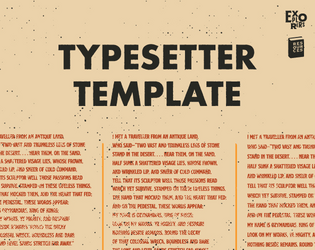
The US Half Letter is only about .2 inches taller than the A5 at the expense of being almost .3 inches narrower.
I think in the case of this template, width is more valuable than length. The narrower your paragraphs, the choppier the writing can feel.
That said, the change can feel pretty minimal. It depends on the project!
Some tips for readability:
- Remember to keep sidebars short. No more than 2-4 lines. Avoid one-word lines.
- Try not to hyphenate words across lines.
- Embrace the paragraph. Multiple singular lines broken by space can feel disjointed. When that feels unavoidable, consider using lists or tables.
A feast for the eyes. It's like getting punched in the cerebellum by a blood-soaked metalhead wrapped in billboard vinyl. Another searing "Vass dram" of art and rules.
The color here is fantastic and unexpected. In another designer's hands, this book would have been black with pops of neon. Instead, you get rich colors and shades found in modern DTC brands. Perfect for subversion.
⭐⭐⭐⭐.5/5 (But 5/5 on the built-in rating system. Take that Itch.)
As a professional deadbeat in real life, I can't help but love this game's conceptual idea. Thankfully the clean and colorful layout, sharp writing, and clever rules mean I can also say: it's a romp. Go play it.
⭐⭐⭐⭐/5 (But 5/5 in the rating system. I can't let Itch control discoverability. I refuse.)
Every judge in The Awards wrote their own 3000 word essay about why a game deserved to win. A real drag-out fight. And then their next message on the judges' discord was always something like, "Oh yeah, and that one adventure 'Into the Bluelight' should win, too." And no one ever contested it. The writing is that good.
It's super interactive and packed to the frost line with proverbial gunpowder. A blast to play and run. ⭐⭐⭐⭐⭐/5
With a title like that, it's impossible not to play. The cover art is stellar. This a great example of modifying pre-existing art and making it better than it was before. I would have liked to see more of that dynamic manipulation in the comic book-style frames—but ultimately, it doesn't matter. It's a game about doing crime. A task my fictional personas are more than happy to take up.
⭐⭐⭐⭐/5 (But I'm puttin' 5 on that big 'ole rating button)


