Thanks! I recently went back to pack, I am once more working on that demo I promised ... 4 years ago lol
FeitizoGames
Creator of
Recent community posts
Hello Zeno, I am very happy to see you liked the game.
About your questions: at some point I tried to sell the full version of the game, and thought that trying it on browser would help with that. After a few months nobody was interested, so I decided there was no reason not to make it free. Since it is very easy to remove the price I just did that. However, I didn't built a full version for the browser for the same reason I do not intend to do bug fixing, which is that this barely gets ever played and is not worth it to keep working on.
My impresions, I hope to not be too harsh and give you some ideas on how to improve:
- Sadly I don't think the game worked correctly: The "player" cube moved very very slow, the "collectable" cubes spun very quick and the cube was not able to jump over the first obstacle. If the game was working correctly and the player must do anything else, then it's too obscure and you need to somehow teach the player what he/she is supposed to do.
- Unify aesthetics: A realistic background does not match the abstract looking graphics, nor does the font used. If you are going for cubes, then make the background out of cubes and choose a more blocky/squarish looking font.
- Do everything with purpose, ie: why are the collectibles laying around randomly? You can give the player a "feels good" start by sorting them in a line to be easily collected while also showing him/her the way. Or, if you want the player to navigate around the platform so he can try the movement controls and take a look around, four collectibles in a square pattern would suffice.
- Transitions will hide small loading times and give your game a more polished feel.
- If you don't have graphical assets you can still add some eyecandy with particle effects (remember that you can use custom geometry with the particle system, creating cubic particles) and "animating" the cubes. Consider stretching the player cube as it jumps and squashing it as it lands, for example.
Hope this helps, good luck!
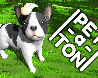
So I have started working on a dog (creatures, but right now there is only a dog) petting game, thinking that that would be a good hook, since people often likes to pet dogs in games and the only games to develop this (as far as I know) were nintendogs and a couple of very small indie games.
I have teamed up with an animator and put together the mechanics and a very basic reaction. I decided to record a few seconds and post it on several places (reddit, twitter, tigsource...) to see if it had any traction. Responses were minimal everywhere and I am trying to find out why. This is the video (i post it in gif form in most places, though).
What do you think? Do you find it difficult to understand what is happening, the idea is attractive but the presentation is not or viceversa, it is just not remarkable enough in any sense...?
Thanks for your opinions.


