Indie game storeFree gamesFun gamesHorror games
Game developmentAssetsComics
SalesBundles
Jobs
TagsGame Engines

Finnmercury

85
Posts
193
Followers
35
Following
A member registered Jan 04, 2024 · View creator page →

Creator of

Recent community posts

(2 edits)

YESS! Thankyouu!

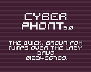
hey, its cyberphont 3.0, its custom made for this asset pack and it contains the same lisence as the ui pack :D

Noted! def expect those on the next update!

hey, im so glad you liked it! could you please specify what type of icons you want to see in the future updates?

Heyy, thank you for the sweet comment! here's the link to the font! https://www.dafont.com/alagard.font , it is not me who made it so i can't really include it in zip file but its free for download!

im in love with your artstyle! super unic and pleasing, i love how this ui turned out!

Im so impressed by how it turned out!! Super Creative use of the ui pack!!

this is so interesting, defenitly addding those on the next update! Thank you for your feedback!

Thankyouuu <3

This is Amazing!

Yes ofcourse! and Credit is optional but always apreciated!

Haha Thats right! I recently started learning godot with brackey's comeback

When i give u credits should i be saying this is jam's blackletter or this is not jam's blackletter? XD, Really awesome font work! so inspiring

if you are interested in medieval UI elements im currently working on one, and it should be done by the end of this week! Here's some insights of it!

Credit is always apreciated!

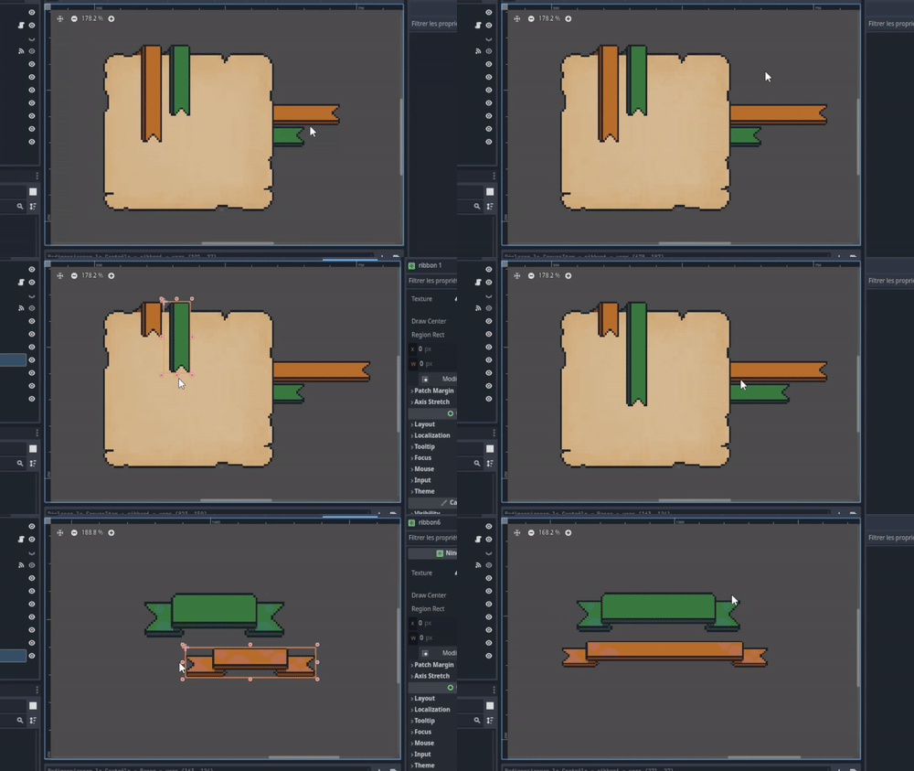
Hello, hope you doing good, im currently working on a major rework for this pack and it will include having buttons in seperate pngs, for the resizable screens u should provide me with more informations, if its blurry you should modify how the engine imports graphic elements and filters textures. if u using godot you may check this youtube video

Its a Game art asset, it helps game developpers progress on their games quickly instead of drawing their own art, hope that answered your question.

im in love with how the UI turned out! Very creative! especially the health bar

I really love your work, especially your presentations and the way you set up your sale pages, so creative keep it up!

Thank you! You should give it a try someday, you got a solid unic style!

Thank youu! Hope you like it!

Thankyouu <3

Hihi hope you liked it!

I'll be adding it next! thank you for the comment!

i love it, u might check sens setting they are a bit glitched to me

im in love!

(3 edits)

Im honored! so glad you liked them!

Hello Thank you for your purchase, the asset is set up in png format so it should work fine with renpy, for your request to put buttons in seperate pngs, expect it in the next update! For the resizing it should be done in a proportional way to keep the png ratio and not have a stretched one like you have done. You can also modify its ratio in any editing software if you are not comfy with the preset one! Hope i answered well, if you have any further questions pls let me know

why not 5 haha

(1 edit)

Great work! i used it on one of my itch.io thumbnails, it certainly draws attention!

(1 edit)

Wait thats a prototype?? it honestly feels complete! Good job, edit : i lost the controllaaa andd it didn't respawn oofs XDD

This is so addictive haha Loved it

I love the concept, whats a Paquerette? is it a type of plants?

Looks epic!

Haha thanks for your contribution ! I took note!

Yes, ofcourse! I'll be adding a .zip file in the upcoming update, Thank you for the comment, Expect it soon!

Love it! keep it up!

Nice thumbnail! so catchy