On Sale: GamesAssetsToolsTabletopComics
Indie game storeFree gamesFun gamesHorror games
Game developmentAssetsComics
SalesBundles
Jobs
Tags

Frajda Games

20
Posts
7
Followers
1
Following
A member registered Feb 25, 2014 · View creator page →

Creator of

Recent community posts

Yeah the trick with hitting the side of the green instead of landing is sort of something I think I'll change. It's because the "finish the level" hitbox is the exact same length as the landing platform and I suspect that when you hit the side of the platform, the collision with the "finish the level" hitbox also happens.

As for adding random geometry gaps I think it's a great idea and I'll add more of them :) initially their purpose was to allow falling down through them but make going up through them very difficult, but I think that if the player is skilled enough to go through it then that's great.

Thanks! I'll post the video on Twitter :) and again - very impressive you got such a good time in such a short period of time :D

WOW! You beat me so fast after I replied :D What's even more impressive is that time starts when you jump for the first time (I did it that way because it was the easiest to implement at the time) and given that you start jumping from the center of the screen and you have to avoid some obstacles, you could probably shave off some time if you started jumping from the right side. That's what I did in my speedruns. Additionally if the camera behaved better and would give you more space for you to see ahead you wouldn't have to stop at 0:10 and you could just jump non stop. Maybe a sub 8 seconds is possible.

Congrats :D I think it's pretty safe to say you might be the best Bravest Chicken player in the world right now :D would you mind if I posted a link to your video on Twitter? I'd love to share your speedrun :)

Thanks :D oh that's a cool challenge! My absolute best time is 8.95 seconds :D you can go below 10 seconds if you do a "speedun route" but you should be able to go below 15-20 seconds if you don't hit any obstacles. Let me know what your best time was :)

Thanks for playing and leaving a comment :) I agree the camera doesn't follow the player fast enough. I'll change it in the future. What do you mean by "controls do feel a bit hard to judge"? As in it's hard to predict where you'll go after jumping?

I'll release it on Steam for sure :) originally I planned to make the game in 3 months and release it at the end of December but I've realized that it's too ambitious and I'll be working to release it in the next 4-7 months. :)

That's so cool! thanks for playing :) yeah I think the game gets too difficult too fast. After watching a few playthroughs it's clear to me that many players get to a certain point and they absolutely can't beat certain obstacles. I'll try to design levels so that they teach the player how to beat the next challenge. Also, about the camera: yeah I think it doesn't let you see where you're going well enough. The camera system is fairly simple and it simply follows the player around without taking into consideration how fast the player is going. I've added this to the list of things to work on.

Thanks :) I just updated the game and now you can also jump with the up arrow as well :)

Oh no, I'm sorry :( I'm aware of this bug but it happened so rarely that I decided to release the prototype without fixing it. Unfortunately the only fix for now is to restart the game. :( The bug is related to some flat obstacle hitboxes that shouldn't be there. I'm adding this issue to my to-do list right now.

<3

glad you liked it :D thanks!

Awesome, thanks a lot! :)

Hi, I love your art style! I really liked the chicken you made for the game so I started using it in my own prototype. I've noticed that in the "More information" section the "Asset licence" is "Creative Commons Attribution v4.0 International". Does it mean I can use the asset of the chicken in my own game as long as I credit you?

Hi, thanks for playing :) what would you say the biggest improvement to the UI could be? One player suggested dividing manufacturing items into tiers, so that you'd have for example 3 items in manufacturing grouped together as "tier 1", etc. I agree that not being able to upgrade max compute limit is annoying. Actually, it was a conscious decision I made because I didn't know if the upgrades would be too powerful or not. But upgrading fire generation to 1 fire every 1.57 seconds doesn't solve the issue that you're getting blocked by slow gathering of wood. Overall, I think that there needs to be a way of speeding up fire generation and wood gathering. One playthrough I won the game in 3.5 hours and about 1 hour into the game it's very clear that you're blocked by slow fire generation. I was thinking of 2 ways I could fix this: adding more upgrades to fire generation or resources gathering and allowing to have more than 1 droid work on a single task, so that you could have 2 or more droids perform fire generation and this would result in faster generation.

Thanks for playing! Yeah, UI is the part I've gotten most feedback about. I think it lacks basic quality of life improvements like right now you might not know where your droids are or what resources you're missing. Somebody in the jam's Discord server mentioned that it might be a good idea to split manufacturing into "tiers", like you'd have manufacturing "tier 1" items, "tier 2" items and they'd be separated. Do you think that would be an improvement, would you like to see some other changes to the UI?

Thanks for playing! I agree that past a certain point the game is slow, especially when you're forced to wait for fire to be generated. Do you think adding an ability to add more than 1 droid to a task would speed things up, or should there be an upgrade like "get 10% more resources when collecting"? If you have any other ideas as for how I could improve the game, please let me know :D

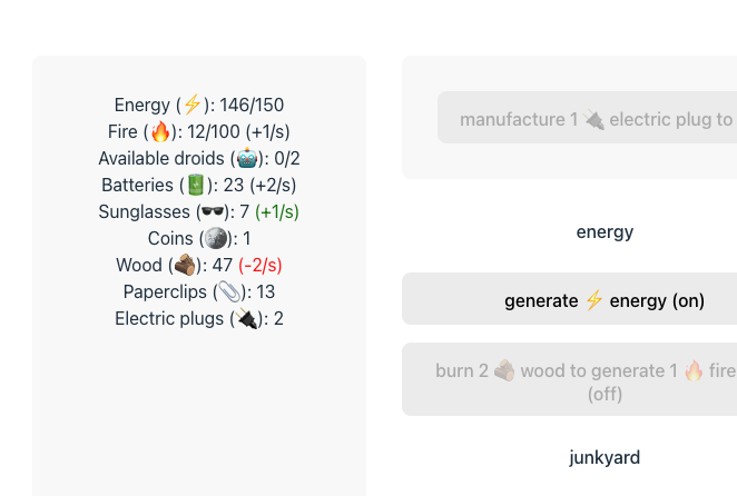
I'm very happy to hear this!! :D Would a simple "+x/s" be OK for displaying rates like in the screenshot below, or would you prefer something more detailed?

My idea for displaying rates is:
- display rates for resources that are "active" (resources you're gaining or losing)
- show red colour for the resource you're losing (and maybe green for resource you're gaining?)

Here's what it could look like. What do you think?

Thanks for the feedback! I do agree that energy stops being a problem past getting 3 solar panels and I was thinking of reducing how much energy you get per each solar panel, but I thought that introducing computing, another area that consumes energy is a better alternative but I guess I didn't make the balance right. The biggest bottleneck I've found is the limited wood collection and fire generation. I've added an upgrade for increased fire generation in Computing section, but I don't think it's enough. One of frequent feedbacks I got was to add ability to have more than 1 droids perform a task and I think this could improve gameplay a lot, but I didn't have time to implement it.

May I ask what do you mean by "more expansion with less hectic recipes"? Do you mean that you want simpler recipes and you want more of them, or do you want the recipes to be presented in a better way? I'm asking because I think that in general the more complex recipes are hard to work with and having all the text in a single button without actually knowing which resources you lack is bad and it makes it hard to work with. I was thinking of improving this by moving the requirements out of the button completely and having them be written down below the button, with the resources you lack be highlighted in red to show that this is what you need. I'm wondering if that would be enough and that this is the problem I need to fix, or are the recipes in general too complex and need to be easier and more straightforward?

Wow, very unique approach!

Cool minimal black and white UI :)

Unfortunately the game doesn't start for me. It gets stuck on loading and prevents me from using Chrome completely. I'm using Chrome Version 114.0.5735.198.


(1 edit)

Hi, I've never encountered something like this. I was able to replicate it as well and I just posted an updated version which doesn't support dark mode, so everything should look like in screenshots. Thanks for reporting this!

Edit: For anyone curious why this happened. I used Vite for creating React app and by default it included CSS with support for light and dark modes, but since I changed some CSS styles but didn't update the light/dark mode styles that's why it looked broken when switched to dark mode.