NICE! <3
Franuka
Creator of
Recent community posts
Hey thanks! I'm really glad you like them and hope they are useful for you!
I haven't thought about making those armors wearable. It would take a long time to make them fit them all in each available animation, and I think I'd prefer to make new characters instead. But I'll think about it, maybe there's an easier way!
It's ok, no worries! If you used the 3x version then maybe it's an exporting issue, because the gif you uploaded is slightly smaller than my 1x version, which causes some undesired pixels/noise. If you could send me your original file (.aseprite or whatever you use) to franukai@gmail.com it would be great!
Hello Dreich, thanks so much!
At the moment I don't have plans for more wall tiles, but I might do it in the future. I'd have to update all my other packs, though, and for now I prefer to keep them simple in order to do more different assets.
But anyway, I'm glad you like them and thanks for the feedback!
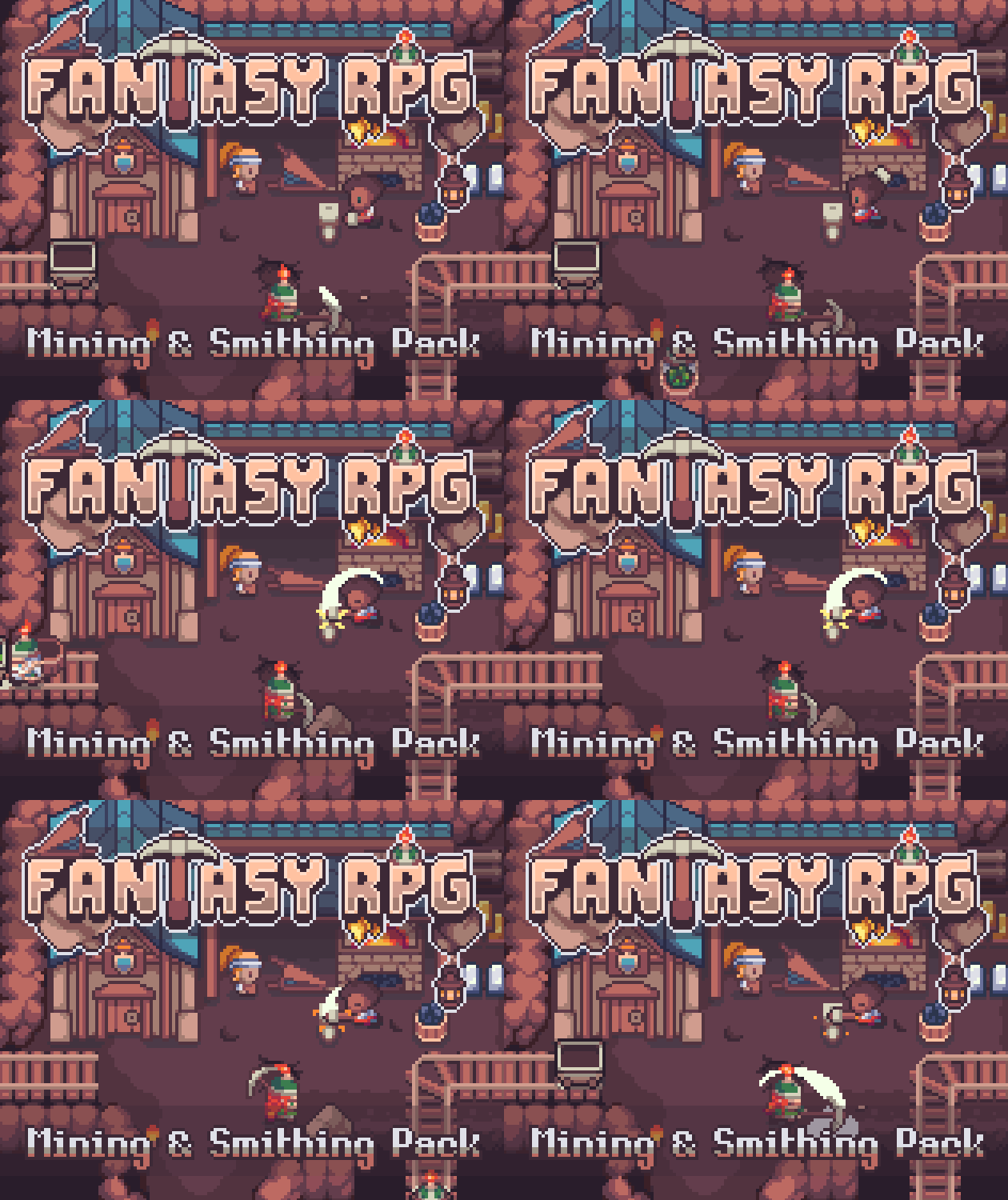
Rock and stone, they say! Well heavy metals, too! It's time for real dwarven jobs, so grab your tools and hop in the cart, this might be your lucky day in the mines ⛏💎
✨FEATURES:
- Cave floors, walls and minecart tracks
- Multiple rocks, stairs and cave decoration
- 9 different minerals, each with ores, icons, particles, ingots and more!
- Animated minecarts
- Blacksmith building and decoration (forge, armor, weapons, anvils, etc.)
- 4 animated characters (4-sides, Idle, Move, Working, Carrying animations)
- Everything comes in 3 sizes (16x16, 32x32 and 48x48px)
--> Buy now and receive free updates soon!


