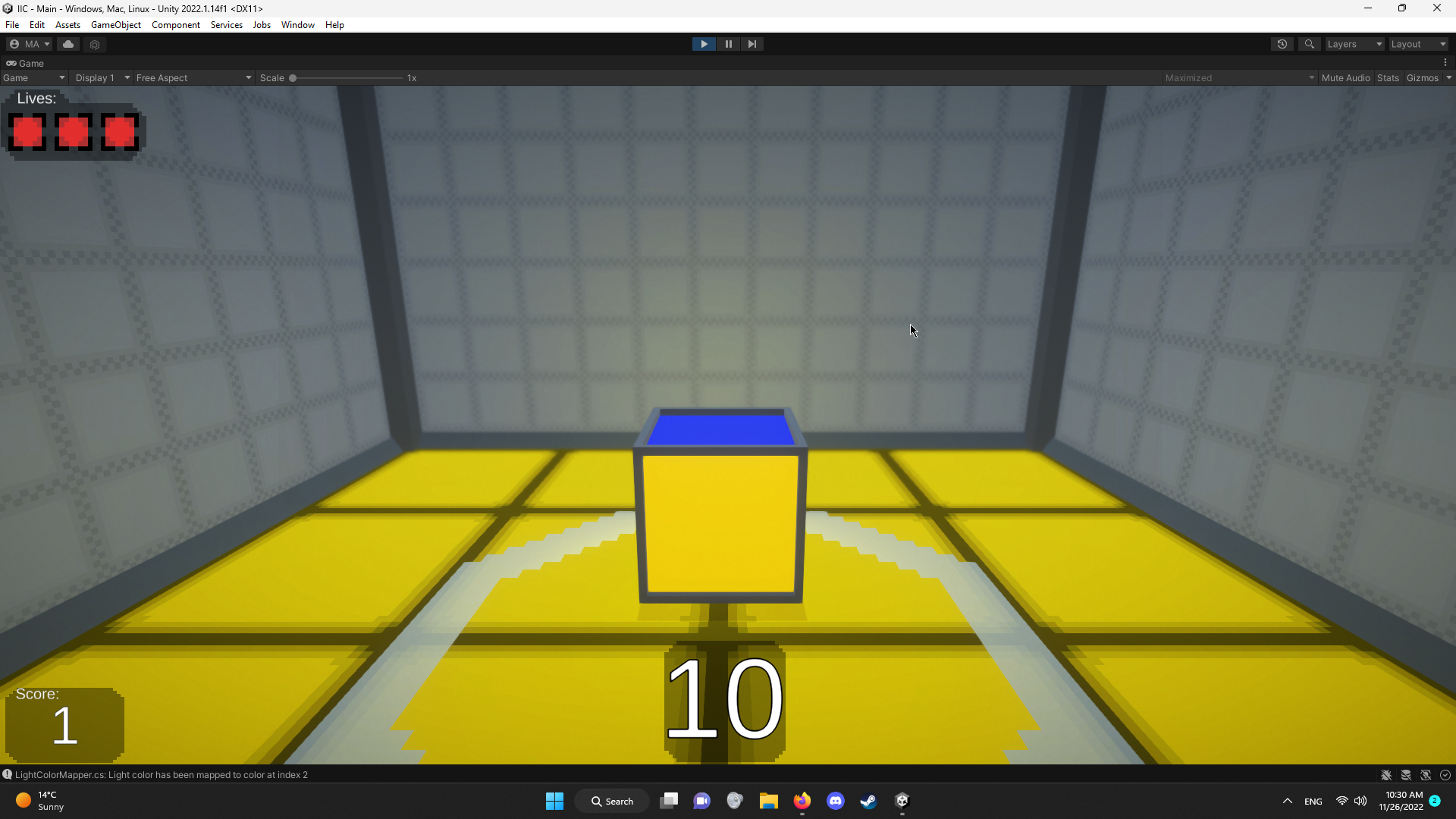
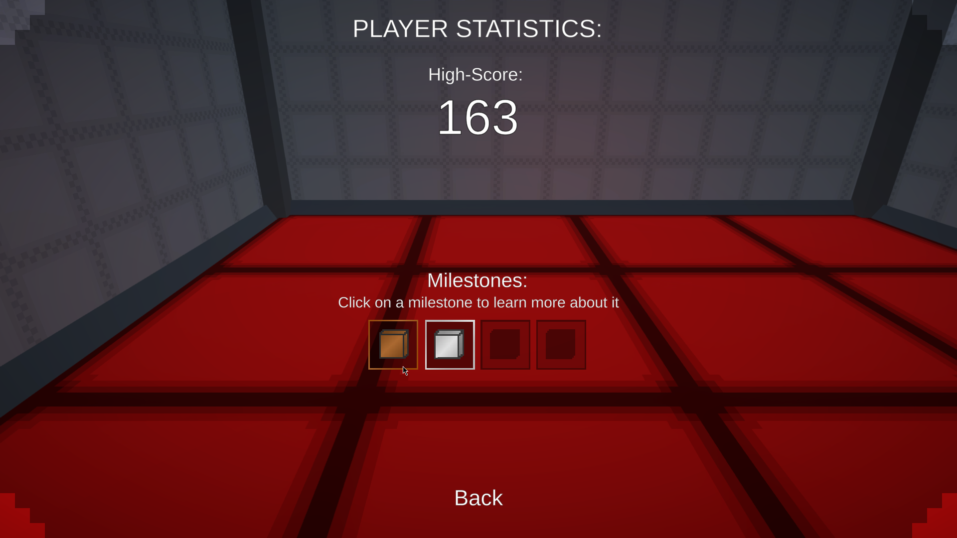
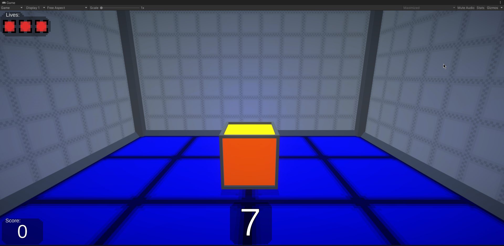
Hi! ( =
HappyMatt12345
92
Posts
1
Topics
10
Followers
20
Following
A member registered Apr 08, 2019 · View creator page →
Creator of
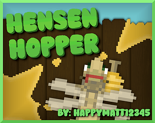
A top-down shmup where you help a vigilante grasshopper battle villanous insects!
Shooter
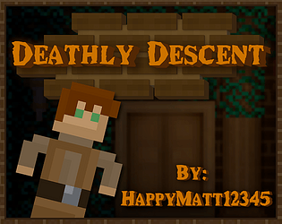
A fast-paced 2D platformer with heavy emphasis on quick-thinking and exploration!
Platformer
Recent community posts
itch.io Community » General » General Discussion · Replied to Upskill Catalyst Studio in post 1 screenshot of your game [finished or unfinished] PLZ read rules!!
itch.io Community » General » General Discussion · Replied to Better Worlds in post 1 screenshot of your game [finished or unfinished] PLZ read rules!!
itch.io Community » General » General Discussion · Replied to Smelly pizza in post 1 screenshot of your game [finished or unfinished] PLZ read rules!!
itch.io Community » General » General Discussion · Replied to Betamaximus-128 in post 1 screenshot of your game [finished or unfinished] PLZ read rules!!
itch.io Community » General » General Discussion · Replied to theosk in post 1 screenshot of your game [finished or unfinished] PLZ read rules!!
itch.io Community » General » General Discussion · Replied to GoodmanEmin in post 1 screenshot of your game [finished or unfinished] PLZ read rules!!
itch.io Community » General » General Discussion · Replied to dianna_gunn in post 1 screenshot of your game [finished or unfinished] PLZ read rules!!
itch.io Community » General » General Discussion · Replied to ProtoX in post 1 screenshot of your game [finished or unfinished] PLZ read rules!!
itch.io Community » General » General Discussion · Replied to UglyPython in post 1 screenshot of your game [finished or unfinished] PLZ read rules!!
Thank you for playing! Yes the character does move pretty quickly, that was intentional, it's meant to be a bit of a step outside of the usual platformer comfort zone in terms of movement. The first 3 levels are pretty easy but the 4th and 5th levels are much more challenging, the 5th level being the hardest. It's definitely a game you need to really practice with to get good at.
Tell your wife to leave a review when she plays it!
itch.io Community » General » General Discussion · Replied to naniloit in post 1 screenshot of your game [finished or unfinished] PLZ read rules!!
itch.io Community » General » General Discussion · Replied to DarkBloodbane in post 1 screenshot of your game [finished or unfinished] PLZ read rules!!
itch.io Community » General » General Discussion · Replied to Awasete in post 1 screenshot of your game [finished or unfinished] PLZ read rules!!
itch.io Community » General » General Discussion · Replied to Gossamore in post 1 screenshot of your game [finished or unfinished] PLZ read rules!!
itch.io Community » General » General Discussion · Posted in post 1 screenshot of your game [finished or unfinished] PLZ read rules!!
itch.io Community » General » General Discussion · Replied to WIZ GAME STUDIO in post 1 screenshot of your game [finished or unfinished] PLZ read rules!!
itch.io Community » General » General Discussion · Replied to PaulsGames in post 1 screenshot of your game [finished or unfinished] PLZ read rules!!
itch.io Community » General » General Discussion · Replied to Danielle's Games in post 1 screenshot of your game [finished or unfinished] PLZ read rules!!
itch.io Community » General » General Discussion · Replied to CrazyCoolGames in post 1 screenshot of your game [finished or unfinished] PLZ read rules!!
itch.io Community » General » General Discussion · Replied to Heavy Poppins in post 1 screenshot of your game [finished or unfinished] PLZ read rules!!
itch.io Community » General » General Discussion · Replied to PaulsGames in post 1 screenshot of your game [finished or unfinished] PLZ read rules!!
itch.io Community » General » General Discussion · Replied to AmatureStudent in post 1 screenshot of your game [finished or unfinished] PLZ read rules!!


