Make that game window bigger.
Having to scroll down to see the upgrades is not good.
I can see something there, though the nature of some of the upgrades, like when you go from rotary to automated press you completely lose the ability to click to make bullets. Having both be available would be nice.
Other than that, the UI is extremely cramped, almost as if this was made for a 4k monitor, text is small, buttons are smaller, checkboxes are tiny. I couldn't even get the game to focus on some research.
Proper settings would also be nice, like the option to mute the sound. Right now all it does is cycle through the appearance.
Managed to finish it in one sitting.
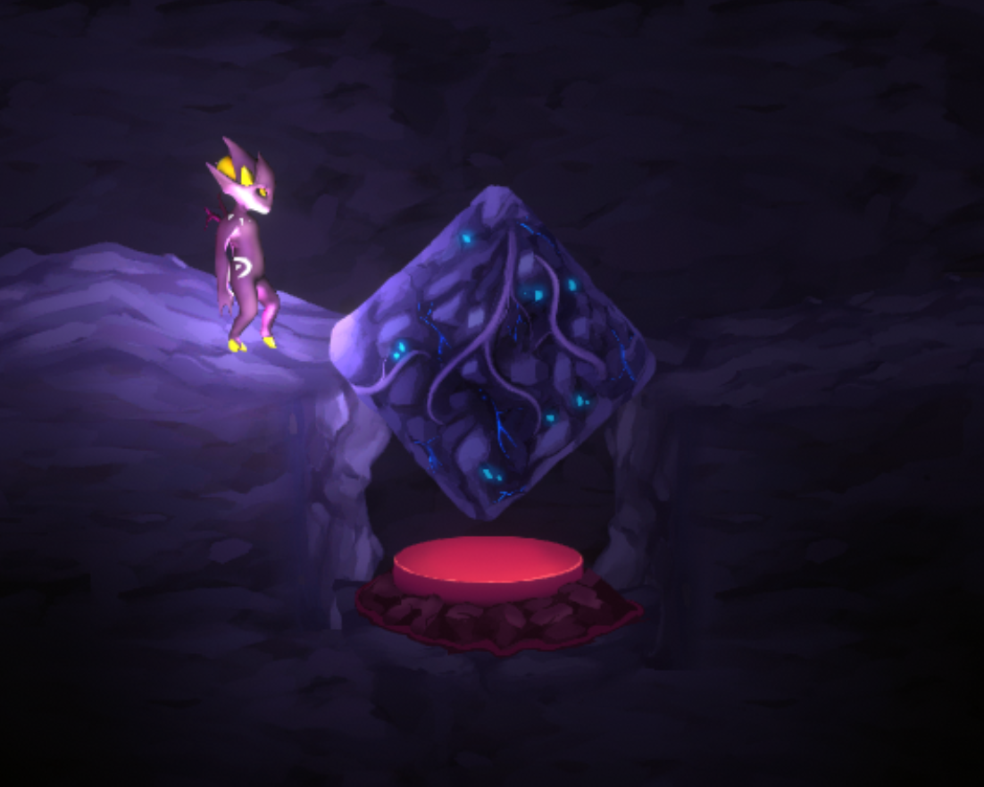
There's this softlock tho, if you don't fully commit to pushing the block into the hole it does this.

Then follow that up with the "Restart Level" option in the menu having removed the 4 collectibles I had grabbed on previous levels.
Otherwise it's alright.
Additionally, please let us use the d-pad for movement/menu navigation. It's a 2d platformer, having only the analog stick as a movement option is dumb.
It's a pretty good metroidvania.
I've had a good time but a few things could be improved.
First is the X swing, way too powerful against everything that is grounded and has rendered a few bosses a joke. Sure the boss that guards it is super tricky to defeat, but that was until I found the right wall and used that to have enough room to react to the boss passing through.
Second is the way the powerup selection is done, I'd rather you make it more like super metroid, where one button selects and another activates, it could even have them start when the button is pressed removing their start delay.
Third is the general directionless after getting dash, if I hadn't committed to memory the 3x2 room in sector 2 that screamed to me that it was a boss room prior to getting dash, I'd be in more trouble. You get an initial marker the first time you visit each sector, but after that it's pure guess which box could contain the next boss. Specially since I've already been to every corner of sector 3 prior to getting dash.
Doesn't help the one scientist helping you gets done in when you get dash. So navigation rooms just become decor then.
Bugs:
Gun sometimes gets looping the reload bar while at full ammo, will cause a reload to happen when it completes the rectangle and the player has depleted some ammo.
Sector changed states don't seem to like to stick, entering some rooms causes those sectors to revert to their original state. Sector 2 reverted to its original state after defeating the boss in lava. Same for sector 4. Unsure if defeating them was intended, I'm sure it reverting when some rooms are entered is unintended.
Problem I've had is I've seem to have sequence broken the game by getting X swing prior to getting dash. There might be one boss left in sector 3 as that's the one sector that isn't changing back on its own. I'll comment again if I do find a solution or if I do give up.
Update: there was a boss remaining in sector 3 and after that I was given the upgrade for generators upon returning to the hub.
The unintended thing here seems to be Nano Shield completely protecting the player from lava damage even after it's depleted. That's what allowed me to just waddle through lava with little to no consequence.
Update 2: beat the game, cheese all around, after dying several times to the final boss I managed to do a simple loop with nano shield up and defeated it without taking damage. That boss having an instakill that bypasses invincibility was annoying and it even activated that while it was on its death animation on the previous attempt.
I'm sorry for busting up the intended order of the bosses, the challenge was all messed up because of it.
No problem, I seem to have hit the end of content for the current version as well.
Another thing I'd like to see is the ability to set the game to "medal hunt", unlocked after beating stage 50, it automatically locks your stage to the creatures you don't have a gold medal of yet. If it doesn't look too troublesome to implement.
I started playing on the embedded version in the browser and I'm now looking to move it over to the desktop version, any instructions on how to transfer the save between the 2?
(Edit) I couldn't figure it out, it seems firefox completely encrypts data saved from anything in-browser, only solution that comes to mind right now is if you implement a text-based import/export feature.
Other than that, could do with the ability to mass aggro stuff on the map. And the ability to set the fox to go chase pots, bags and chests when they do appear on the map.
Hit a big slowdown before the first coin, challenges too far away from completion, next inflaton too far, and inflation slowly ticking towards the e40 required taking something like 5 minutes per e39.
In relation to the e46 infinity lul, the way is to reassign points in amplifier until it stops changing the best one between removal and assignment.
That feature could do without having the middle color and just setting everyone but green to red.
Just messing around with the demo, I haven't discovered how to place down the chest or the wardrobe that I purchased.
However I learned that it's possible to push the player around with the preview of the furniture, resulting in some pretty amazing speeds.
I can also be used to push npc's around. Pretty fun to mess around, but I smell some game breaking stuff in case this stays.