Indie game storeFree gamesFun gamesHorror games
Game developmentAssetsComics
SalesBundles
Jobs
TagsGame Engines

d.h. croasdill

43
Posts
133
Followers
131
Following
A member registered Dec 09, 2017 · View creator page →

Creator of

Recent community posts

extremely cool way to represent dialog in a web-ish game

will you post another comment here if you end up making anything in this vein? would love to see your take on self-reporting progression

i sent you a little cash through the support button, & i urge other people reading this to do the same!

this was so much more engaging than i expected-- gonna echo another commenter here to note that it took me 6-8 hours to get through the game & i only got frustratingly stuck once. the mystery is designed very well.

i think you've also tapped into something special with how the interfaces & the researching behavior interact. you've essentially split up the functions of a text parser game across a couple different tabs, sort of forcing the player to move between these tabs & actually earnestly learn & retain fictional information. it's very Sam Barlowe, 90s-00s narrative design-y. it's also very true to how one does research. as someone who does a lot of historical research with often fairly inconclusive findings, it was super satisfying to use those same behaviors make demonstrable process through a system.

The Roottrees are Dead is a great work. thanks for sharing it.

try clicking on the words in the "awake" option, more options should telescope out. if that doesn't work, try a different browser. if that doesn't work, you've unlocked a challenge mode where you have to escape the first screen good luck

if i ever had to make this game again i would absolutely change it from puppeting mario to holding his hand because he's scared. it's very sweet

this is a 10/10 game. it's pretty much Journey 2

thank you, i'll relay your kindness to the ghosts

what a thoughtful set of replies! i am, perhaps unfortunately, a bit of a formalist, so a tight relationship between form & content is something i prize quite a bit. however, i will consider the use of a looser connection next time i sit down to make a hyperpoem, maybe i'll even drop you a line to hear more about your thoughts on the matter.

thank you so much, i'm looking forward to playing with your submission early this week.

(1 edit)

poem.

oh whoa! hell yeah it's o.k.! that makes me feel real nice :)

got

 stuck and

 tried to type gamer to free myself

oh.

oh

thank-you for understanding. i have just tucked the lawyers into their bed & given them glasses of warm milk. they will not bother you any longer. tonight, you & your pipes are safe.

mr. milkman,

there was only one rule for downloading my pdf. having broken this rule, i suspect that even now you are hearing from my team of lawyers as they scuttle through the walls of your home. you have until midnight to return any stolen tattoo ideas, or else my lawyers will make their way into your pipes. god help you if they should make it to the pipes.

please consider this your final warning.

-- d.h. croasdill

do it! i was using this largely as a way to try to make something purely html/css/js, w/o relying on twine or bitsy or unity what have you. now i feel like i have a better handle on what i can do to make a twine game look less like a twine game lol. good luck designing!

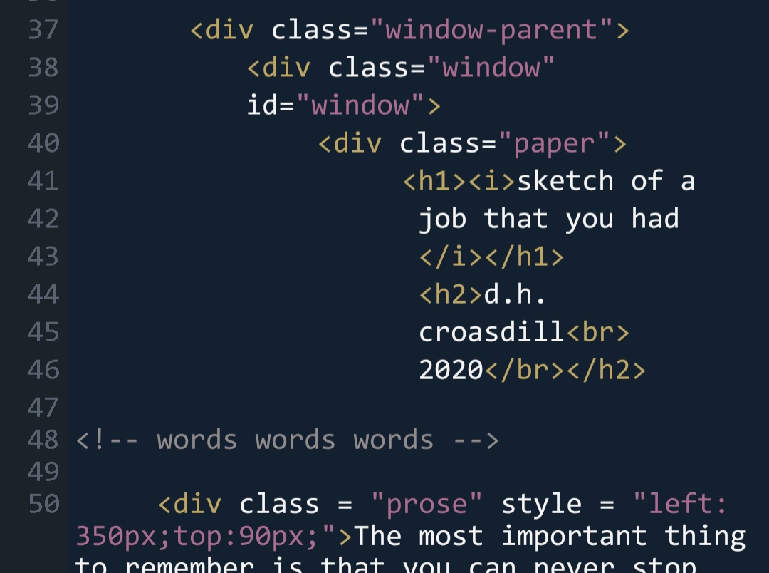
aw thanks nur. i appreciate that coming from you. i made 100% of this on my phone, & everything except the bg image (put an image thru ditherit.com to get that good, crunchy look i love) & the tilt put on the tiles (javascript lifted from Pippin Barr's website & cranked  up) is stuff you can do in html/css pretty straightforwardly. the window itself is a set of three divs nested inside of each other.

the css for that:
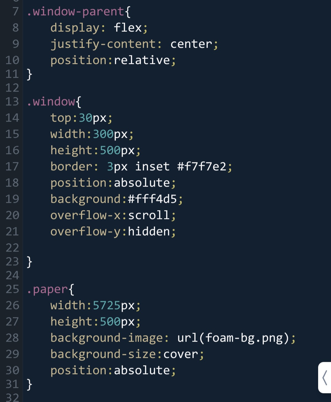
the css

the html:

it's me...... i'm the good dog.........


love how this is constructed & love your message. keep up the great work

damnb that is one hot froggie

i love what you did with the dialog menu, the scrolls are really fun. also, i hope in every screen in the next game there's a shield Otiz can get snarky about.

“in his dream, he gets beaten up by a boxer made out of bones and meat scum.”

best line in the game. i can really see the care you put into the character designs, it's lovely work.

love the distinct character voices! also just the size of the viewport is really neat? having it so small made the contents of the game feel especially charming & intimate imo

what a way to end. it's a pretty interesting cut off, it riles me up into imagining the next two or three story beats, like i just want to play more.

you KILLED me for my opinions on bbq i will resent you forever

i love..... cool cat.......

the level of polish here is blowing my mind. how hard did you work on this? it's astounding how much you got done in such a short time! every one of the background paintings enchanted me.

big agree the devs are clearly geniuses

(1 edit)

this game is required reading in a game design course i'm in & i'd like to report a bug i encountered where i am unable to do a write-up because i finished the game & it made me so happy that i died instantly. five stars.

absolutely wonderful. the only critical thing i could say is that i wanted it to play more of it!

thank you for your amazingly thoughtful feedback. i've appreciated it both here & on so many other jam submissions

thank you so much. there are tens of hours of learning & working & loving here, i'm glad you enjoyed it

(glad you liked it)