Indie game storeFree gamesFun gamesHorror games
Game developmentAssetsComics
SalesBundles
Jobs
TagsGame Engines

ID-Sketch

7
Posts
A member registered Jun 09, 2021 · View creator page →

Creator of

Recent community posts

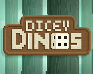
I really liked this entry, not only that the dice showed you what enemies you'd get but also where they would appear. It let me be a bit more strategic with my rerolls. In addition to the gameplay, great job on the pixel art, especially on the title screen and the backgrounds, as some others have said variety in the rooms would have been even better, but with 48 hours, I understand some things just need to be cut. 

The fact that I forgot I was rating games because I just had to beat the last dude, and I wasn't getting the cards I needed speaks volumes on how great this entry is. Fives across the board, excellent job on the concept the art and the creativity behind it all.

huh, I don't think I get it...

First roll, six. Second roll, four. I am undefeated. But also really great art style I really like that a lot! 

I think i got it at the end, But i think a tutorial would have been helpful for me. I liked the concept though and found it interesting. i would suggest though upping the contrast of the enemies against the background, I couldn't always see them too well.

The concept is super simple but really well presented, I wish that there were people just going crazy over my rolls though to hype up the excitement! also I'm not sure if missed something but could i have also used the Black Die somehow?

Interesting concept, the In TV aspect was really cool and well done!