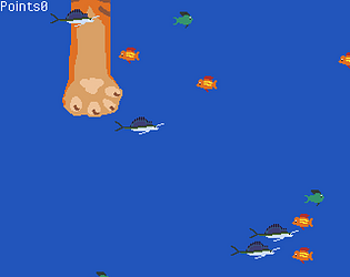
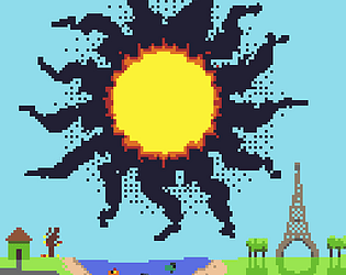
284 is my highscore!
JaimeKurz
Creator of
Recent community posts
I probably learned more in this jam than any other. I spent the day before the jam learning how to create a leaderboard. I used Silent Wolf, which in Godot is really easy to use. It took me 30 mins to set it up initially, but then it took me a couple hours to create a custom leaderboard without getting so many errors.
Self analysis:
This might be the most fun game I have made. It's close to the final vision I had for it, but I would like to add boosters you can fly through to get speed, and some way to regain wax.
I estimate that I spent 6 hours just to code the character controller, probably 8 on the art, 1.5 on sounds, and 4 or 5 putting all the pieces together.
This is the most time I have sent on art in any jam, and it really shows. However, I made quite a few mistakes, and I would like to add more to make it feel cohesive. Icarus is way too large. This led to the problem that people couldn't see far enough ahead to dodge enemies, and there was only so much room from top to bottom. Also the background feels empty. I would have preferred some sort of parallax, like waves and more clouds, to make it feel like it actually occupies space. I'm also not sure that the pixel sizes are all the same. The water used to have twice as large pixels as the rest of the scene, and it made the art feel incredibly incohesive.
I also spent way too long making the water look like water. I was so set on everything being in the same shade of brown, but I should have changed the color sooner. I would love to make a shader that can make any color waves look like water, but I don't know how I would do that. In the end, I made it a purply color, which doesn't fit the color scheme perfectly, but it is pretty close.
I would have also liked to make a better menu, but I had no time left.
The character controller took me three attempts. I looked up the math for airplane physics, and even asked chat gpt for help, but nothing seemed to work. I made my own physics using a staticnode2d, instead of a rigid body, to give me more control. I had the velocity variable, but in the end I realized I needed to create an acceleration variable as well to store forces.
However I should have attached a camera to Icarus, and have him move in the x direction. Instead, I kept his x direction locked, and referenced it from the other sprites. This forced me to put all movement of the clouds, birds and waves in the physics frame, to avoid drifting. (I guess it wouldn't have been awful to put it in the processing frame, because they are only on screen for a little bit.) still, it would have been better to just move their spawning location. On the web version at 60 frames a second, it was really stuttery, so I decreased the physics frame to 30 fps. Not ideal, but it fixed the stutter.
My main gripe with the gameplay, is that avoiding birds is more of an act of luck than skill. I lowered their speed once, but clearly not enough. Same with the clouds. They should move at the same speed as the waves.
For some reason on the web version, there is a gun shot sound. I believe this is the wave sound rapidly decreasing. Even though I set the initial volume to -60, so I'm not sure why it's happening. I use a custom, dynamic volume adjuster to change the sound of the waves based on distance. The built in audioplayer2d by Godot didn't give me what I wanted.
The wind does sound really good though. It changes the pitch and volume based on speed. This is really the only game juice I added.
The volumes of everything need to be tweaked and clamped so you can't accidentally blow your ears out.
OMG the music choice! I love the aesthetic.. The drifting mechanic is so fun, except the map layout is awful for it. The walls are too high to see the character sometimes, and anytime you touch the walls you instantly lose all momentum. Most of the map is corridors, and they are almost impossible to fight in. If those were fixed, this would be the best game in the jam.
You made airplane physics too? Cool! How long did it take you? It took me 6 hours and 3 attempts to get something I actually likes. I love the game, but it is so stutterey and if you go too fast, you just stop in midair, which ruined many of my runs and made diving useless. I managed to get 575 after a lucky placement of obstacles. If you have a downloadable version, I would love to play that!
Of all the flappy-bird clones I've played in this jam, this one is by far the best feeling one to play. It's not too hard, yet I still came away feeling like I could still do better. I tried 30ish attempts, and only got 220 points. The art and sounds are a little lacking, but they help with that retro feel. Super addicting game, top tier!
No problem, and I didn't mean to sound harsh. Just it probably would have been better not to add it at that point. I didn't add any music to my own game because of time as well. Though if you want tips for music to sound at least a little better, the easiest way I find is to pick two or three chords that sound good together, and arpeggiate on them. Depending on the software you use, there is sometimes a way to limit the piano roll to a scale, (ie. all white notes), and that usually prevents the music from getting too strange.
I found this game incredibly difficult. Every time, I would place a point in empty space only for it to be an asteroid later. The distances always felt off. I think the game would benefit from having music with some sort of steady beat to keep time, as I found the best strategy that worked for me was clicking in a consistent, but short, rhythm.
I felt like the mechanics were introduced at a good pace. Feels like some of those laser puzzles, but the sound mechanic was a nice addition. The sound for the last level was too long, I wish there was a way to stop the lion's pattern early. Also the SFX and music were a little bit lacking. Otherwise, great game!
The game looks so much fun to play, but I feel like the actual gameplay is missing something. I'm not sure what it is, maybe the drifting just needs to be tweaked. Maybe it would feel better if you could take out enemies while drifting, but that would ruin the main idea of the game, so probably not. For minor tweaks, I think the respawn time could be quicker, and you should be able to see a larger area when you start so you don't immediately run into the enemy. I like the game, it has a great appeal for marketing, and HUGE potential. Well done
Dang, I got 87. 1 away from 1st place. This game is incredible! For once, I was not frustrated by the difficult controls, but I thoroughly enjoyed them, and wanted to master them. I think the only problem I had was when a rock spawned on top of me, sending me flying in a random direction. I liked the music as well, but each song feels a little too short.


