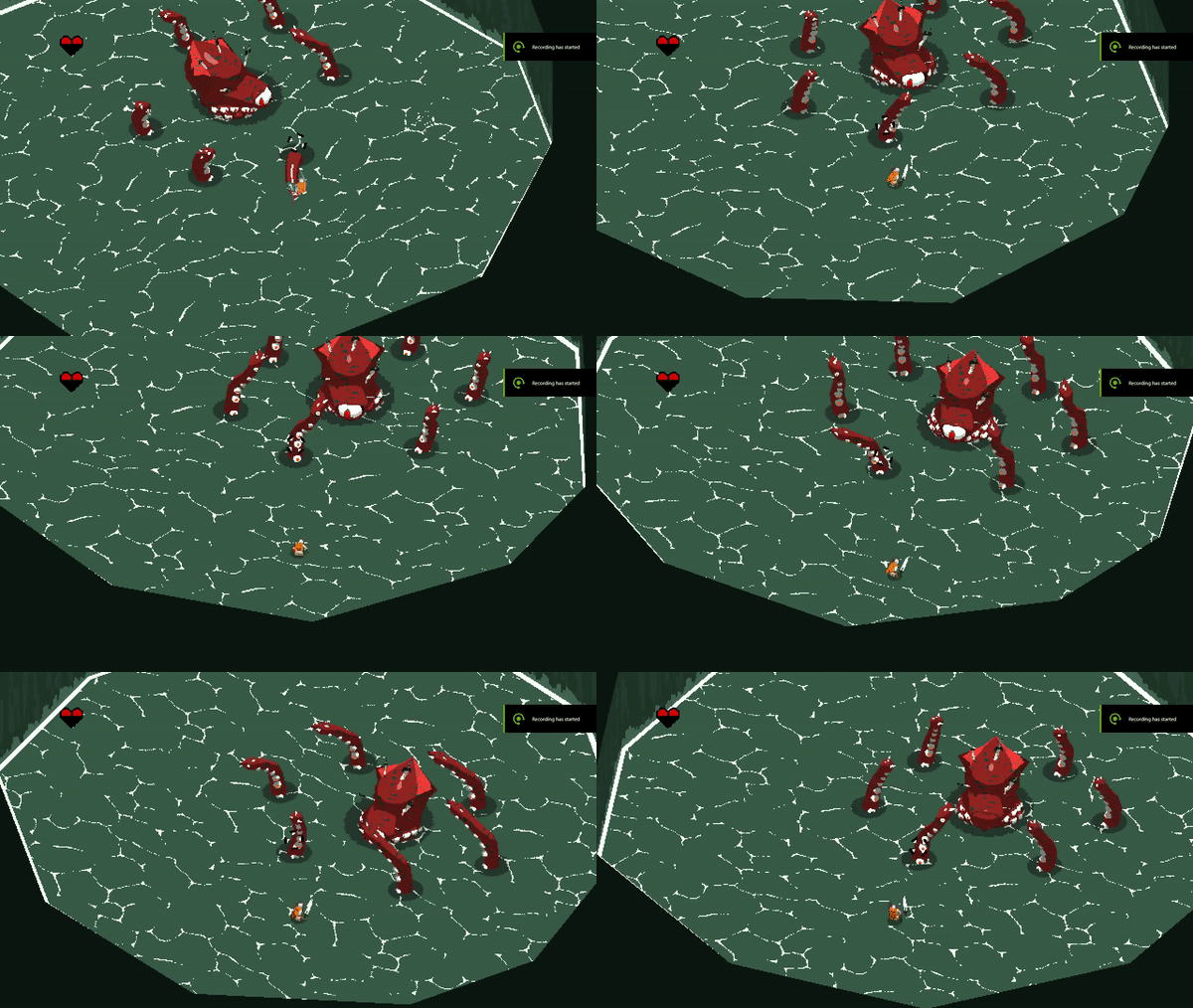
I have only read a few posts. I don't want to just summarize what others say. I want to make sure my thoughts on this game are open and honest and fresh. So if you see some topics or ideas, clearly from such a short experience, just remember I am not intending on repeating or copying. I merely want to talk from my current thoughts.
The good:
Aesthetic:
The art direction of the game is very interesting. I like the basic bitmaps reduced to a single type of squarish pixel, but allowing it to change around a bit and float over edges some. This really enhances the visual aesthetic. The colors are of a muted tone. This tinting of all the colors with a bit of white is a common way to introduce a harmony among your choices. This is important for future boss/areas and I hope that you explore a range of color usages.
The character designs are very fun. I like the minimalism of the protagonist, the stranger and the octo. It seems that the driving concept behind human figures are pointed triangles. I like this and I thought if you are to introduce any other character remain conscious of the theme you have started.
The corridors that are currently available have a wonderful forest element and I love aspen trees so you already have a bit of my heart. The meshing of the tree tops together to make them seem unified is a good choice. I would continue to with this concept into other methods of unification.
The Game play:
The best part of the gameplay so far is the theory. The feeling that I have a chance to defeat the boss, but knowing I have to work for it just a bit more than I'm used to, is an excellent design choice. I can imagine there being a tutorial boss for this game. One were it teaches and waits. DO NOT do this. Leave it just like it is.
The swiping of the sword having a certain amount of damaging frames and a bit of a delay and cool-down seems very effective. I can rely on the delay in the set of swings to count my hits accordingly. I also can mostly rely on the shield. Over all the melee combat is effective and serviceable. I would like to see it flesh out even more, such as parry, stuns, rolling attacks etc.
The dodge roll is, manageable. This is were I start to find it hard to compliment certain choices. 
The lock on system is very reminiscent on the Legend of Zelda Ocorina of time. It has a nearly perfect ellipses that the character follows and the camera rotation follows the same track. All of this is fine. But above you can see what I have discovered as certain zones of influence for dodging.
The tops triangles above the yellow lines are the effective dodge range for when you are not locked. The red cone behind is the effective doge range while locked. This is more representative of the stick zones on my control really but I don't have a good way of showing.
This seems to work fine when I am locked onto the trees. 
It seems that the system breaks when you start fighting the octo. The character hits a weird invisible wall that seems to prevent them from completing the entire action. 
Out of anything I could say is bad, hitting a invisible wall during a dodge is just awful. I would make this one of your main focuses.
The visual design of the game is good. The sound is serviceable but you've already addressed that, its royalty free stuff so I get it. The core gameplay is good but could be even better if you could resolve the dodging issue.
I dont know code, I just play lots of games and have been for most of my life. Also, as far as art is concerned, I have a degree in fine arts and I wouldn't mind helping some of the direction of the game. If you need it. Message me for details.
Thank you for the fun experience. ( Oh and I found and exploit that makes this very easy to beat without taking damage. Ill let you in on that problem/feature if you need to know.)
Have a great day!

