Indie game storeFree gamesFun gamesHorror games
Game developmentAssetsComics
SalesBundles
Jobs
TagsGame Engines

JamesTDG

60
Posts
5
Topics
7
Followers
8
Following
A member registered Jan 03, 2017 · View creator page →

Creator of

Recent community posts

Pretty great work, just a little stuck on the 2nd to last level for this...

(1 edit)

Mastodon thread documenting the problem: https://mastodon.world/@JamesTDG/113133633353101256 (I did end up modifying the image to not have the dark red bars)

So, for some odd reason, running the tool with brave (with all extensions and shields disabled for the site) causes this alignment issue that is too much work to fix in post. This should be looked into and be fixed.

We didn't have time to implement a scoring system actually 

I just released a pack of phone backgrounds in 16:9 format, and it is based on the original card backs you'd see in OG solitaire, plus a few based on the fronts. NGL I do wish I did a better job with the royalty, but there's not an easy to find higher res render of em sadly...
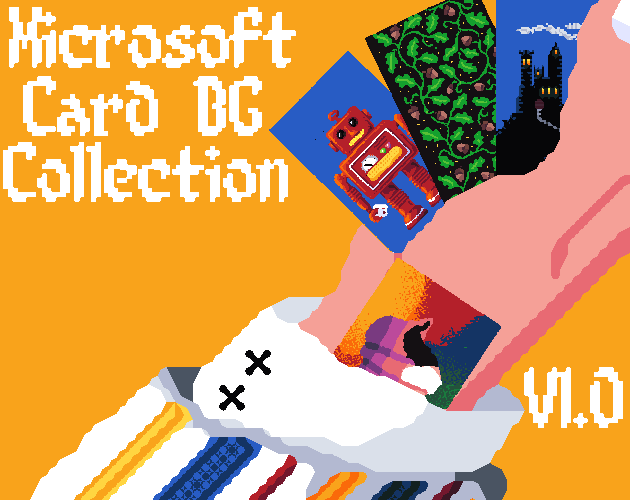

Check out the pack here: 

https://jamestdg.itch.io/ms-card-bg

Yeah I forgot which version this was for, and the file dump I found didn't label the cards right anyways...

(1 edit)

I wonder if you will ever come back to this to work on the other cards, I'm busy making phone BGs based on the cards seen in 3.1 solitaire and yet I am struggling to read some cards...

Yeah I kinda just bought Crocotile and it is doing the job way better 

Sure, pick one on my linktree https://linktr.ee/Jamestdg

hear me out, what if the open source version had the music taken out? It could be easily reintroduced once an agreement is made between you 2. 

I'm down for helping with the writing and world design

Honestly, if we were allowed to, we would have used mouse controls. We honestly tried our best to mitigate it using the gun star heroes control scheme

I think that may be the best option 

We really should have the player collide with the cubes, otherwise I can't make my favorite level from portal flash. Again, we should have the hitbox work as a pentagon.

Sounds like a physics bug, could prob be fixed easily if the hitbox were like a pentagon on the player

If you need one, lmk

Are you gonna update the version on the TIC 80 site?

Using Steam version 4.0, latest build. 

Simply put, the tool is just not accepting whatever tilesets I attempt to import, including the ones I made specifically and even just random images as a test. Nothing shows up and I cannot even get started with this. 
I have followed all basic troubleshooting steps, including but not limited to relaunching Blender, reinstalling the plugin, and rebooting my computer. I seriously do not want to have to use an older Blender build just to use this. 

So wait, this is p much the stop n swop on crack, isn't it?

If you do want to make a legitimate port, may I suggest attempting to mod Faceball 3D to be Wolfenstein and work from there?

Seems interesting, but I'm not getting anything good from it

Damn, looks like I gotta pay for the engine then...

Is there any way I can get this game to launch in retroarch?

If you are still in need of a guy for graphics and already have a game idea, I might be able to churn out some stuff for you

The point is to see the new features, not just experience the same old game that I already have ripped from my dad's floppy, an index (probably the ONLY headset kit I will invest in) still goes for over a grand and needs a LOT of open space to work with. I can't afford either at my current state.

(1 edit)

It would be interesting to have a spider demo event for this, same with 10,000 years of evolution. They definitely have some epic designs that could span into a larger roster if you need to. 


Edit: original character idea: Afro Demourai. Literally just a spoof on Afro Samurai, lol. Haven't watched the show before to flesh the idea out 

That is something I definitely want to see happen considering I didn't get a chance to get my hands on the other 2 games, mostly because I had no knowledge about the games...

FarSky community · Created a new topic Thanks

Thanks for taking the time to upload it here. This was an amazing game that really deserved to be enjoyed by everyone, even though it is in a postmortem state. I still own and occasionally play my steam copy of the game, but I'll make sure to nudge people over here if they are interested in playing. Before I forget, is this an open-source build or not? If not, it's kinda a shame, I know there are many of people who would want to see how much further they could bring this orphaned game.

(1 edit)

Downvote me if you wish, but we need a blatantly visible play button on the menu, my dumb ass can't figure out how to see what this has become

So, the game does not adequately teach me how to play, and it is next to impossible to do so when the enemy EVERY match is literally making a b-line to my front lines, I've tried a lot of things, such as shoving my adversary small nations to slow em down, but every time they still break down my door before I have a good enough defense. This game is just too much of a pain to be worth getting into.

So, I ran into a couple of bugs:
1. I cannot seem to continue a campaign when a country "triumphs"
2. The tip boxes do not fit in the screen when not in full screen

Spider wall, spider wall, does whatever a wall can do

I kinda wish there were graphics for these animals, would be neat to see what cursed creations could become of this

Would be neat to see Aliensrock try this out

Yeah, I think flipping would be neccessary. I guess the only way to resolve my problems with the zoomed out issue would be to make a PicoTron port that can allow for a larger screen size. Also, yes, my first experience with this game was on Mobile rather than PC

This is a pretty nice AoE clone. I just wish being able to read what certain units were doing was easier, enemy units were more obviously labeled (perhaps a red outline?), and that I could retreat units from combat rather than then remaining in it despite my orders.

I think having a muted dark green with lime text can fix the page, the other bit is more tricky, all I can say is use darker colors

(1 edit)

My eyes actually hurt from looking at this, can you please change the colors to be something that doesn't make me cry blood? (Both the page UI and the game itself)

It's probably a difficulty curve situation. I'm a rock band unplugged and Tetris addict...

Also, yeah, I think a difficulty toggle could do nicely here.

Looks and plays well, but man does this feel too easy...

Pretty cool, hoping this gets an update to be playable without VR so I can experience the retools without wasting a lot of money on a headset...