This one issue was a serious design challenge for me.
The problem is, I didn't want to make stalling a good tactic, but neither did I want to make a ramping difficulty by making more characters appear, as due to the aesthetics, when a lot of indicators appear, the visual clarity is quite poor (definetely something I would work on once the games are unlocked for edits).
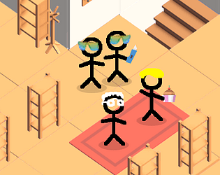
The reason why I didn't make an indicator on shelves was the fact that the player has to specifically pay attention to everything that happens on screen at once, even if there is no "hurry". I really wanted to avoid a fetch quest feeling :b
Thank you for the feedback, I may try to add some "shelf full" indicator to solve some clarity issues!
janus1001
2
Posts
1
Followers
A member registered Nov 05, 2018 · View creator page →
Creator of
Help your grandma by buying her ingredients for cake. Beware of mafia.
Adventure
Play in browser


