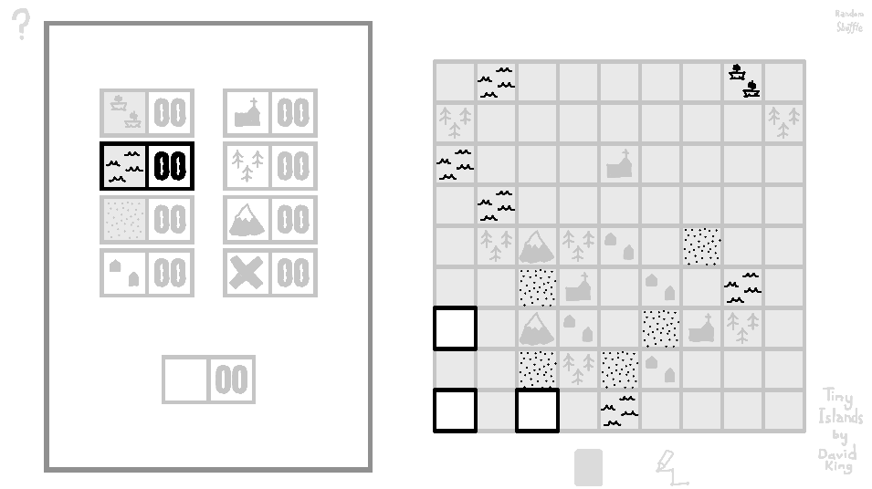
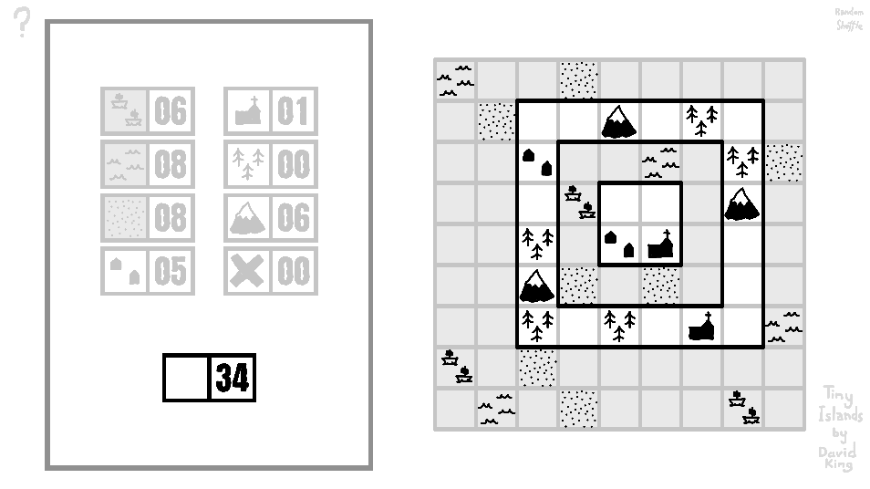
i like the new churches. this is closer to how i first assumed they worked. i think it makes more sense and plays better.
jukebokks
Recent community posts
Some feedback from my friends and I:
The Good
Its a lot of fun to surround mountains with forests, knowing you'll get two big point boosts.
I love having a choice that seems equal, but choosing one tile over another in the hopes that the perfect card will appear and bag me some extra points. For example placing a forest that almost connects two forests for instance and then having another forest appear that lets me connect them and rewards my optimistic thinking.
Houses are great! They give this extra meaning to every other card, tying everything together and rewarding you for careful placement. Fantastic design.
I think having only two cards which each give you very restricted choices is right. I was worried at first that this game wouldn't be as relaxing as the art style and concept suggested, and I think without this heavily restricted choice it might be. If my islands don't work out I don't feel stupid - the deck just wasn't stacked in my favour.
The Bad
Some of the rules were unclear. All my friends and I were unsure of "near" and forests "touching" when we first played. The boats also still confuse me. They don't care about diagonals as much as you think they should.
My friends and I have noticed we often have two nice islands and finish the game by drawing an empty and sad third island. It's a strange feeling to end the game like that. Maybe making the islands smaller would force you to use the third island more often? Or maybe just letting the player skip drawing a third island would solve it.
Check out this zero point boat. The gray search area filled up the board, but it didn't show any points.


