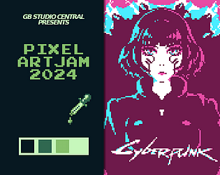
Wow, thank you so much! I haven't done art for a GameBoy before so it was definitely an experience.
karhuthebear
17
Posts
1
Following
A member registered Oct 05, 2024 · View creator page →
Creator of
Recent community posts
GB Pixel Art Jam 2024 Submission jam comments · Replied to TerranAmbassador in GB Pixel Art Jam 2024 Submission jam comments
GB Pixel Art Jam 2024 Submission jam comments · Replied to ChunkySteveo in GB Pixel Art Jam 2024 Submission jam comments
Homework Havok [GB Pixel Art Jam 2024] jam comments · Posted in Homework Havok [GB Pixel Art Jam 2024] jam comments
Color Inflation - GB Pixel Art Jam 2024 - vezemo jam comments · Posted in Color Inflation - GB Pixel Art Jam 2024 - vezemo jam comments
GB Pixel Art Jam 2024 Submission jam comments · Posted in GB Pixel Art Jam 2024 Submission jam comments
GB Pixel Art Jam 2024 - Date Sim jam comments · Posted in GB Pixel Art Jam 2024 - Date Sim jam comments
GB Pixel Art Jam: Watercolor by Crab jam comments · Posted in GB Pixel Art Jam: Watercolor by Crab jam comments
GB Pixel Art Jam 2024 submission! jam comments · Posted in GB Pixel Art Jam 2024 submission! jam comments
Gloomy Night - GB Pixel Art Jam 2024 jam comments · Posted in Gloomy Night - GB Pixel Art Jam 2024 jam comments
GB Pixel Jam 2024 /Stranded on the Phantom planet comments · Posted in GB Pixel Jam 2024 /Stranded on the Phantom planet comments
GB Pixel Art Jam 2024 Submission jam comments · Replied to NathanLurker in GB Pixel Art Jam 2024 Submission jam comments


