That is pity, because i think that will "scare" a lot of people hire on itch.io . I don't know how much peopley downloaded your game but if you make "lightweight" version it could increase this number
Klogner
Creator of
Recent community posts
So my few coments about this game:
1) you should distribute .zip instead of instalation package (if GM2 allow that)
2) i like your graphic, good job done
3) whole game is really confusing, you should focus on improving this so more player can explore your game. You should tell player what to do and is goal. Map is good start but make it open somwhere around "WSAD" so you can open it when you fly and check if you are heading right way
4) i had problems with camera, it's hard to fight where you need precise controll but camera is "randomly" changing. Make camera more "static" in slow speed and then you can move it when player gain speed
5) faster travel, you should implement some "boost" to travel between planet, it's booring to wait until you fly that distance
6) i'm not sure about reloading, first i think that lower ammo you have, faster you reload, but then i realized that i reload faster if i'm moving and slower when i'm statit, that is really wierd
7) also i had problem when two interactible entities was near each other and i could "highlit" only one until i move in some precise spot
But beside this you game look nice on first look, i only managed to play it around 5 minut, then i was demotivated to play more because i didn't know "what to do and why"
Few tips:
1) Don't make instalator for those small indie games, noone want to instal "something" when they just want to try it + windows is trying to report it as virus
2)I like idea of small fast paced map with lots of ideas, but ... you maybe want to create "hardcore" experience, but please add things like treshold for jump after you "leave" ground (make 5 pixels wider collider than actual image) and walljumps works wierd because you jump further than with regular jump and also try to make them more "sticky"
3) Pixel graphic looks nice but some sprites don't fit it, like doors or spikes, also made UI more "pixel"
4) Main menu is funny when you need to jump instead of clicking, but i'm missing some level selection (i don't want to play it all again every time)
5) You should made some "tutorial" or hints how game work, noone know that there is wall jump or what watter do to you
I found some things that need atention:
1) i have random flickering in game (GTX 650 Ti, but i can run 95% strategy game without problem)
2) rotation (with middle mouse button) is too fast and there is no way to set it to original position (like small "North" arrow somwhere on the screen)
3) when i want to build some building it shows me "you need to place it on road" (or something similar) but it overlap description, try to move it a little bit
For now (early-early acces) you can distribute just .rar (or .zip) of your files. I don't know what engine do you use, but Unity for example compile everthing to single folder, so you just "zip it" and post it hire. Trust me, instaling something from someone you don't know is not good idea. Also you can do web build and upload your game directly to itch.io so anyone can play it without even download
Nice to see some space strategy, you almost done basic of your game to be playable. But i would redesign UI, now it's looking like 1990 game, i would simplify icons and gave them uniform look, also screens like research have really anoying background so you focus more on background than on information displayed. In planet overview you should add hints about how resources are produced, like +1 100 credits (+800 mines, + 400 taxes, -100 fleet maintence) and same for those % stats. Also ship building should be improved, listing through list of weapons isn't fun, i love how they done it in Stardrive 2, but that would take some serious time to implement.
Anyway, i will folow you for your future improvment, keep working you are on good way ! :)
I think that lowpoly graphic and those shiny effect dont go very well togeather, i would recomend to switch to more carton look like "Train valley 2". And for the trailer, i would like to see some UI when loading train (like how much cargo it loaded), your game don't have that beautiful graphic that you can focus only on "cinematic" video. But music fit this video really well and those "cut" with train movin along the camera was cool !
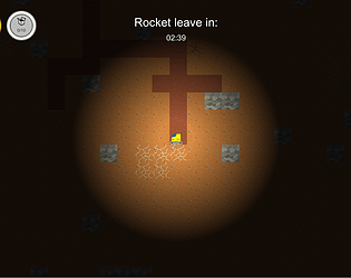
Hi, i'm also starting developing similar game, so i'm glad that i can play your game. I have few sugestions, first the movement feels really wierd, accelerations for vertical movement is really low i think. Next is graphic, i know that you want something like pixelart but textures of tiles making me sick when moving, i would sugest to make them more "clean". I also found that pressing "enter" on my keyboard don't close any menu (when clicking on close) (but mouse can do this) :D Idea of building that structure is great ! that should be main motivation and plot, that you unlock new upgrades by reciewing more data with upgraded structure. Also you could add some way to remove stones, like they could have 10x more HP than regular block. And mayby work on some balancing that would encourage players to dig also into sides. But anyway, keep working, world deserve more games like this ^-^


