On Sale: GamesAssetsToolsTabletopComics
Indie game storeFree gamesFun gamesHorror games
Game developmentAssetsComics
SalesBundles
Jobs
TagsGame Engines

Kygron

25
Posts
78
Followers
A member registered Aug 06, 2020 · View creator page →

Creator of

Recent community posts

Nice game, lots of complex interactions with the dice and breeding available early on.

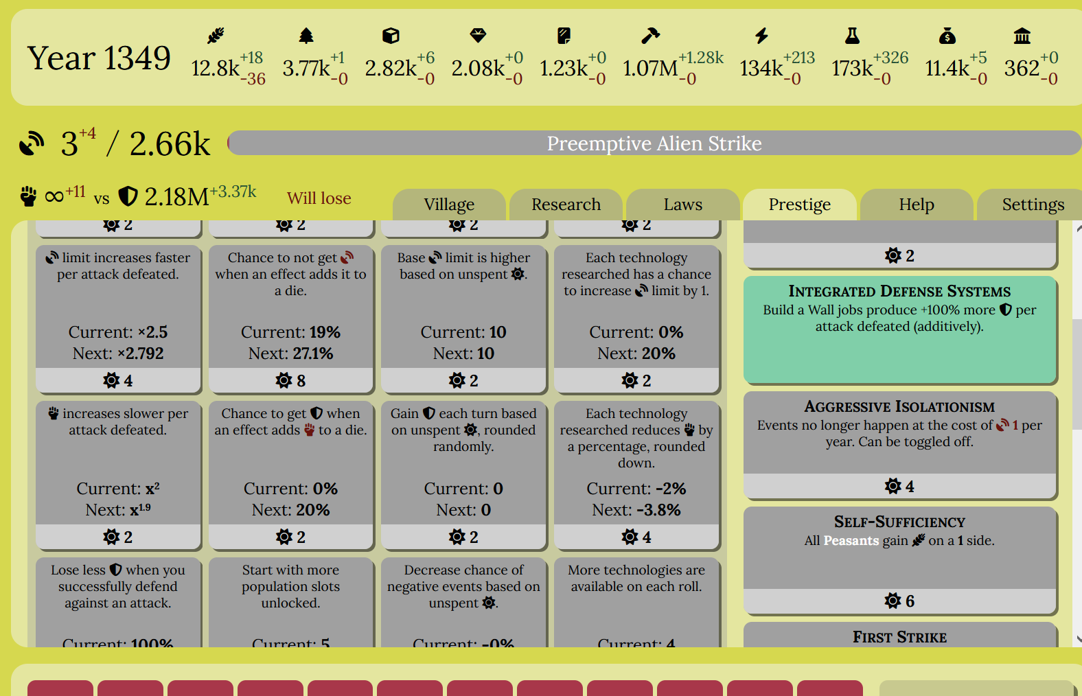
Prestige, however, needs some work. I was able to reach end-of-content on my third play through (plus two failed attempts). For that, I get 25 prestige, nothing close to the 128/512 I need to access the true end-game. So rather than being a continuation mechanic, prestige does nothing but hold me back. Why can't I play to the end if I'm successful so far? Do I have to grind now, even though I haven't had to so far? Why isn't there a "bad" ending, even a one-screen congratz, with a restart adding something new to play with from the beginning? This game doesn't actually need any of the repeatables, except one or two that could be one-offs.

I did like the main game, though, so maybe i'll grind to see end-game content. It's just a pain to be forced to play a game a certain way, especially when the presented challenge is to get as far as you can. If you want people to fail (and prestige) a lot, you have to make the challenge harder but also more compelling.


My end-game (second alien attack):
I haven't had this problem, but I did check the performance. It looks like most of the time the CPU is drawing numbers on the screen. Imagine if all the numbers you see on the page were updating as fast as the guide when you're watching one bar fill up. 

For most people this won't be a big deal for this small game. I will try and avoid this in my next games, because I probably want more numbers on-screen. If you know anything about css, you can hide all the numbers you don't care about and it should go faster/cooler, but I can't really test it because my computer runs the game too fast to tell.

Sorry for the trouble. Thanks for the feedback!

There's a "you win" screen for end-of content, so you haven't reached it yet. You probably need to build more to unlock final buildings

I used the first reset to activate the star and never touched the planet again.

Glad you liked it! And I'm glad your existing tools worked. I'm using web technology for the graphics, without otherwise forcing color schemes and such. With a larger team I'd get screen readers and the like to work as well, but for now it's good to know that this is working without much additional testing from me.

Most of the issues you mention were intentional to give the game more of a puzzle aspect and/or challenge at the end, without making it tedious. But I agree there's a lot of room for improvement there, and these comments have helped. I'll need to get lots of people to help test if I do a longer-form game. For a short one like this, there was no time for refinement.

I'll keep this idea on my list of longer games to make. Though my amount of time for development is uncertain at the moment.

The game is a browser screen, it's itch.io's interface that's poorly planned. In Firefox, once the game is started, I can right-click and select "This Frame -> Open Frame in New Window" to get the result you're looking for. There should be similar options in most browsers.

Yeah, we all struggled to handle the theme, and most games seem to be at a disadvantage because of it. But mine was inspired originally by the theme, so I can't complain much.

There should be a "Hard Reset" button at the bottom. It deletes your saved game, so you still have to refresh to restart the game, or it will autosave like usual on a ten second timer.

But you probably don't want to reset. There shouldn't be any stuck situations (send screenshot if you actually get one). And the game is short, an hour or two so if you're active.

thanks! glad you liked it!

Thanks for the considered reply!

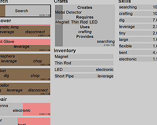
I find that a lot of incrementals are about waiting for numbers to reach an arbitrary point and then being disoriented by a bunch of upgrades before being forced to "prestige" which is really a downgrade. So I switch it up with progress bars, "crafts", and other more concrete or lifelike situations, and fit them into the incremental model.

I like a lot of your concrete suggestions. I can always use interface suggestions. I'm seeing from comments that this could be a good long-form game, and adding features like dismantling would make it a lot easier on me, preventing the need to analyze skill unlocks to avoid soft-locking the game.

For the theme, I really wish I'd added the text "Capped at 1" on every item. People didn't associate "unique" with "1". The game was designed around the theme entirely, I didn't even have an idea for a game before the theme came out. I didn't want to play with some math to make the skills appear as if they were capped at 1 without it affecting the mechanics. I did it with the progress bars, and now you can't tell how long something will take. Every button caps at one to the detriment knowledge, but that isn't enough to count for the mechanics-based theme? As a long-form game, you better believe there would be 10k screws and 5k metal plates to craft a "chamber" or whatever. I just have to remember to spell out themes for people, my interpretations are too unusual.

Ok, sorry for that bit of rant. I do appreciate the feedback and I'll look for someone to look over the interface before I post my next game.


Thanks for the support! You can retry for a better time now that you know what all the junk does, but yeah, random search doesn't actually add much replayability. Please check out my other games on itchio, or from the links in discord channels for the older ones. I'll try to make more eventually, but I'm not a professional game dev (yet :) ).

Thanks for trying! I had mobile in mind, but I forgot to actually test it on a device. Glad it worked!

Evil Grin.

(We applaud optimization, but remember to have info and constraints first or it's not effective. Did you get a final time and then replay the game? Even though it's random I bet you did a lot better the second time!)

Thanks! I'll consider a version2 but I have other ideas to try out first.

Sorry about the OCD trigger.

The MRA is part of the hidden tutorial that teaches you that you can lose a skill if you craft it away. That would have been more significant late-game, but the challenge of balancing while preventing a locked game was more than I could handle for this short game. So it ended up less of a puzzle than I intended, but no one should ever be locked out by missing skills.

Thanks for playing! I'll be more careful with balance in the future.

Interesting game. I liked the concept of the charge matrix, but it ended up more of a burden to the gameplay. I either clicked way too much, or ignored it, there wasn't a good balance.

The theme caused problems with this design as well. I'm used to a box filling, say 75% and stopping to mean that my strategy is good, but if it only fills 25% before stopping it's bad. Inverted, the bar fill 2% in both cases, and then is suddenly maxed when you hit the right button. So you don't get feedback, and the charge matrix is useless unless each cell is at 0.998 or better. And later it was hard to tell if I even got it right, because multiple boxes would fill and autocomplete and all stay at 2%'s.

Choosing the order of upgrades could be interesting. At first I thought it was a bug that research point cost changed inconsistently (or rather, didn't change once chosen, making the order matter).  Makes me wonder if there wasn't another weird feature I missed? It wasn't in the info screen. But concentrating on research cost meant I didn't pay attention to anything the button did. So by the time I had 2 charges there were too many upgrades to re-evaluate (and the charge is different on each), and you lost me to arbitrary clicking.

plus, the scroll bar didn't work (and I couldn't fix it in css), so I don't know how far I got or what the benefits were.

I would have like to play til the end, but I knew less about the game the more I played.

You can make it full screen with itchio's button in the lower right. The game was designed to work at any size.

It's funny, when i did click to progress, people wanted auto-click. When it was a pain to hold the mouse there, I went with a single click to auto-progress. Now that's not enough either and I guess I need auto-play?

But seriously, there's only one button in the game that stays where it starts, and that's "Search". There are early bonuses to speed, and later in the game there is auto-search so you don't even need to click it. So progress is there. I'll continue to work on balancing this sort of thing in later games. Thanks for the feedback.

No big loss, you have to get used to resetting villages if you want to play the game anyway. It'll be faster and easier the next time

(2 edits)

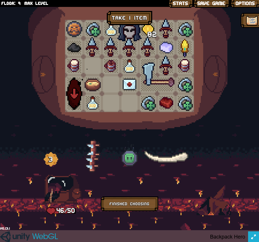
Beat the final boss without taking any relics, because they didn't help the build. Maybe a bug report?: The cursed whetstone consumed all my energy, activating multiple times.


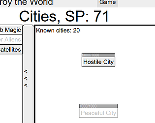
You can "Absorb Magic" to make it faster, or get some "Laser Satellites" and leave the game on overnight. If you can't get the SP,  you should explore more of the game. There are plenty of ways to get lots of points fast (as you just found out).

Yeah, minor design bug at the beginning of the game for anyone who doesn't read first. If it's your first or second village, you should restart and avoid the bug. The full game takes about 30 villages, each easier than the last. So you haven't lost much effort.

talk to leaders, activate technologies, ...

You did nothing wrong. But you don't start from scratch. The town's bonus to villages is resource income, which provides a big boost to initial play. Check it out in the preview (hover on the values) and increase it before starting the village if it's not to your liking. If it's going slow, let it idle a bit and spend the surplus all at once, there are no resource caps, only requirements. Thanks for playing!