I wanted to get something out for the demo day, so I missed certain features like a continue system, which would have been very helpful.
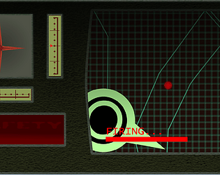
Balance is something I am looking into, the hitbox is slightly smaller than the circle but still may be larger than I want it to be (8x8, I forgot to adjust the sprite to match). IIRC touhou's uses a 4x4 or 5x5 hitbox depending on the character, but also the game region itself is wider which allows for more room to move in general. I'm still experimenting with how large I want the game region to be, at the moment I think it may be slightly too narrow, especially when I compare to to other games like Dodonpachi or Hellsinker which may have a region that looks narrower, but in reality the game region is wide but the camera is zoomed in so that you do not see the full horizontal size.
Thank you for the input!


