Indie game storeFree gamesFun gamesHorror games
Game developmentAssetsComics
SalesBundles
Jobs
TagsGame Engines

Michaelabruckner

21
Posts
7
Topics
A member registered Jul 15, 2022 · View creator page →

Creator of

Recent community posts

Hi there, I am very sorry for my delay in responding to you. Something came up and I had to push this task back. Here is my feedback for you:

Create world:

  • Tutorial world> The instructional video is useful, though I would recommend adding arrow keys so that people can scroll back through the key instructions if need be.
  • I do not understand what the screen next to the instruction video is for. Once the tutorial is done, you need an indicator that will send the player back to the main screen - or wherever they need to go next.
  • The 123 keys didn’t work for me so I couldn’t change any objects that I inserted.
  • Overall confusing what I am supposed to do after watching the key tutorial – where and when do I start building and how do I get away from the tutorial page…?
  • I couldn’t get back to the main menu from this tutorial page. – I pressed the esc button which worked. I would prefer a visual button on the screen so its clear.
  • Sorry, I haven’t done much with this part of the game. I explored the create game options but them I was a bit stuck. I felt I had limited accessible mechanics and I didn’t know what to do so I left it there.
  • Arrow key and zoom navigation – I feel that this could be faster.
  • Overall, the buttons are hard to use, in terms of how to interact with them and what to use them for.
  • I would recommend decreasing the number of blue buttons at the bottom that are used to create the pieces. Its overwhelming and not demonstrated enough to be used immediately. (I have explained more on this below). Perhaps you could simplify and then make the player unlock more of the options later – once they level up and slowly reveal more options. This will let the player get used to the basics and then you can add the extras later (e.g. the effects).
  • I was stuck on this page with no where to click in order to “load a world”. I tried clicking on everything, but nothing happened.
  • If I need to create worlds in order to load them then I would recommend telling the player that they need to create worlds first. You could even block that button (stop the player from accessing the page the button leads to) until they have created at least one world.
  • Overall, the game needs more explanation of how you play it. Everything is written out very well, however, most players will not actively read and remember everything. You need step by step demonstrations and activities so that the player can slowly get the hand of it. It would be great to provide the player with a demo map to play with that you have created. Then then can understand the mechanics and see an example of what they can create. If you give someone all the power, then they are left with too many options. But if they see great examples of the fun that is possible to be created with your game then their mind will start exploring ideas of their own. 

    Load World:
  • I was stuck on the "load world" page with no where to click. I tried clicking on everything, but nothing happened.
  • If I need to create worlds in order to load them then I would recommend telling the player that they need to create worlds first. You could even block that button (stop the player from accessing the page the button leads to) until they have created at least one world.
  • Overall, the game needs more explanation of how you play it. Everything is written out very well, however, most players will not actively read and remember everything. You need step by step demonstrations and activities so that the player can slowly get the hand of it. It would be great to provide the player with a demo map to play with that you have created. Then then can understand the mechanics and see an example of what they can create. If you give someone all the power, then they are left with too many options. But if they see great examples of the fun that is possible to be created with your game then their mind will start exploring ideas of their own.

Sure thing :)
I will be able to start from the Tuesday 27th onwards.

Hi whats up

Really sorry about the late reply. I am running the game on windows 10.

(2 edits)

Hi, I tried playing your game Below the Oak and this is my feedback:

Below the oak game test feedback

  • Hard game to play with almost zero visibility
  • Uncertain about key controls. I can only move with the arrow keys but can’t fight.
  • There is a sign at the start which I cant see because its too dark
  • I can't find where to go or any way out.
  • You may need a flashing light warning somewhere. When I kept loosing health there was a constant red flash.
(1 edit)

Yes. Here is my feedback:

Airplane – Game testing feedback

  • The first time I tried loading the game in browser it didn’t load even after 5 mins of waiting. I refreshed the page and it loaded fine after that.
  • The music is very loud, I had my volume up halfway and I had to turn it down to about 10/100.
  • There are so many bold colours being used for everything that I can’t focus too well. At least when the game is not being played you could add a dark overlay to the background colours. This well help the buttons and text be more visible.
  • The colours used for the city’s reflection are better than the main colour scheme.
  • I would recommend adding spacebar as a pause button.
  • Once the missiles are in play then its hard to continue the game for too much longer. Perhaps you could add more elements into play e.g. abilities, powerups etc.
  • Its not fun it it’s the same thing over and over without any sign of change. E.g. after you last longer than 50-100 seconds something could change.
  • I think the hearts/lives should be placed on the black area where the pause button it.
  • Is the smoke supposed to come out of the plane when you loose lives? I don’t think it happened the first few times I played the game.
  • The pause button colour scheme doesn’t match the rest of the colour scheme.
  • The text in the settings menu is very hard to read, especially because the city is a dark grey colour.
  • All of the buttons are in different places for different menus. It would be good to have a consistent place that the player unconsciously knows that it is going to be e.g. bottom right o middle of the screen. And don’t have the buttons right next to the edge of the screen either.
  • It would be great if you gradually increased the difficulty by increasing the speed.
  • If the plane is flying through the air then the smoke should reflect that by moving left behind the plane (not up).
  • In the shop, the plane you have equipped should be the first one you see. Even after I buy another plane then the blue and red plane is the first one I see.
  • You need more elements that will make the player want to play for longer e.g. achievements.
  • When on the main menu, the small text under the title could be improved and made more prominent. Make it bolder and more comedic.
  • I like the fact that you can make the plane go off screen however I would advise only allowing half of the plane to go off screen. On the bottom of the screen, you can go all the way off.

    Of course, these are just my thoughts and opinions based on my experience. Totally up to you what you want to pick and choose from this :) Hope it helped

Hey. I have done some testing and got stuck at a bug.

Please add me on discord so that I can send you the doc.

Thanks a lot for inviting me to be a part of your project. I don't want to stretch myself between too many projects, so I'll concentrate on the first two requests for now. Once I'm done with these, I'll give you a shout. Feel free to add me on Discord (username: NarraDes) to stay in touch more easily.

Thanks again!

Will do! I will get on this today or tomorrow :)

My Discord handle is NarraDes. Feel free to add me so we can continue on there.

Sounds great! I will have a look at it tonight or tomorrow.
My discord handle is NarraDes. Lets chat more on there :)

(1 edit)

Hey there!

I'm on the lookout for an awesome project to jump into and lend a hand with testing. Got a few hours to spare every week and ready to dive in right away! I'm super excited to gain some hands-on experience and beef up my CV with some real-world projects. Let's do this!

P.S. If the project is 3D then that would be preferred but either one is great.

Hi all!

I am available to game test for a couple of hours a week. Let me know if you need help for your project! :)

Discord: NarraDes

Hiya, I'm interested in being a play tester if you still need help. :)

Discord: NarraDes

Hello fellow creatives, I am a recent grad who specialises in character animation and hard surface modelling.

I am looking for a project that I can do for a few hours a week and gain experience that will help me find an entry level job in industry. If you need some 3D models made for animation/games projects, I would be love to participate :)

Hi all,

I am available to make any 3D assets and animations you need for a  game. Character, prop, environment, you name it! I would love to collaborate on a small project.

I model in Maya. Texture with Maya, photoshop or substance painter. And can export  my work to the GDs to work with in Unity or Unreal.


Please contact me on with this email: Michaelaibruckner@outlook.com

Take a look at my art station for my art work or itch to see my previous games.

 https://www.artstation.com/holeysock

https://michaelabruckner.itch.io

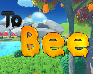
To Bee

https://michaelabruckner.itch.io/to-bee

To Bee


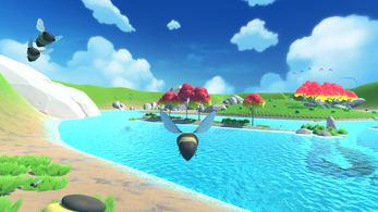
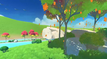
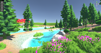
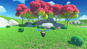
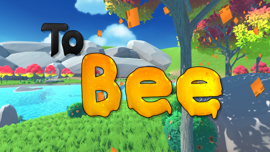
To Bee is a game within the zen gaming genre, made at the University of the Arts London as part of a collaborative project.


Players are put in the position of a bee who is determined to rejuvenate the valley it calls home. Due to a hurricane in the night, the bee awakes to find the landscape barren.


As the bee, you must collect pollen from flowers located around the environment and deliver the pollen to the beehives. When this happens, you will be rewarded by getting to witness the regrowth of the environment. 


We hope you enjoy exploring the environment, discovering the different foliage areas, exploring ruins, and reviving the valley. And most of all, relax and enjoy the experience. As a collaborative project all members worked incredibly hard to put this project together, we really hope you enjoy the final product. Thank you.


To Bee community · Created a new topic Game Release

After a lot of hard work, the game is finally released. Hope you enjoy!

To Bee title page

(1 edit)

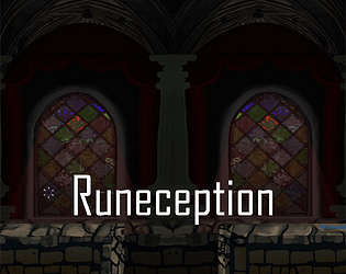
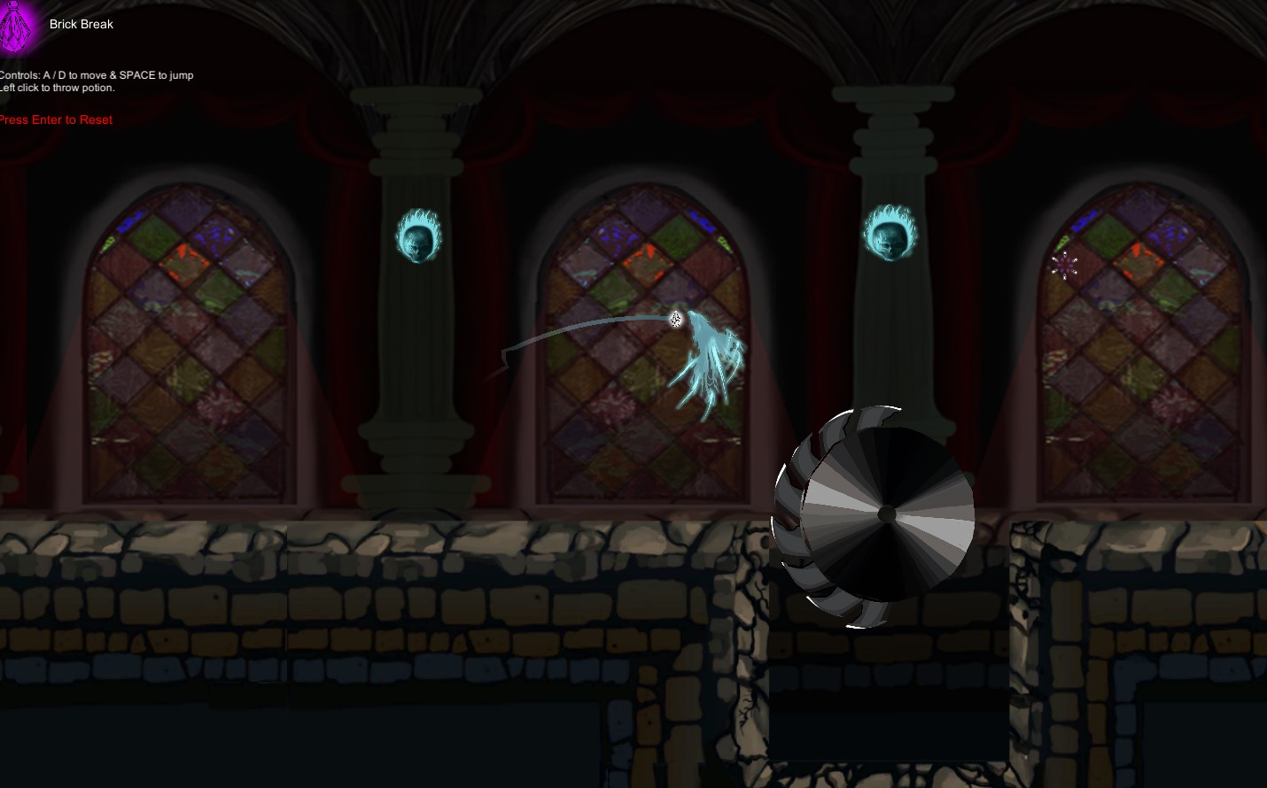
Runeception

Play the game now: Runeception by StevenRoweGames, Michaelabruckner (itch.io)


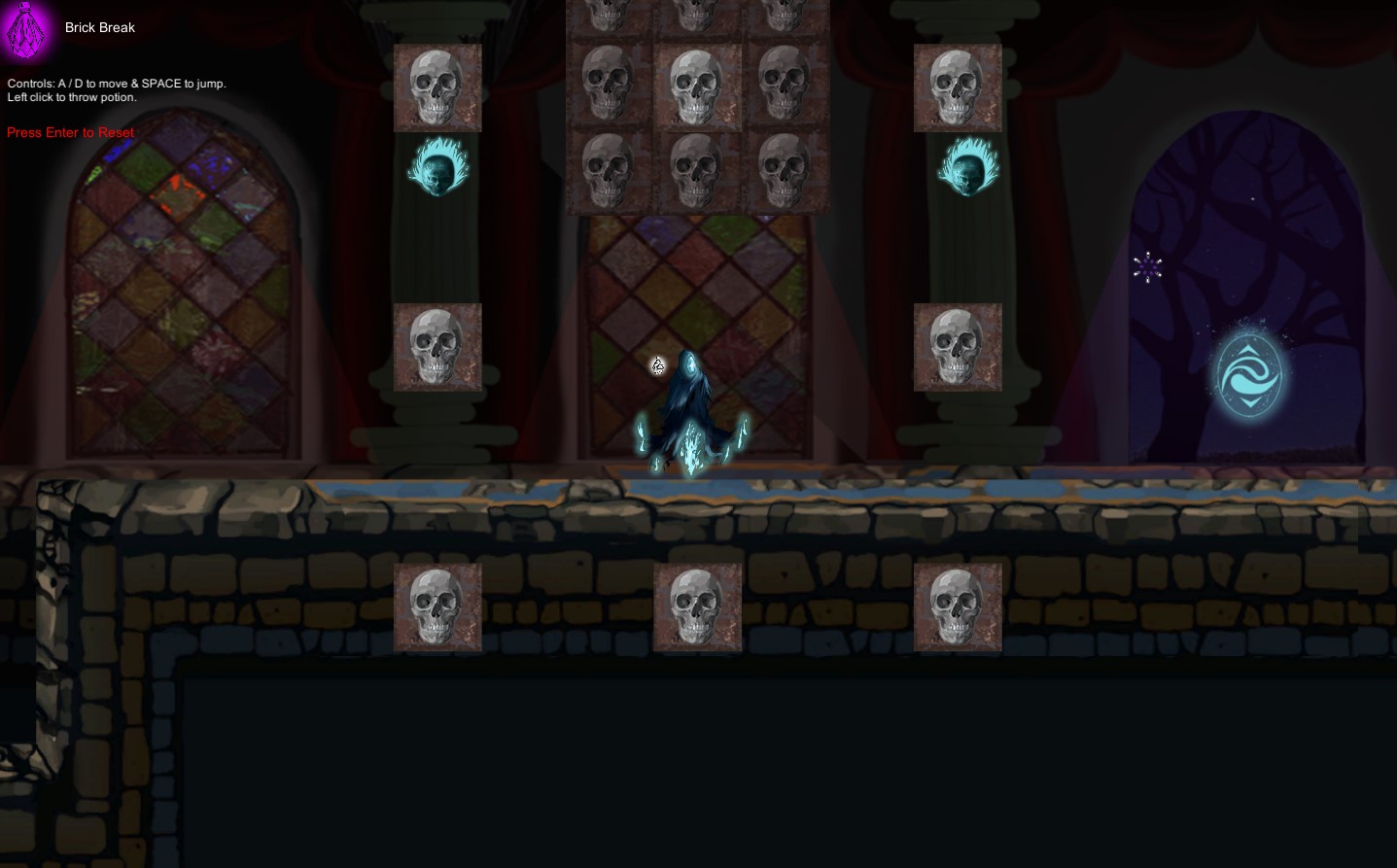
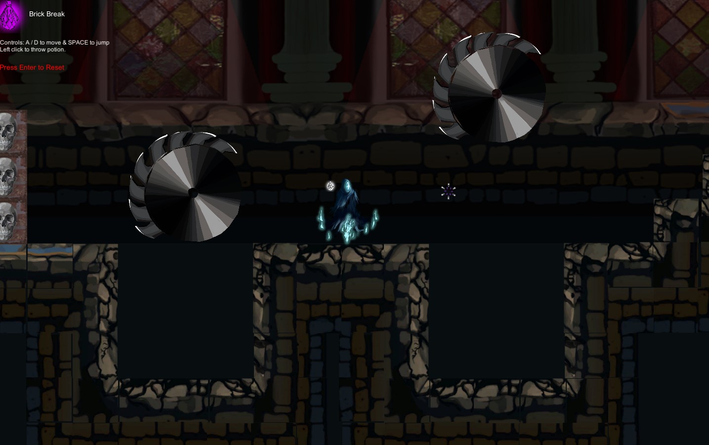
The ghost needs to avoid the hazard in the castle and move to the exit.
A short game, run time: 5 minutes.
This is my first game!
(2 edits)

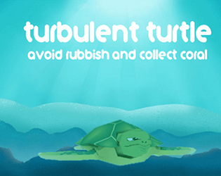
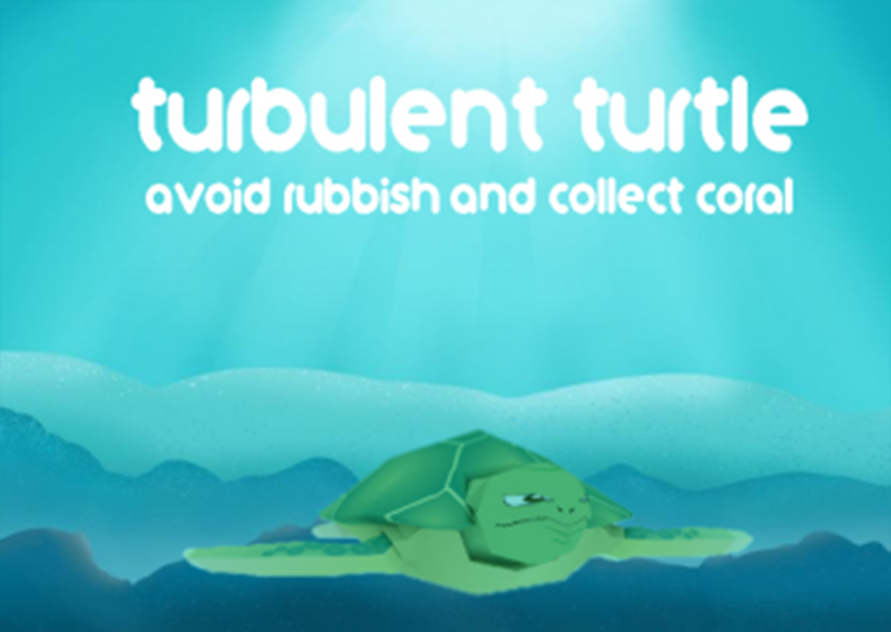
Play this challenging game now!Turbulent Turtle by Michaelabruckner (itch.io)

Description: The turtle swims through plastic litter filled waters and must avoid them to stay alive.

Serious advice: See how long you can last! The record so far is no longer than 10 seconds.


Turbulent Turtle