Indie game storeFree gamesFun gamesHorror games
Game developmentAssetsComics
SalesBundles
Jobs
TagsGame Engines

murks

166
Posts
7
Topics
41
Followers
167
Following
A member registered Sep 04, 2014 · View creator page →

Creator of

Recent community posts

Is the music from Rockin’ Cats?

Nice :) I think it would be better if it got progressively harder.

Now I only need to find out what a broughlike is, how to play this game and what all those campfire things do. I see the resemblance to Tetris but while that could get away without explanation this game can’t.

Sorry, I don’t think it is worth the effort for this quick prototype. If I ever make a proper game out of it I will of course make it easier to run.

Thanks. That is actually not intended, fixed in git head. I will package it properly tomorrow, sorry for the inconvenience.

Thanks for testing Hatnix. I would prefer a native build and would be up for testing as well.

Please do and let us know whether it works on Linux.

I just tried again. At least the client has the Windows-Version pre-selected for some reason. Now I selected the Linux version and it works. Must have missed that yesterday, sorry for the fuss. Not quite sure how to tell it to offer up the Linux version. Pretty sure it works correctly through Butler but not sure how it works with manual uploads.

I have installed it via the itch client and there the game was launched under WINE. So maybe it’s just a packaging issue of sorts.

Unfortunately the Linux build seems to be a Windows build running in WINE.

Unfortunately at least on my system the Linux build is unplayably slow.

Not actually a Linux build unfortunately, runs in WINE.

Understandable, no worries. It’s definitely a funny concept :]

I found a softlock issue in the game. The last enemy alive was a ghost, the hero dies around the time the ghost appeared and the ghost was destroyed by lightning. At that point the game just got stuck at the fighting screen. Softlock
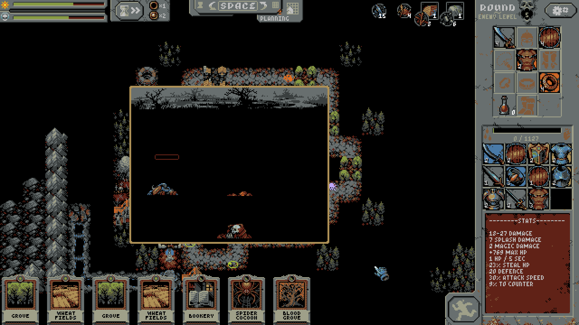
The mouse cursor in addition to the ingame cursor is not great either. This is on Linux.

The game itself is interesting at first but unfortunately gets very grindy. The upgrades seem pretty meaningless while at the same time they are the only thing that drives the game once you maanged to defeat the Lich. Still, it kept me playing for much longer than it has any right to.

You could provide an itch version. That would be significantly easier than messing with Steam keys and everyone would get it.

Thanks, it now seems to work fine in both programs. Strangely GIMP seems to be able to draw a Ü in any case but automatically uses the Glyph from some other font. This becomes clear at least in the current version of monogram since the Glyph ends up about twice as large as it should.

And as a tiny unrelated sidenote for anyone using the Löve framework, use hinting mode ‘mono’ for best results.

Thanks for the fix!

Well, it’s a learning experience. Just don’t overdo it I guess. I need to learn a lot about juiceing up games myself. You are familiar with this nice video I assume? If not, have a look: https://www.youtube.com/playlist?list=PLVbXUoK1ADqs1ZrQ2jr2c5CV9EZURKcRd The rest of the videos in the playlist are also nice, in my very personal opinion ;]

Both. Although as one of my viewers pointed out the game is not actually violent. I don’t think much of ratings in game jams ;]

I forgot which Christmas song yours is based on but if it was Jingle Bells you are probably fine as it is old enough. Sorry for being a bit salty here, the game as it stands is probably just not my jam. Especially the music rubbed me the wrong way. I thought the houses with the target symbols on top were the targets and the one with the food on top is the one where you get the food.

Unfortunately I could not try the game since it has no Linux build and I could not get it to work through WINE.

Good idea :] One thing that might be nice is temporary chromatic aberation when you hit the bumpers for example. It has been overdone a bit but I think it still can be a nice effect when used well.

Unfortunately I could not play this game because there is no Linux build and it did not run through WINE either.

Cool idea and nicely done as well. Too bad you didn’t have time during the jam. I find some font choices questionable, here on the page it is very small and on the left side in the game it is hard to read.

I do not think the attribution for the music is sufficient. I do not see the unusual combination but OK, we usually don’t take the topic too seriously. I didn’t have anyone to play against so I had trouble figuring out what the items do.

Lovely idea. I’m not a fan of the platformer aspect but I understand that you wanted something more than just combining things. The art is nice but the music very repetitive. It is not clear when things register with the machine. Very nice entry overall.

Unfortunately I could not try it because there is no Linux build and I do not have the required VR gear. When I watched the presentation I did not understand what is going on. There were things being drawn and sometimes something happened.

The basic idea of Stanley Parable is nice, so is the music and narration. For my taste the game is far too combat-heavy. The characters are kinda cute. I didn’t figure out how to interact with the dark blocks.

Nice art style and disconcerting music. The concept of a memory game under time constraints is also nice. I have trouble with the camera. The way it is implemented it shows you what is behind you rather than what is in front of you.

Nice simple Tamgotchi-style game. Really not my kind of game though, much to stressful. The game itself does not tell you the goal. Nice modelling, animation and music.

Unfortunately no Linux or even web version so I could not play this.

Nice weird art collage. There is not enough time to read the quotes. Nice take on a one button game. The music sounds awfully familiar, I have to wonder whether you have the rights to those songs.

I hate the memey pictures. The idea is cool but it is very difficult to control. Somehow I won despite being hit every time. The prompts are hard to see because they are white on a mostly bright background.

Hey Jogo, I finally came around to playing your game. I’m not too fond of the idea simple because it is a shooty game. About half the games in existence are shooty games and you simply made a non-shooty game into a shooty game, something you can do with just about any game. It seems to be well executed. The leaderboard is definitely a nice touch. I would have expected the shooting to work with LMB rather than space. It’s unfortunate that there is no sound.

Well, I suck at it. “Bella Ciao” is a nice song. I wonder whether it is legal to use images from other games in your game. At least your did credit your sources. I still wouldn’t risk using material like that. Nice idea to make a game like that for a jam.

Unfortunately no Linux or at least web build. The music and sounds are super obnoxious, the voices hard to understand. Did you make the music yourself? It is very hard to get into the rhythm. I hit the houses but mostly don’t get points. Otherwise the game seems to work well.

Reminds of Little Inferno, except it misses the lacks part, the burning. The music is a bit too repetitive. I guess the game speaks to collector or completionist types.

Not sure I buy the premise, why doesn’t the protagonist just leave? The art and sound is nice, although I noticed a small bug, the voice volume is actually controlled with the sound slider. The colour choice for the text boxes and font is honestly horrible. Looks like nice dating sim all in all.

I love the graphics and sound, really nicely done. What is weird is that you can talk to so many people about things you haven’t heard of. I don’t understand why some doors are one-way.

As it stand it’s still very much a button masher, which is not quite what I had in mind originally. I myself am looking forward to the more tactical mode. I hope my idea will work out, design space is rather limited in tic-tac-toe land :]

(3 edits)

I wonder a bit what the minimal ideal font sizes are. By that I mean the smallest sizes at which all glyphes are displayed correctly.

From what I could determine by experimentation they are: In Aseprite 1.2.27: monogram.ttf: 18 (weird vertical offsets at 9, missing glyphs, for example Ü, ) monogram-extended.ttf: 16

In GIMP 2.10.24: monogram.ttf: 9 monogram-extended.ttf: 16

I assume what I determined using GIMP is correct and Aseprite has font rendering issues?