
oh excellent. i still need to learn a lot about a lot of the technical side of making typefaces, hopefully once i know more i can put out a revision that fixes whatever's up. and, i'm excited for whatever you end up using it for!
A member registered Nov 21, 2017 · View creator page →
Creator of
Recent community posts
so, i've noticed the OTF version behaves kind of weirdly at smaller sizes in certain situations. i believe it is something to do with how the formats handle hinting and aliasing, which i am still wrapping my head around.
here's an example of the same text in the two formats with 12pt text, rendered as a .PNG from Illustrator. i really notice it on, say, the "c" and "e" in the OTF version: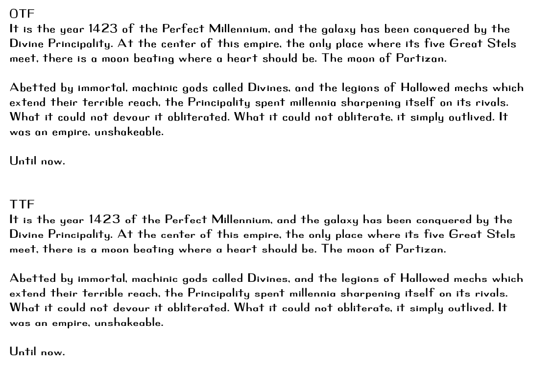
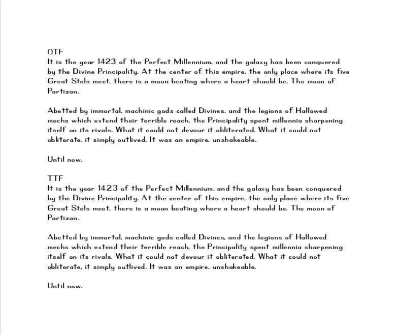
but then, Pages handles both of them without any problem. here's a screencap of the same text, same size, exported to .PDF from Pages.
i have heard there can be some printing situations where OTF is preferable, so i included it. but my rule of thumb for this typeface would be that TTF is probably just fine unless you specifically know you want an OTF version.
i hope that helps, let me know if you have other questions.