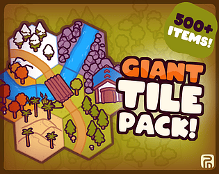
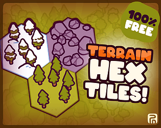
Hi there. The asset pack are free for personal use. If you use it commercially, you must donate the suggested amount. Let me know if there is anything else I can help with :)
Penzilla
Creator of
Recent community posts
Thank you for the compliments :)
I have a MA in game design, with a focus on graphics, so for me it's just been years of building up my style and repertoire. I use a mix of procreate and photoshop to create most of my assets, so getting into those programs, and working on flat colour techniques, would be a good start.
Hi there :)
Like the other asset pack, these assets are optimized for video games, but they could easily be used for ttrpg as well. Since these assets are already large in scale, they would be perfectly suited for print as is. Let me know if there is anything else you would like to know, or if you need custom assets.
Indeed it is. You are welcome to contact me on PenzillaDesign@gmail.com, and we can discuss what you need in detail. Yo can also find infomation about my commisions in general on https://www.penzilladesign.com/commisions :)
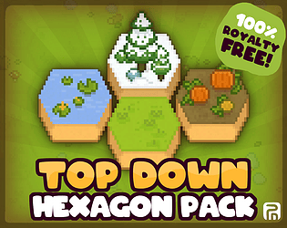
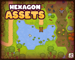
These are some older assets I released after the fact, so I don't entirely remember how I set them up originally. The tiles are made to overlap, and I believe I set them up with pivot points snapping to a grid. I made an example of where to place the pivot points, and how they should overlap. When cut to 800x800px tiles, this pivot point is 438px in from the left, 360 up from the bottom, so if you do this to all four tiles whey will snap to a corresponding grid, though I do originally intend to just set up the tiles in the pattern depicted in the example gif. Hope this helps :)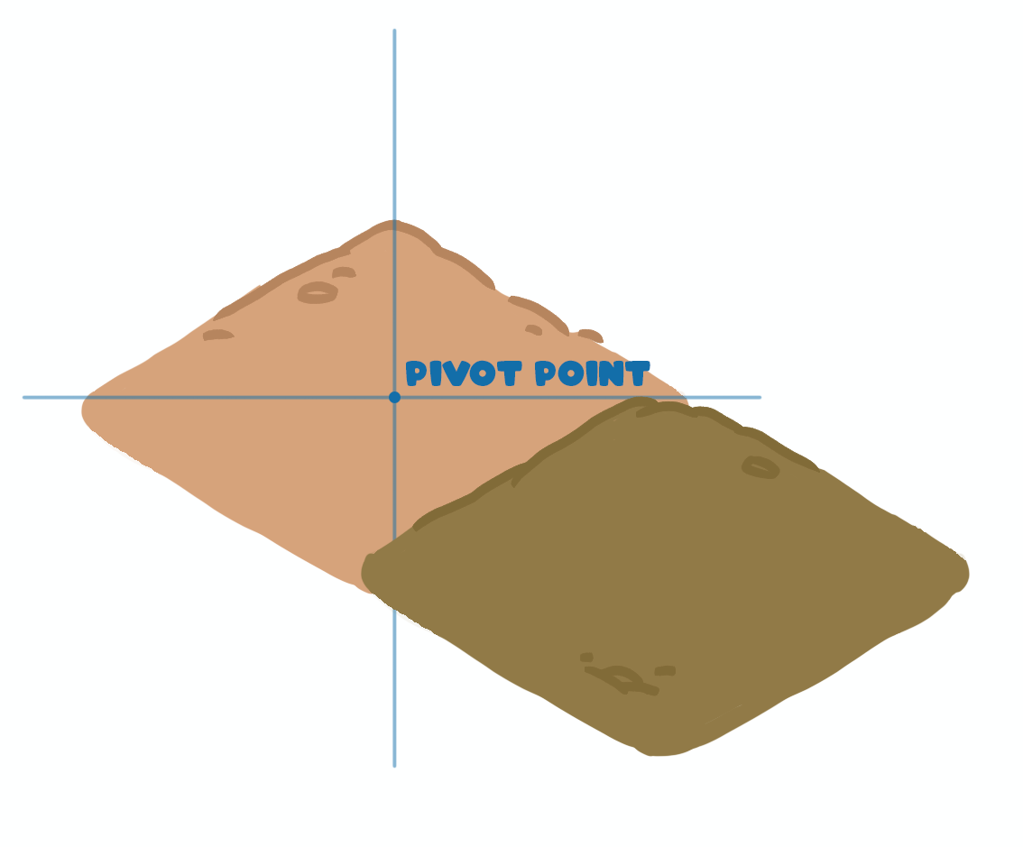
Thank you so much for the compliment. You can find more information on custom orders and commissions on my website: https://www.penzilladesign.com/commisions
You are also welcome to contact me with more info about the project you have in mind, and I'll put together an offer PenzillaDesign@gmail.com
Hi Ponkght. I don't have a minimum for commision orders. You are welcome to contact me directly about commisions on PenzillaDesign@gmail.com, and I'll put together a custom offer based on your needs.
You can also find more infomation about my commisions on my website: https://www.penzilladesign.com/commisions
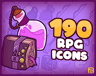
All of the icons in this pack are only included in this pack. There might be a few cases of thematic overlap, like common food items, or items like a stone, branch, etc., but no duplicates taken from other packs and included in this one (and many of my other asset packs have different formats, depending on which one). In short, all the icons in this pack is unique and can be found in no other asset pack for sale on my site.
Hi, thank you for downloading the package and for the compliments.
Though this pack has been out for a while, no other people have come with this request; I expect not a lot of people use the open doors, creating closed off rooms instead, and/or cut out a piece of the wall themselves.
I've added an asset where there is an opening lining up with the doorframes. I hope this helps :)
Thank you for the comment.
You can use them with these:
https://penzilla.itch.io/top-down-retro-interior
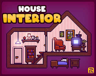
https://penzilla.itch.io/house-interior
combining all of the options together will generate way too many assets, which is why they are currently split up. I recommend, depending on the game engine you are using, to create a layered character. alternatively if there are any specific combinations of colours you'd like to see, I'll merge these specific files for you as well.
I'm alse updating the text here on the asset pack in order to avoid any future confusion. Thank you for making me aware that it might be an issue :)


