On Sale: GamesAssetsToolsTabletopComics
Indie game storeFree gamesFun gamesHorror games
Game developmentAssetsComics
SalesBundles
Jobs
TagsGame Engines

Philip Park

29
Posts
19
Followers
14
Following
A member registered Dec 01, 2017 · View creator page →

Creator of

Recent community posts

This is SUCH a good stress reliever. I love the premise so much! 

I think one very minor critique is that the the controls feel very sensitive, so maybe slow the cat movement down a tiny bit? I also think the music stops playing after you play like 2ish games, so having it continue playing would just make things more consistent! 

I think the 3D models are really nice, and the whole aesthetic is super cute and cozy! Well done! 

This game is super good!! I love the whole premise of this a lot :)

Santi! Love the art for this game a lot--the pigeons look especially awesome. I also find it very funny and entertaining that the camera tilts like a bird's head normally would while looking around. 

 My one critique would probably be for the special treats to feel a bit more interactive? Maybe when you throw out the treats, more pigeons come into view, or maybe they have a special animation to come and peck at them. I also think there is a very slight delay (probably just a second or two) from when you press the space bar to when the food gets released to the birds. I feel like if the treats were thrown out immediately after pressing the space bar, it would help make things feel more satisfying! 

That's about it though! The art is great, the audio is great, and the whole vibe is great. This is one of those things that I could just leave running on my computer while I go off and do other homework. Nice work! 

I think this idea is super cool, Gen! Taking the theme of "Non-Human POV" and making the goal of this game be to find out what you really are is a super clever way of flipping the theme upside down! I enjoyed playing through this game a lot, and I was very glad to get the good ending on my first try :)

These might be very minor things, but in terms of critiques, I think the controls feel a bit slippery (?) because I notice that letting go of a WASD button after walking makes me slide to a stop rather than stopping right away. Perhaps this was intentional, but I personally think a hard stop would make things feel a bit nicer overall. I also personally think the mouse controls are a little too sensitive, but that is just my personal preference anyway. 

Lastly, I think some sound effects would have been nice, but I am unsure if you meant for there to be no sound since you credit the NYU Game Center's Audio Library as a source for sound effects in your description. Regardless, I think some nice music definitely would've fit the style of this game very much! 

I don't think there's much else I want to say though! I liked the art you drew (and the fact that they stand around Paper Mario style) and the fact that the point of this game is to just walk around and talk to people in order to discover your identity. The act of going around and talking to people is very chill (even though the story can sometimes shift to be more dramatic), and the whole idea of this game could lowkey be symbolism for real life--sometimes you need to go out there, meet and talk to a bunch of people, and do some self-reflecting to find out who you really are! Wonderful job, though, Gen! I always look forward to playing your games! 

I think the premise is super entertaining and cute. Controlling each finger to play rock paper scissors is really cool, and I love the fact that you decided to use PIGEONS to make a game like this. 

I think one minor thing I'd like to see is just the result of the fifth and final round. Right now, the game just kinda goes directly to a win/lose screen, but I think it would just feel nicer if we actually go to see what the opponent did and THEN go to a win/lose screen right after that. I understand that it's not entirely necessary because we essentially get to see the OUTCOME of that one duel with a win/lose screen, but I just think it would help make things flow a bit better. 

Another nit-picky critique would be that the opponent pigeon uses their first two fingers to do scissors. However, for the player, they must use their second and third fingers to do scissors. It confused me a bit in the beginning because I tried using scissors with my thumb and index finger too, only to realize that wasn't the correct way of doing things. I think either changing the art for the opponent or making the index finger + thumb a viable scissors combo would be useful! 

I can't really say much else though because this game has so much charm to it! I also love the fact that you need to do a thumbs up to replay--very clever! Loved this game a lot :)

This is a really nice game! I'm amazed that you were able to make a whole rhythm game in just a week. The art and music are all very fitting for the vibe you were going for, and I had a lot of fun trying to stay alive in the game! 

I agree with some of the other comments written on this post (I think having more feedback would be more satisfying) so I won't go too deep into that. I think another minor thing you could very easily add is having a unique animation for when multiple directions need to be inputted at the same time. I feel like it would just make hitting multidirectional inputs a lot more satisfying, and it would make it clearer to the player that the input they did was the correct one. 

Also I might be missing something, but is there a way to restart the game? If not, I think that is definitely needed! 

Overall though, I think this is really great! Awesome work! 

This is very nice! It's like a very simple zombie shooter. The zombies can get very overwhelming very fast if you let them keep spawning, and I think that's something you might have been aiming for with this game!

I think something nice would be if the zombies reacted a bit quicker to the players' clicking. Whenever I hit them, I can't really tell if I hit them or not because it takes a few seconds for them to drop dead. I think it would be a lot more satisfying if they just did their drop animation right when I hit them. 

I also think a "Restart" button would be very helpful! 

Even though you didn't have a lot of time to work on this, I think it came out very well! 

I think having a bit more control over the jump might make things feel nicer, especially because some of these jumps require precise timing and aim. For example,  I could jump higher the longer I held space, it could make aiming my jumps more fun and rewarding. It could also add additional layers of strategy to this game if that's something you want to go for. 

Nonetheless, I still think this game is very solid, and I enjoyed playing it a lot! 

Hey Drew! This game is actually very clean, and I enjoyed playing it a lot! The jump feels very nice, and the simple gameplay brings me to an almost hypnotic zen state. 

I think if you were to continue working on this, you could make the controls even tighter--perhaps the longer you press, the higher you jump! The way it is right now, I jump the exact same way when I tap the space bar and when I press and hold it. Some more detail to the controls could really juice things up!

Overall, though, I really liked this! Great work :)

This game is super fun! It was challenging at first, but once you get into it, you're able to come up with words a lot quicker, making this a very rewarding game. The presentation is clean and simple which works well with what this game is going for. I also REALLY love the fact that there is a leaderboard--it made me want to come back and play again and again. 

I think one minor thing I'd appreciate is if the entire slot would reset after you enter an incorrect word. The way it is now, you'd have to go back and erase all of the letters yourself. I think it might be more convenient if the entire word was just erased so you can type all of the letters all over again instead. Also, some sound effects for various things could definitely make this game feel more satisfying! 

Overall though, I really enjoyed everything! It was a very fun game :)

This game is so simple and fun--I love it! I probably sat here playing for 10 minutes straight because it's just one of those games that really takes you into the zone. The type writer noises were super satisfying and feeling myself get better and better was always nice to see.

For very quick critiques, I think having new words come from top to bottom would be better than having the words come from right to left. When I try to type a word, I usually have to read the entire word first, and once I know the word I know to type, I then type it with my fingers. If the words came from top to bottom, this process would be very easy for me because it allows me to see the entire word right when it appears on screen and go into typing right away. When it comes in from the right, however, I have to wait for the word to center on screen and THEN start typing. I feel like going from right to left definitely helps with the type writing theme, but personally,  I found myself wishing for this change multiple times while playing. Also, I think the color contrast for the letters could be a bit stronger. The black and gray look very alike, and sometimes, I'd get confused about which letter I was stuck on. 

Other than that, though, I really dig this game! I can definitely see myself coming back to play this game, so great job Arjun! 

Woah, what an EXPERIENCE! I loved the zen-like feel of this game, from the music to the simple controls, and the colorful BOIDS. It's honestly so amazing how artistic you make your games with such simple shapes and designs. I also really love how the stars look as well! 

I think for critiques, I'll just say that the controls were a bit confusing in the beginning. When I dragged the hydrogen clusters to the middle, the hydrogen clusters would start spinning counter-clockwise around the star, and I initially thought I messed it up because  I thought the clusters were supposed to go directly into the middle. It took me a couple more stars to realize that spinning counter-clockwise was indeed the thing that I needed them to do. Maybe making them just go directly into the middle would make things more clear? Or, even if they do spin around the star, just have them very visibly show that they are gradually going into the middle. 

Other than that, though, I have nothing else to say! Really amazing job! 

Hey, Claire! I really like what you have here! I think what stood out to me the most was the very nice animations for the cat. They makes the cat feel really alive, and I think that's an important thing to have in pet games. 

I think one thing I'm unsure about is the money system. I understand that the player is supposed to be a homeless man, but it feels kinda sad when I know the cat's hunger is in the red and I can't do anything about it because I have no money. You earn money by just waiting around for a while, but I think incorporating a new way to earn money might be useful! Maybe make the cat perform or something, and that'll cause people to donate money? Or maybe you could have the cat go and steal money from people and it'll cause the cat to be injured, which will then require the player to tend to it? Just some ideas to make the game a bit more lively! 

But honestly, those are only things that would help expand this game. I think what you have here is really good for a week's worth of work! Great job! 

Very cute game! The animation/drawing is simple, but it fits really well with the tone of the entire game. I think the music is also a very nice touch and it surprisingly did a lot to set the mood for this pet game. 

For critiques, I think having a little more interaction coming from the pet would've been nice. I really love the fact that the pet will look towards where your mouse is when you're playing with it, but I think it would've been really cool if it also hopped around and followed your mouse. Also, when eating its food, perhaps it could have a special animation or make some kind of sound to show that it's eating. These are things that would only add to the experience though, so if you want to keep the very simple feel and tone of this game, then I totally understand as well. 

Also, I notice that when I press the food button after playing with the pet, the pink sparkles will continue to come out. I feel like having the sparkles just completely stop appearing after selecting the food button might be nicer and make the game feel a bit more polished. 

But overall, this was a very stress-relieving game! Good job! :) 

Ah YES! Tamagothy, my most anticipated game from this prompt. 

Overall, I think it definitely did live up to the hype I was expecting. The art is very nice for the concept you were going for, and I think the humor is also on point. 

I think one thing you could work on is making the player input a bit more satisfying. If I press a button, it would be nice if there was a little clicking sound or some kind of visual cue to let me know that the button was indeed pressed. There were times when I didn't know if I actually did anything or not (but maybe that was intentional given your theme LOL). 

But yeah! Very funny and enjoyable experience. Great job, Ron! 

Hey Ivory! Nice game you have here! I really like the concept of this game--making a monster with specific characteristics is a very relaxing and fun activity.  I also really appreciate all the art you had to make for this! The art is very cozy and cute, and it comes together in a nice way. 

I think one thing you could do to improve this game is actually increase the potion count. With a game like this, I really want to explore every possible combination and outcome I could make with my pet. However, with a very limited potion system, it becomes hard to do. If, for example, I had a blue monster but I wanted to check what it'd look like with red, then I'd have to use up 10% of my potions just to check and see whether I'd like it or not. Perhaps one thing you could do to still keep the urgent feel that I think you were going for is make the timer go a bit faster and make the potion count higher. This way, I can still have fun exploring the different options I have, but still know I have to make very quick decisions because I'm on a time limit. Just a food for thought! 

Also, a restart button would be very handy! 

Overall though, I thought this was a very cute game. Good job! :)

Love the fish animation and the song! I think you set a really clear mood and I think it's really great! 

For critiques, I think having the fish use an animation that makes it face left-right-left-right-.... is kinda confusing, especially since you're trying to choose which direction it can jump towards. I think having a slightly milder animation would be nice! Also, I think having walls on the edges of the screen would help as well. It can get a bit frustrating when I land offscreen and I have no idea where my jump is being aimed. 

Overall though, this game was super fun so good job! :)

Holy cow, Arjun! This game's visuals are insane. I love everything about it--from the blood splatter, to the falling leaves, to the very ominous triangles, everything fits together so well and I think it really captures the aesthetic you were aiming for! 

I think the one thing I'll point out, though, is that I do wish there was a "speedup" or "skip" button for the results screen. During some of my playthroughs, I knew for a fact that I messed up and I wanted to try again right away, but I had to wait for all of the animations to happen first. Perhaps make the animations unskippable when the player gets a new high score? But have the option to skip open when the player gets a really bad score? I think it makes sense cuz I'd want to see my 60+ score in all its glory (with animations on) when I know I did well... but if I know I did bad, I wouldn't want to see my results as clearly LOL

But yeah that was pretty much it! The last thing I should mention is how good the sound design is as well. Every cut sounds EXTREMELY satisfying and the calm wind blowing in the title screen gets me in the proper meditative mood. Great job Arjun!

This game is so good! I love the pixelated art style, and I think the premise is super fun too! It really reminds me of the Gamer minigame from "Game & Wario". I really dig the way you incorporated a timer into the actual game setting as well. It's really clever! 

I think one thing you could possibly add in a future installment is some kind of "boss detector" just so that players can have a sense of when the boss might come around. I think another way to get around this could be having the boss only get angry when he LOOKS at you. This way, you can keep playing the video even if the boss keeps walking around in front of you, but you'd need to watch out for whenever he might stop and snap his head to see you. It could add a lot of layers to strategy and risk-taking, and I think it would make the game feel a lot fairer as well! 

But other than that, I thought this game was great! I loved the very cutesy aesthetic. :)

I am honestly so blown away by how polished this is. It's hard to believe that this game only took one week because it really looks like a game I could go and buy on the App Store right now. I love the simple and round art direction, and I'm in love with the animated background as well. The thing that stood out to me the most is definitely the sound design. The fact that you were able to match the music with the actual gameplay so well is amazing. I especially love it when the beat drops and three more circles come into the screen. Oh MAN does it get me pumped. 

This game is damn near perfect, but if I were to point out a couple of nitpicky things, it would be:

1) Having the obstacles disappear when they are right in front of the player feels a bit strange. I understand that the obstacles do not harm you when they are disappearing, but it still gives me a slight jolt when it happens, and I think players would have a more comfortable experience if the obstacles just disappeared when the player was on the other side of the circle. 

2) I don't know if this is a bug or if it's intentional, but when you die while the three other circles are on screen (when the bass drops), all of the circles stop spinning except the bottom left one. Is it supposed to be the only one left spinning? It felt a bit strange but it's honestly such a small thing that I wouldn't care if you left it as it is. 

3) I kinda wish you started the song at the same time at the beginning of every round. I know it might be hard to do cuz of how well the sound is mixed in with the gameplay, but I think having audio cues to know how far you are in your run would be helpful. During my playthroughs, the bass drop could happen before the 10 second mark, or it could happen near the 50 second mark. It would be nice to have it always happen at the same time so I could be like "Oh I hear the bass drop! Now I know I'm past the 30 second mark" or something like that without having to constantly glance at the timer to check up on how well I'm doing. 

I think that's about it, but even while writing this, I can't stop thinking about how good this game is! Please release this on the App Store asap cuz I am so ready to buy it. Phenomenal job! 

Also, if it is okay for me to ask, what song did you use for this game?

Geneva! I had so much fun with this so great job! :)

Once you get used to the controls, the game becomes super engaging and I really liked the fact that the focus shifts from just seeing "how many homies can I kiss?" to "how fast can I kiss the homies?" 

I will say, though, that the controls were a bit confusing in the beginning. There was a lot of text to explain the mechanics in the beginning, but I think having more UI/texts in the actual game might be helpful to more quickly understand what's going on. 

But yeah! This game was really good. I also really love your attention to detail with how the homie's intimidation can affect the player. Having the meter slow down or freeze because of what the opponent does is really cool and it goes to show how much thought you put into this game! 

Yep--they spawn dynamically! I just have it so that when the trees you pass are a certain distance away from the player, they will spawn another tree in front of the player and delete itself. 

Thanks for the feedback!! 

Great clone! The game feels very nice and I think it's very cool that you used 3D models instead of sprites. However, I sorta wish you made a 3D model for the player sprite as well (just to make the art feel a bit more cohesive). 

Also, I had a bit of difficulty in the night time sections because it was very dark. You could have been aiming for that effect, but I personally thought it made gameplay slightly more frustrating. Maybe a flashlight feature could be added next? 

But yeah! The clone was very fun so good job!

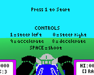
Honestly I think this clone is insanely good! I also think the fact that you decided to use 3D models instead of just reusing sprites is really praiseworthy. I love the way they look! I also really like the trail that the targets leave behind while driving. 

I think one small mechanic you could think about implementing is allowing the player to redirect their bullets. In the original game, when the player shoots a bullet and steers right, the bullet actually steers a bit to the right as well. This made aiming a slightly deeper skill, and I think something like that would be useful in this clone! Because everything is 3D, the scale is a lot bigger, so I think having more control over your bullets would work well. 

But again, I think this clone is super fun and well-made! Great job!

Hey Arjun! Really liked your clone! One thing I really like is the way trees snap into position when they're far in the distance. It's a really cool effect! 

However, I feel like the rate at which these trees grow when you get closer to them is a bit too drastic. I mainly just think the final sprite for the trees is too large compared to their other sprites. 

But other than that I thought this was great! The effects you have for when an enemy gets hit by a bullet/missile are also very juicy. 

Thought this was a solid clone Gen!

I also agree with Miles' comment about it feeling a bit slow, so allowing the player to go faster might be a good idea! 

Another thing is that in the original game, if you shoot while turning, the missile/bullet will also go in the direction that you are turning. I think having a mechanic like that in your clone might help things feel a bit better. It would also help make "aiming" more interesting in your game! 

Had a lot of fun with this one! And I definitely applaud you for making 14 whole rounds as well :)

I really love the way this game looks and sounds! I especially love your missiles--the explosions they make are super satisfying. 

If I were to be a bit nitpicky, I'd say that turning either left or right feels a little slow. I struggled a bit during my playthrough because the yellow target kept going offscreen (to the right) and it took a while for me to turn to face them. So being able to turn a bit quicker might make the game feel a bit nicer! 

(I guess you could also make it so that the targets don't travel left and right as much, but I personally feel increasing turn speed is just easier.)

Otherwise, it's a great clone! It felt very polished. 

Oh yeah, the bullets will also explode if they hit a tree so I'm assuming that's what you noticed. But now that you point it out, I do realize it might be confusing for players, so I think changing it to just explode for targets might be better. 

Thanks for the feedback Cooper! :)

Thank you! :)