Probably not, been working on other stuff.
pigmasteroink
Creator of
Recent community posts
That's all right with the long comments.
For Iggy's gender icon, the reason for it is his gender icon goes past the viewport border. I could either move ALL of the gender icons to the left a little or his gender icon only. Which one do you think would work the best visually?
For the random character icon, what do you think of a dice icon? Pretty cool right? Could be animated as well to show 1-6 dots.
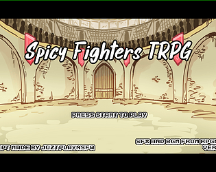
I'll think of about that main menu thing, keyboard controls, FIGHT! text lasting more, and the sound and music.
As of the time I am replying, I have now fixed the bugs and added the random button to the character selection screen. I am thinking of adding music and sounds to the game.
Would the music and sounds from RPG Maker VX Ace be good enough to add? You can search those up and give them a listen to see what you think.
Thank you for the comment!
Though it may seem that Nari's attacking frame is missing a neck, it is the just parts of her hair that blocks the view of her neck after I looked over at the other frames where that part of the hair appears to be in front of her shoulders. At least that is what I assume.
For the Space thing, yeah I'll definitely need to change that. Might as well do it when the match is over, in which I'll make a retry button for the mouse as well.
The Recommendations sound awesome and simple! I'll try my hand at implementing those parts of the game!
Well, there does exist to be male characters, only that it is hard to tell when they don't have the sprites yet or an indication to tell the gender.
At the moment, I am working on the character selection screen and plus some changes to the mechanics according to the original trpg concept creator Juztplay.


