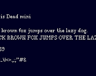
Thank you! I am now (im)patiently waiting for your game with this tileset ^^
poppants
Creator of
Recent community posts
I think a hug is a panacea for everything, so here is one in either case 🤗
Darren, the developer of dawn folk and previously Lueur, said that Lost Lands did indeed inspire him to make those games. At first I thought it was a blatant ripoff, so I asked around my friends and other fellow developers. The majority said that this would fall under the category of “heavily inspired by”. I still believe it is the latter, but I dusted it under the “you are just being paranoid” carpet. I will try Dawnfolk to see which one is true, but for now… yeah, I don’t know man.
Onto your other question - I am indeed working on the successor for Lost Settlers called Lost Lands which relies on the same philosophy of making a minimalistic, exploration and discovery based city builder (just in 3D). Hopefully it will be as good as the first one ^^
ps: thank you for posting, makes me feel less alone in my camp :D
Glad you liked the game! That was the whole idea with the game, so I am glad it worked for you :)
So, emm, I got the track off humble bundle quite some time ago, there was this gigantic pack of loops, sound effects, etc. Found one track I liked, adjusted the pitch so it sounded a lot more slow paced, and you got the track! No magic there I am afraid. I tried looking for it now, but can't find it :/
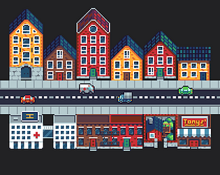
The tall buildings (bottom left) were indeed inspired by Amsterdam! The barn, and small houses (top right) are inspired by Norwegian architecture. So, you are bang on!
The palette is actually from Lospec.com, with a few changes and additions, but I cannot for the life of me find the original one now :(
Hi there!
Your comment made my day, thank you :D
I honestly never considered the possibility of the starting point to be surrounded by the mountains, like in your case, so I already made myself a task to take care of that so that does not happen.
Regarding resources - noted! We also changed how some of the resources "behave" and what they are used for, so hopefully we can balance it out so there is no grinding.
And regarding the last part - you can expect more of those indeed! We aim to make a lot of building to provide new unique actions and changes to the game mechanics, and more chains (e.g. when upgrading or building next to each other). Also, perhaps not in early build, we will be adding "prettify"ing options for some buildings, allowing you to customize how stuff looks but also brings in some bonuses. So.. stay tuned ^^
PS: I really liked the concept of a mushroom farm, so I am stealing that one for the game :D
Instant wishlist on my side! This also begs to be released on switch.
A few comments, hopefully useful notes:
1. The order of enemy turn is ambigious, would be great to include some indications of that, so you can plan your moves well (this is especially important since enemies can damage each other);
2. In the classic roque-like run (Hades, Slay the Spire, etc.) the most vital resource is health since it is rarely restored. This can impact the playstyle, like forcing players to be defensive. This could limit the viable strategies in game, and hurt replayability. The potions kinda aleviate the problem, but I got to dig deeper to see if that becomes a problem later in game.
3. Allow some potions to be used in between the fights?
4. Really easy to forget what some of the moves (player's or enemy's), would be nice to have some way to read about them and their special moves.
In any case, good luck, this is gold ^^
Hi Darenn!
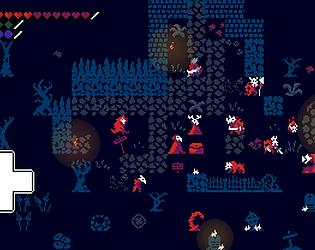
I really liked what you did with the "source material"! Really liked the illumination mechanic, and the end game is a lot more fun, can be challenging in the first run. The 64px limitation makes everything looks crammed, but that honestly works well with the darkness of the world that you've built.
For starting pixel art I think that looks quite good! I would advice you to look over at lospec.com for palettes and tutorials (artists Pedro Medeiros and Slynyrd are my recomendations). Even a tiny change, like applying a custom palette will breath a lot of live into the game.
Looking forward to the final version!


