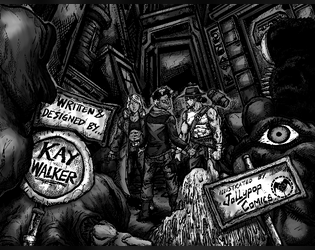
Hey, read a buddy's copy of the game, and it's cool! I'm excited to sit down with them and play it (and buy it later). Concern, though: the font choice for titles on boxes and such and the large lettering for major factions and the like is an accessibility issue. The fonts are difficult to read for me, and I had another friend who could hardly parse it at all. It's kind of an issue if a player can't tell what most of the boxes are labelled. Maybe you could include a smaller, more legible version of those texts somewhere nearby?
probskay
Creator of
Recent community posts
Oh, certainly, and there is 0 chance that I revise this game again. I've already gone through all of that process. I didn't want to mandate a 1 in a player's stat block, as that just takes away their agency. This way, they still get to make the choice regarding if they want a 1 in their stat block at all (or a 0, in the case of Fortune).
It's interesting that you point out backgrounds, because that's actually the backgrounds playing as intended. It promotes players building a very obvious strength and weakness. In an earlier draft of the game I didn't have a background system, and some folks I had make characters for testing were very frustrated with the way that the game didn't have a "balanced" character option, since they didn't have enough points to balance out their weaknesses. I reduced the total number of points available to the players and added the background system to promote both character building and more polarised builds. The players feel like they got one over the game by getting a "free point," and at the same time are guided into playing more interesting characters
As for the capitalising errors. Ah, eto... Bleh?


