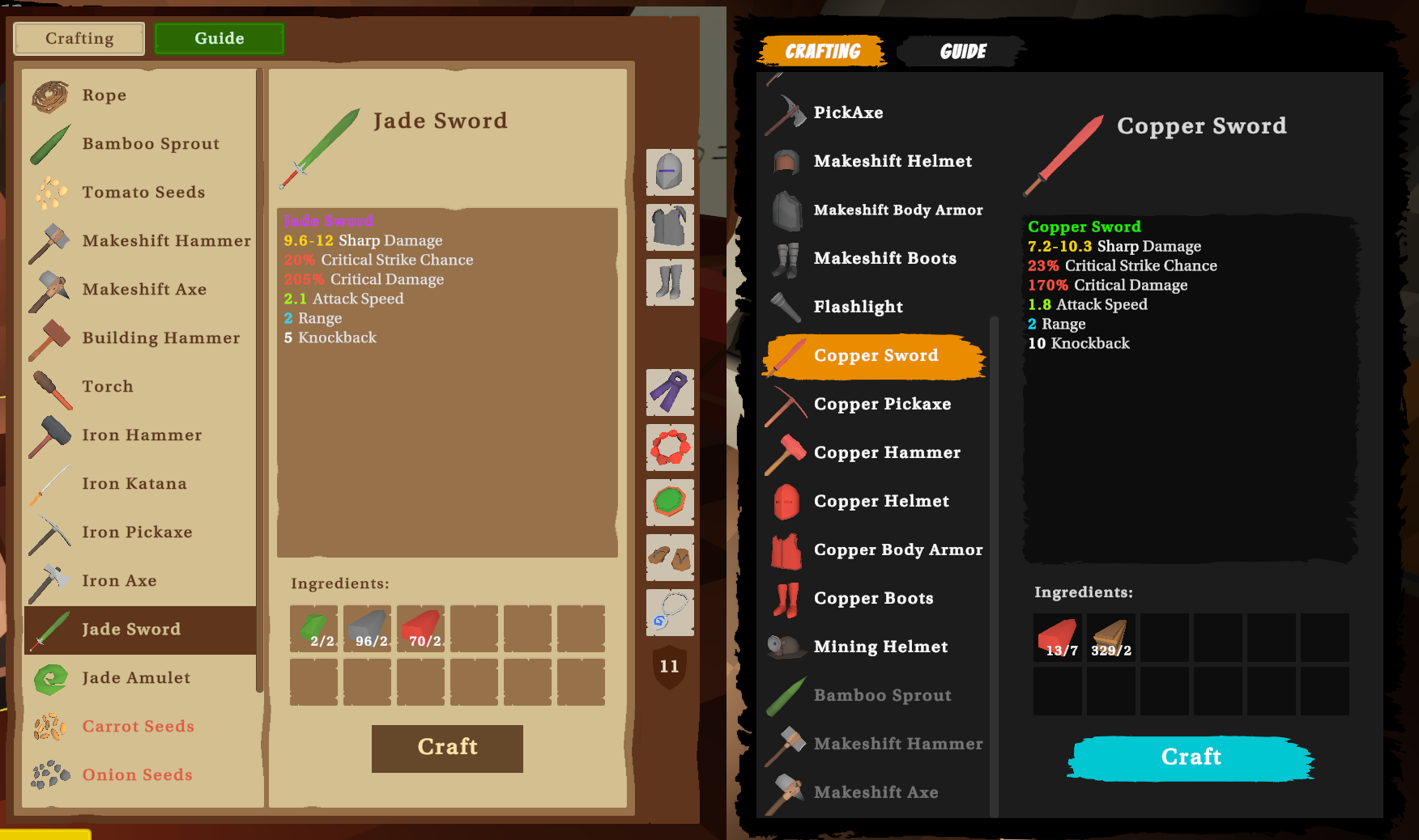
Reworking the UI. Going for a different style but the layout will mostly be the same. I think the new style fits the game so much better. Before (brown shades) and after (dark colors with vibrant buttons)
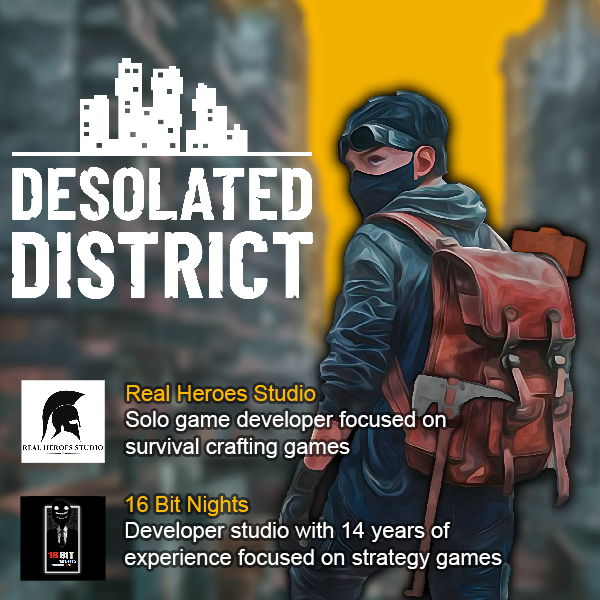
A few weeks ago, I've connected with the team at "16BitNights", who saw great potential in my game, Desolated District. After some inspiring discussions, we decided on an exciting experimental collaboration.
Through this partnership, "16BitNights" is contributing their expertise in marketing consultancy, environmental storytelling design, and providing some minor investments to support the development of Desolated District.
If this collaboration proves successful, I will be able to follow my passion of making games, full time.
You can find our game, Desolated District, on Steam here: https://store.steampowered.com/app/2454070/Desolated_District/ . We’re working hard to bring this magical open-world-survival-crafting game to players, with a planned release in Q2 of 2025!
Hello,
Time for an update.
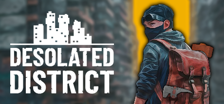
We just polished the capsule art and I want to share with you the process we went through.
Old capsule:
This was the old capsule art.
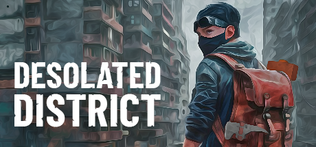
The point of the capsule art foundation was to show the environment(because it's a big selling point for us) and the main character with the crafting tool.
Polish
Here are a few polish iterations we did:
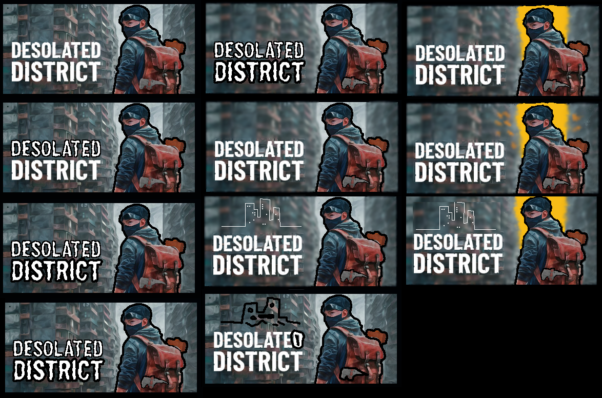
And here is the list of improvements and reasons for them:
- blurred background = so that the character and title text don't blend in with the background too much and stand out more
- Orange/yellow sky color = so that the background character is more heighted and for the capsule to stand out a bit more in the sea of capsules, it is well known that bright colors in capsules help a lot
- City logo = so that the game is more recognizable in a matter of branding
- character black fade outline = so that the character gets even more highlighted including his crafting tools, this is after all a crafting game
Here is the final result:
Hope you enjoyed the read.
Hello, wonderful people of Itchio!
My name is Marius, I am from Romania and I am a solo dev on [b]Real Heroes Studio[/b].
About the game

Desolated District is an Open-World Survival Crafting game set in a post-apocalyptic dystopia. Scavenge for resources, craft essential tools, build your base, and battle deadly threats as you explore a sprawling, decaying city inspired by the Kowloon Walled City.
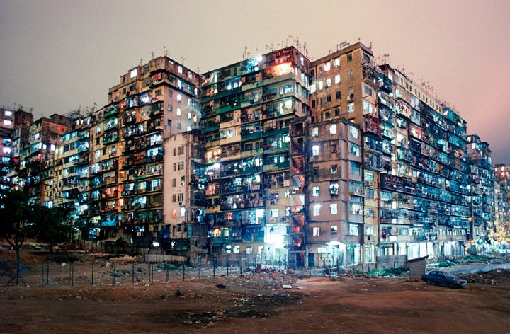
Kowloon Walled City wiki: https://en.wikipedia.org/wiki/Kowloon_Walled_City
In my own words, I try to mix the Survival genre with rich lore through environment storytelling and a dark theme.
So this is how it started:
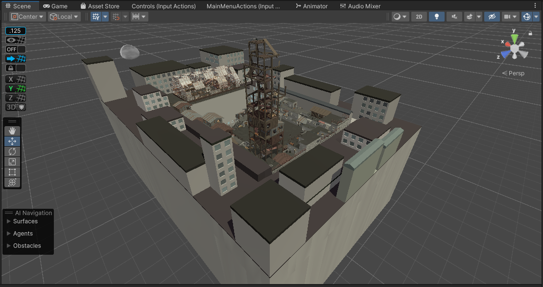
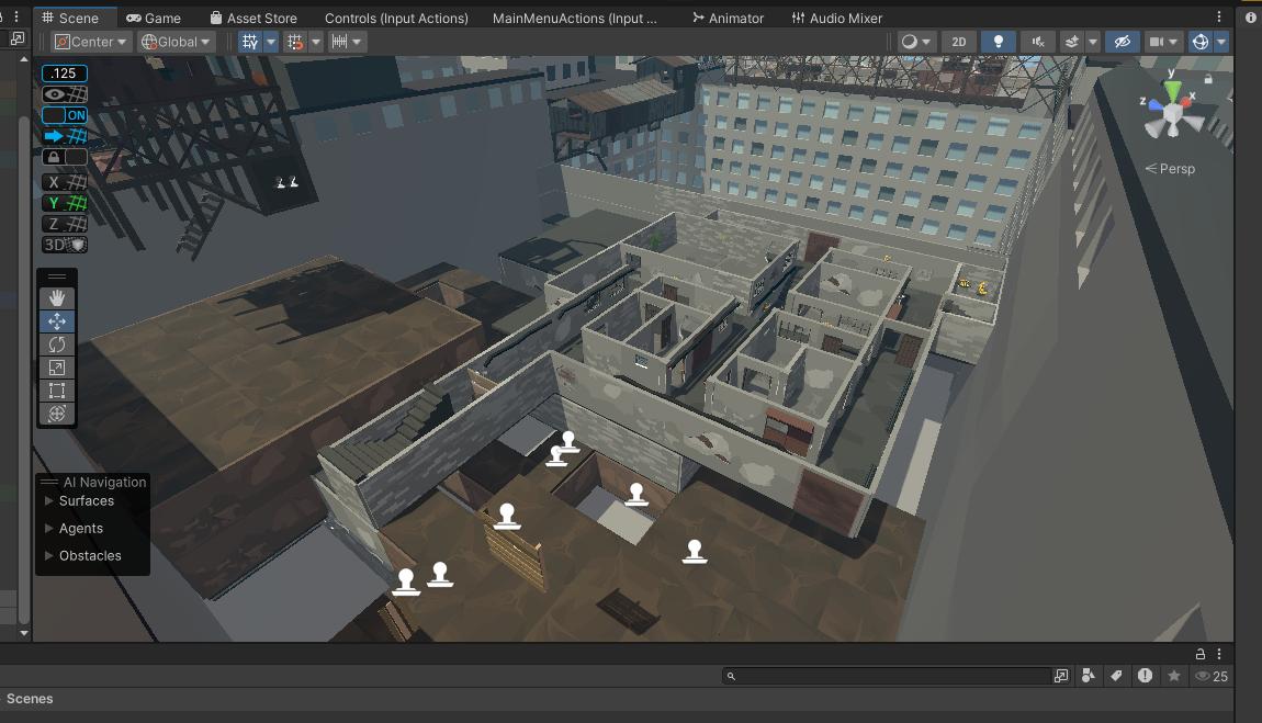
And here is where I am now:
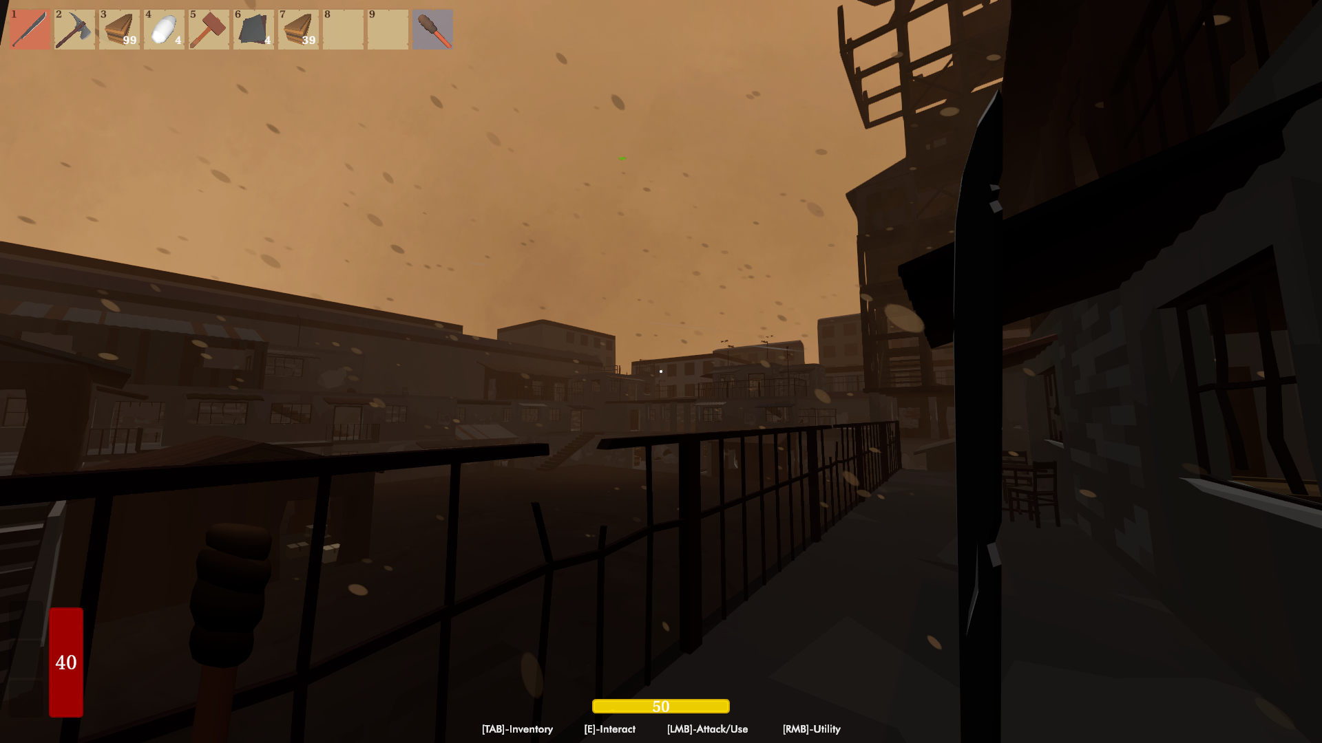
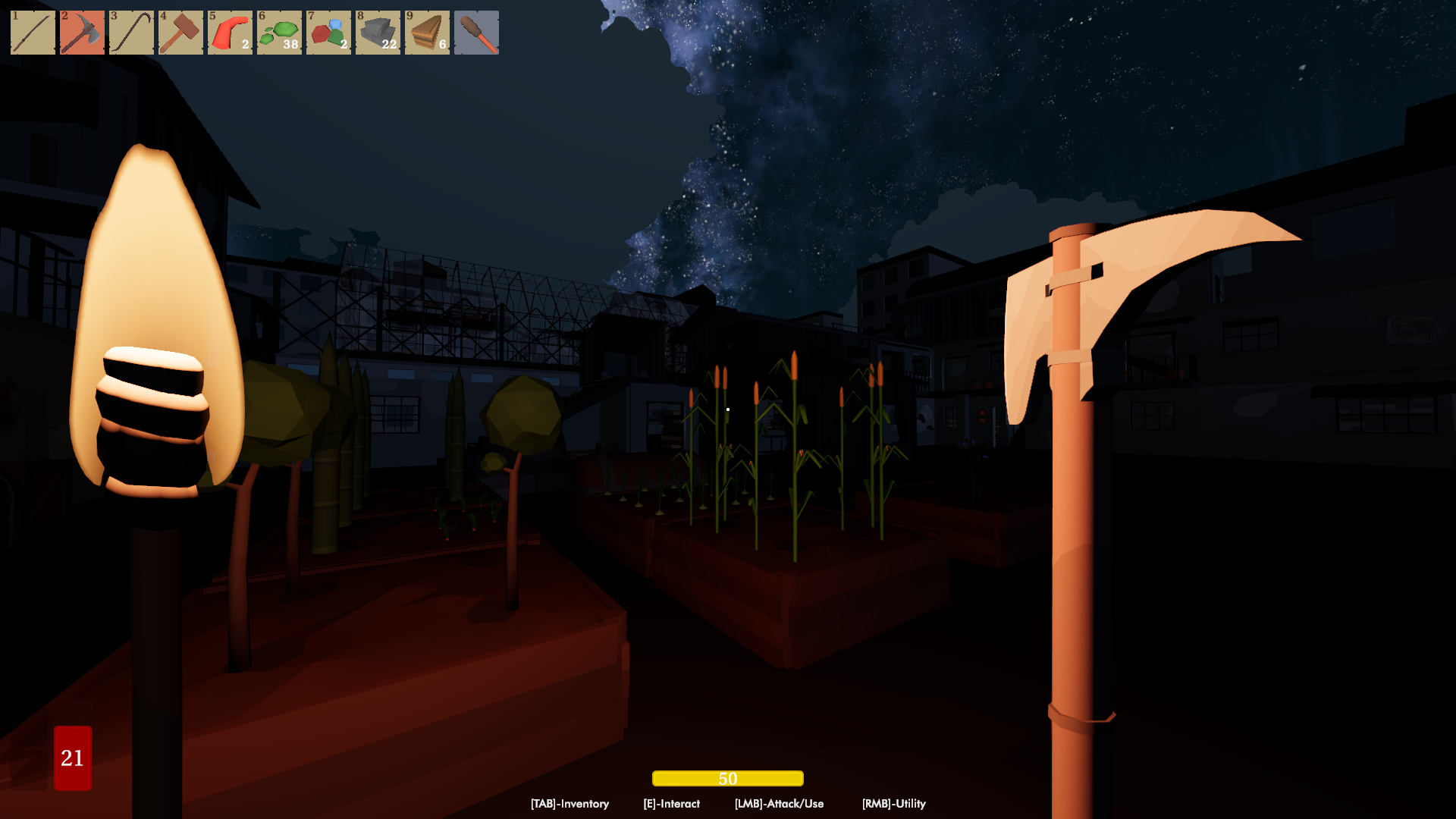
Now my priorities are to finish the remaining content and polish as much as I can because the release date is planned in Q1 of 2025.
Social Media Links
Twitter: https://x.com/realheroesstud
Discord: https://discord.gg/tNr6Mnf7
Itchio: https://real-heroes-studio.itch.io/desolated-district
Facebook: https://www.facebook.com/profile.php?id=100094870548240
Recently I also found a magical troll in one of the game dev suburbs and I decided to have him join my endeavors to get some additional help with Marketing, environment storytelling design, and minimum guarantee(money investment).
I'm talking about one of the guys from 16 BIT NIGHTS.

Regards,
Marius - Real Heroes Studio