It's now fixed. Anyway, it's a Spanish translation of the supplementary rules for Cthulhu Dark, by Graham Walmsley, made quite a while ago, in 2010. In English they were titled Dark Depths and Dark Tales.
Rúnica Games
Creator of
Recent community posts
¡Hi, IronMagpie! Sorry for the delay, life was merciless these past few days.
The original idea bahind the Age Chart was a mix between these goals:
- Making it somewhat fair to have a Child character next to an Elder one;
- Representing the fictional trope that younger characters depend more on their character developement (i.e.: their Rewards and Potential) to be successful than older characters, while they in turn depend more on their learned Traits.
- Making an homage to Burning Empires, in which characters with more Lifepaths start out with fewer Artha points.
About the symbol on the cover, it is credited at the end, but I'll repeat it here, :). It was called "Adorno Flor Simetría", which roughly translates to "Symmetry Flower Decoration", and the author is OpenClipart-Vectors. Here is a link (but it appears to have its name changed): https://pixabay.com/es/vectors/ornamento-flor-simetr%c3%ada-c%c3%a9ltico-147146/
The pattern that is in the background was done by Gonzalo Rubio, who works with us and has his own itch page too: https://krinnen.itch.io/
Nice! Thank you SO much for arriving! You still have time, and if you want, you can email the author at nargosiprenk@gmail.com to ask for the .indd files for layout. In any case, there is no restriction to the looks of submissions, so please, do submit anything you want! One guy even posted a videogame!
Hi, Waanor! Sorry for the delay, we were full of work and everyday life issues. I hope it's not too late to answer!
If you email the author, Martín, at nargosiprenk@gmail.com, he can provide you with the .indd files he used for layout. Sadly, the fonts used are not free to use, unlike the images, so he cannot upload them to be available for the Jam. If you can find them elsewhere, they are called the Candara family of fonts for all the text except rank 1 Titles, which used the font Old English Text MT.
About the spacing:
- Rank 1 Titles have 6mm of space after the paragraph. The font size is 30.
- Rank 2 (size 16) & 3 (size 13, Candara Italic) Titles have 2 mm of space after the paragraph.
- Basic text (size 10) have 4 mm of space after the paragraph.
- The paragraph before a list has 0mm; likewise, each item in the list has 0mm, except for the last, which has 4mm again.
- Examples are in Candara Light Italic, with 5mm of left ident.
- The lists of Lifepaths and Skills have special formatting to better highlight them when they are printed. It's... very much a pain in the lower back to explain it this way, so let us know if you want the .indd file or email Martín to know more, :).
Another alternative is to give Martín your text and some instructions as to how it would fit in the layout, and he will be happy to do it for you!
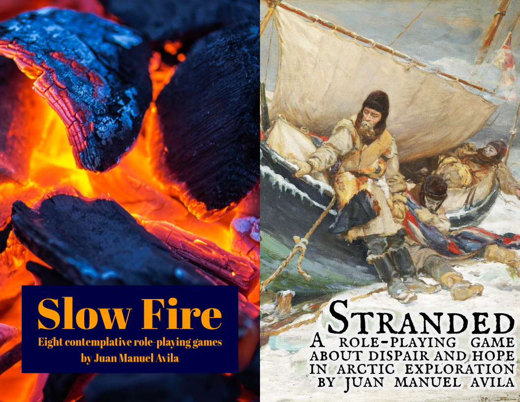
Hey, we are super excited to have uploaded our first two projects on itch.io! Both games are designed by Juan Manuel Avila, and we would like to share the news with all of you.
The first entry is an old submission to a design challenge, which Juan expanded through eight different scenarios. Together, they form a nanoantology of games that share the feeling of road movies.
https://runicagames.itch.io/slow-fire
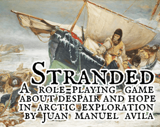
The second entry is a game based on Jared Sorensen's InSpectres. But here, the tone is not comedy, but arctic drama. A stranded crew has to survive until next summer, fighting cold and despair.
https://runicagames.itch.io/stranded
We invite you to visit the store, grab some community copies and tell us what you think of the mechanics. Maybe you can even tip a few bucks. ;)
See you!
