Indie game storeFree gamesFun gamesHorror games
Game developmentAssetsComics
SalesBundles
Jobs
TagsGame Engines

ScottLewis

9
Posts
1
Topics
76
Followers
1
Following
A member registered Mar 29, 2016 · View creator page →

Creator of

Recent community posts

Unfortunately i used Game Maker 8.1 for this, and as far as i know it can't export to Mac.

I could port it to GM Studio, but then i would need to fix a lot. And exporting to Mac from GM Studio isn't something i've figured out how to do yet. It's got a few more steps than i would like.

If i get a mac version of one of my games working it might inspire me to go and port others, but right now i don't have plans to do that. Sorry! :(

Hey! I played your game and I want to offer my thoughts. Sorry if i repeat something someone else has already said, but i wanted to have a fresh impression so i didn't read other comments.

I think the art style and character are really fun. The screenshots looked great. I wanted to play it!

The puzzle elements were heavier than i thought they would be. I was expecting an shooty action game so it took me a moment to figure out i had to backtrack and talk to Otto. This wasn't disappointing though, because you put a lot of fun details and variety into the courses.

There were some things i didn't like. More save and recharge locations would be nice (At least at the start, so people can make progress and adjust themselves to the game without dying and being sent back too much).

My biggest gripe was the overheat mechanic for the blaster. It feels really good to rapidly fire a blaster and i'm not sure why you would want to prevent the player from doing that. This was most noticeable in rooms filled with crates. Instead of being a pleasurable-feeling task of bursting lots of boxes it was instead frustrating as I waited for my gun to cool down between shots. Personally i would remove the overheat entirely.

Overall i think it's a fantastic start. Loads of charm. Have fun making Ro_Bit!

Game Maker.

If you're interested in making games for fun or looking for a gentle way to start then it's a way I recommend. Just ditch the 'drag and drop' picture interface and learn Game Maker's code language as soon as you're able.

I certainly can't deny that i really like Yoshi's Island!

I also took inspiration from palette limitations on some old 8-bit consoles (specifically how they could only show 4 colours in a palette at a time). With a few exceptions on background elements I used that as a creative limitation. So every individual bit of dot art is limited to four colours (usually white, black + 2 others).

The player sprite being 'unpolished' might be due to it being the first art i did for the game, and then not having the heart to change it later!

The reliance on encountering new gameplay/enemy objects it partly due to the simplicity of the gameplay. But later on old gimmicks get recombined in (hopefully!) interesting ways. The final area introduces relatively few gimmicks but i wanted to have a "Show me whatcha learned" feel happening with that.

Hi!

Scott here. Originally my goal in life was to make free games on the side of my work (doing TV animation), but I want to see if i can sustain my life for a little while doing something i love.

I like experiencing games because they capture my attention and i forget that death is real.

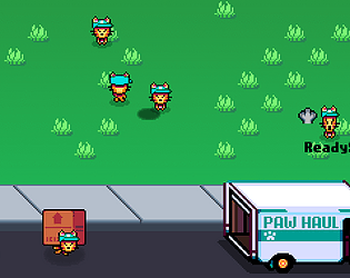
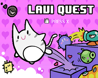
I've made a handful of small games like The Box Brigade which is a simple management game where you help cats pack a moving truck. There is also my first game, Lavi Quest, which is an hour long or so platformer where you play as a naughty cat that likes to knock precious objects from high places.

I don't just make games about cats.

(1 edit)

A page of GIFs!

The inspiration behind this game is mainly Gameboy and SNES platformers from my youth. Particularly Warioland and Super Mario World. The player uses a tackle attack like in Warioland.

I introduce lots of new gimmick stuff to the player throughout the experience, to avoid repetitive gameplay.

This game is almost done. Just some extra non-gameplay related bits to work on, like an intro scene and a new title screen, as well as finishing programming the world map. And i'm finally realizing i should have started showing it off sooner. T.T

Can anyone tell me what they think based on the screens? Do you feel anything? I'm not sure if i'm supposed to ask that in a devlog topic.

I'm not yet a popular game developer or a member of the gaming press, but I'll respond so you're not typing into the void.

Was a press release necessary for a title like this? It might be good to assume that nobody's gonna read more than a line. Instead of a cover letter I would want to be taken right to a nice, brief webpage where i can watch the trailer and grab the game at the same time.

Also, the trailer makes the game seem bland. The music may work for the thinky sections of the game, but it's plodding for a trailer. In the beginning the trailer holds on a still frame of the woman in the yellow jumpsuit for four whole seconds. That's WAY too much time to have nothing happening (this sort of thing feels like an issue throughout, imo). Also, the trailer makes it seem like there are no sound effects in the game. The card concept is cool, and some nice card flipping and playing sound effects would have been pleasing audio.

The concept of interrogating witnesses through a card game is neat though! Something that i think would have added a lot is different visual reactions from the witnesses depending on your questions (Have you played Phoenix Wright?).

Cheers and best of luck selling your game!

Thanks! That was entertaining to watch!

Glad you liked it. :)